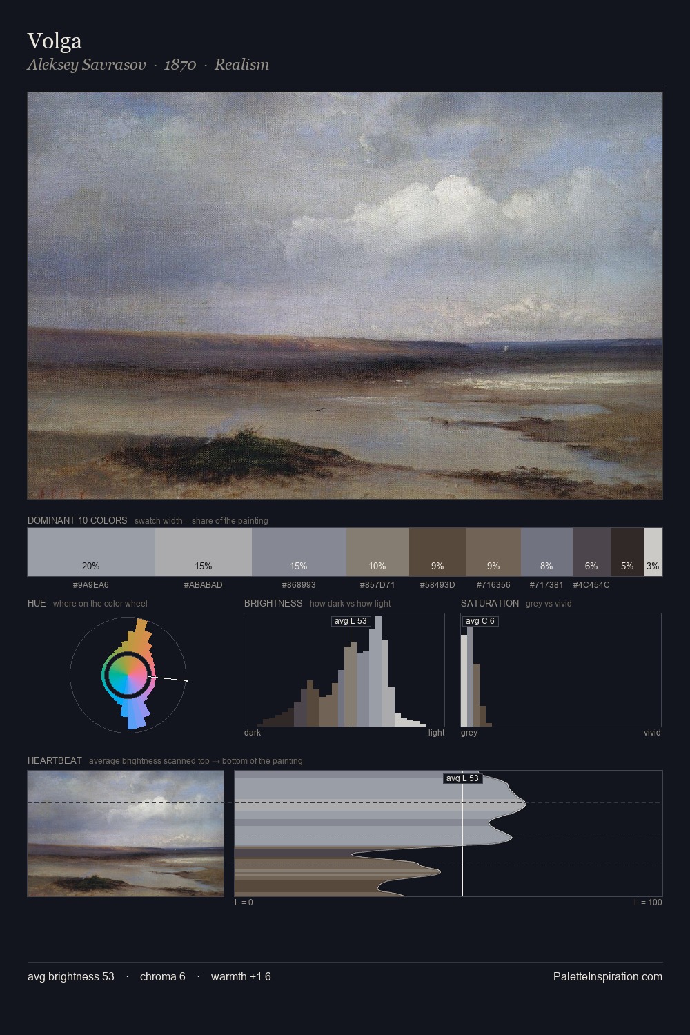
Aleksey Savrasov Palette 13
Shadowed Ash
Shadowed Low-key - values weighted toward shadow, the palette of dim interiors and overcast skies.
Ash Mid cool-gray - the neutral residue of fire, between white and charcoal.

Palette Analysis
Aleksey Savrasov distributes its values across the middle register, creating harmony without high contrast. Warmth dominates - the palette of Aleksey Savrasov leans heavily on the yellow-orange-red arc of the colour wheel. All colours lean toward grey, building depth through value rather than colour punch. The most saturated colour, #6A4F3E, is reserved to 4.5% of the surface, where it acts as a focal punctuation. From deepest dark to palest light, the palette traverses 59 units of the value scale - a span that creates natural depth. Palette 13 sits within the larger chromatic argument that Aleksey Savrasov's complete body of work advances.
Example use cases
- film & entertainment
- fine dining
- spirits branding
- menswear
- theater design
I Love This!
Use This Palette
Copy, export, or download for your project
Copy, export, or download for your project
Copy:
Download:
Share: