Aleksandr Kiseliov Palette 1

Palette Analysis
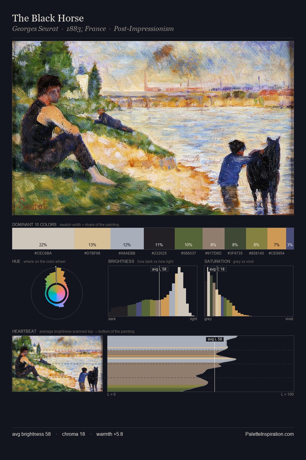
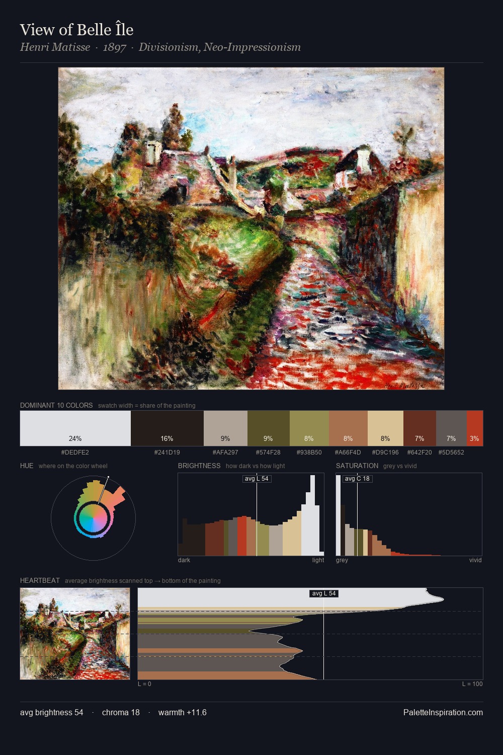
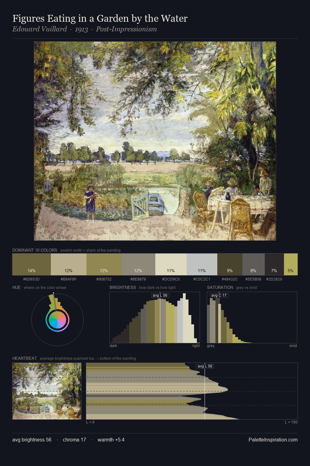
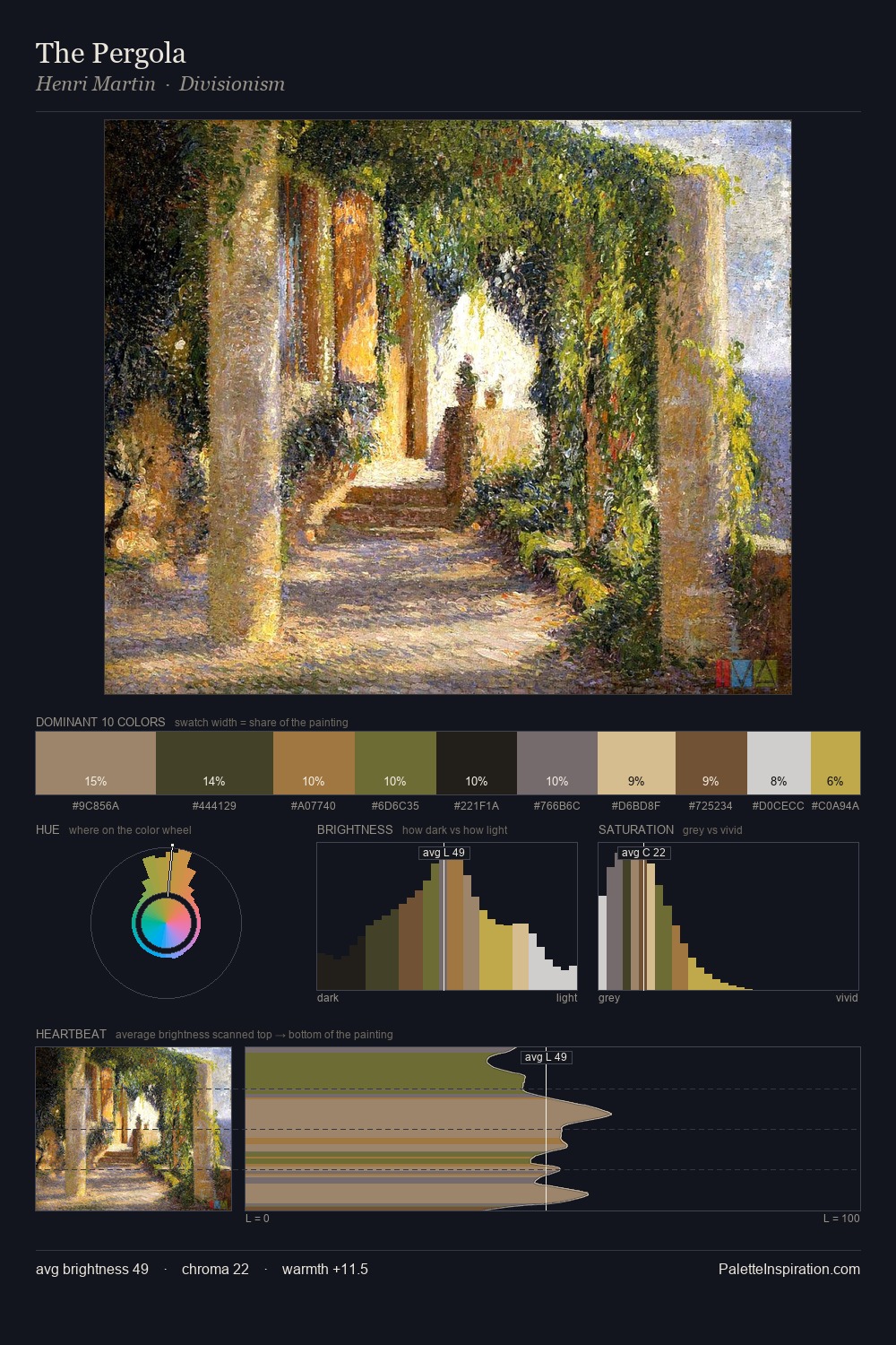
Aleksandr Kiseliov occupies the comfortable middle of the value scale, avoiding both extremes to hold the eye in a sustained middle grey. Cool hues prevail: blues, greens, and greys anchor the palette's emotional temperature. All colours lean toward grey, building depth through value rather than colour punch. The highest-chroma note - #CEA884 - appears at just 3.2%, deployed as a precision accent against the quieter ground. At 62 units of value range, the palette has the tonal breadth to sustain complex spatial readings. The palette has the character of outdoor light: cool, mid-bright, with colour rendered faithfully rather than expressively. Palette 1 sits within the larger chromatic argument that Aleksandr Kiseliov's complete body of work advances.
Example use cases
- exhibition design
- foundation branding
- estate management
- art education
- museums & galleries
I Love This!
Copy, export, or download for your project