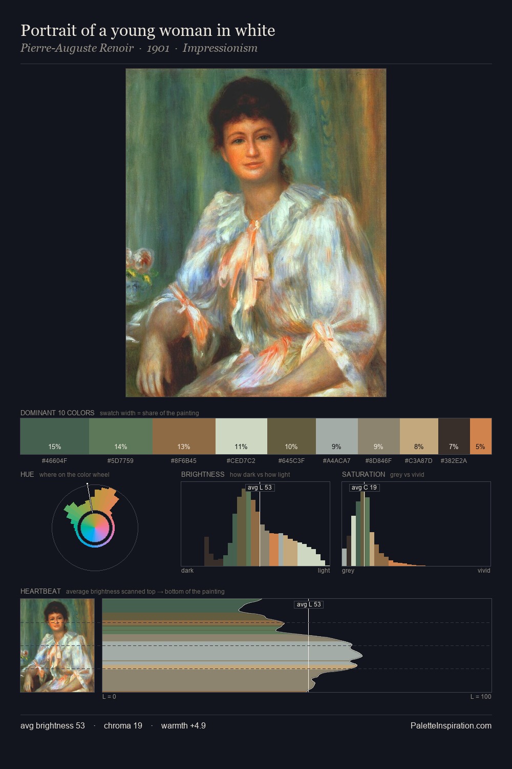
Albert Bredow Palette 2

Palette Analysis
Values in Albert Bredow tilt decisively toward white, giving the palette its luminous character. Albert Bredow tilts toward cool - blues and silver-greys carry the structural weight. Saturation is deliberately withheld - the beauty here lies in the near-monochromatic gradations rather than colour difference. The saturated accent, #6C543A, registers at 4.4% - sparse enough to feel like a deliberate surprise. From deepest dark to palest light, the palette traverses 57 units of the value scale - a span that creates natural depth. The palette has the character of outdoor light: cool, mid-bright, with colour rendered faithfully rather than expressively. Albert Bredow's palette 2 carries its own internal logic while remaining in conversation with the artist's broader colour intelligence.
Example use cases
- ceramics & pottery
- boutique hospitality
- menswear
- heritage food brands
- craft & artisan brands
I Love This!
Copy, export, or download for your project