Advertisement Palette 1

Palette Analysis
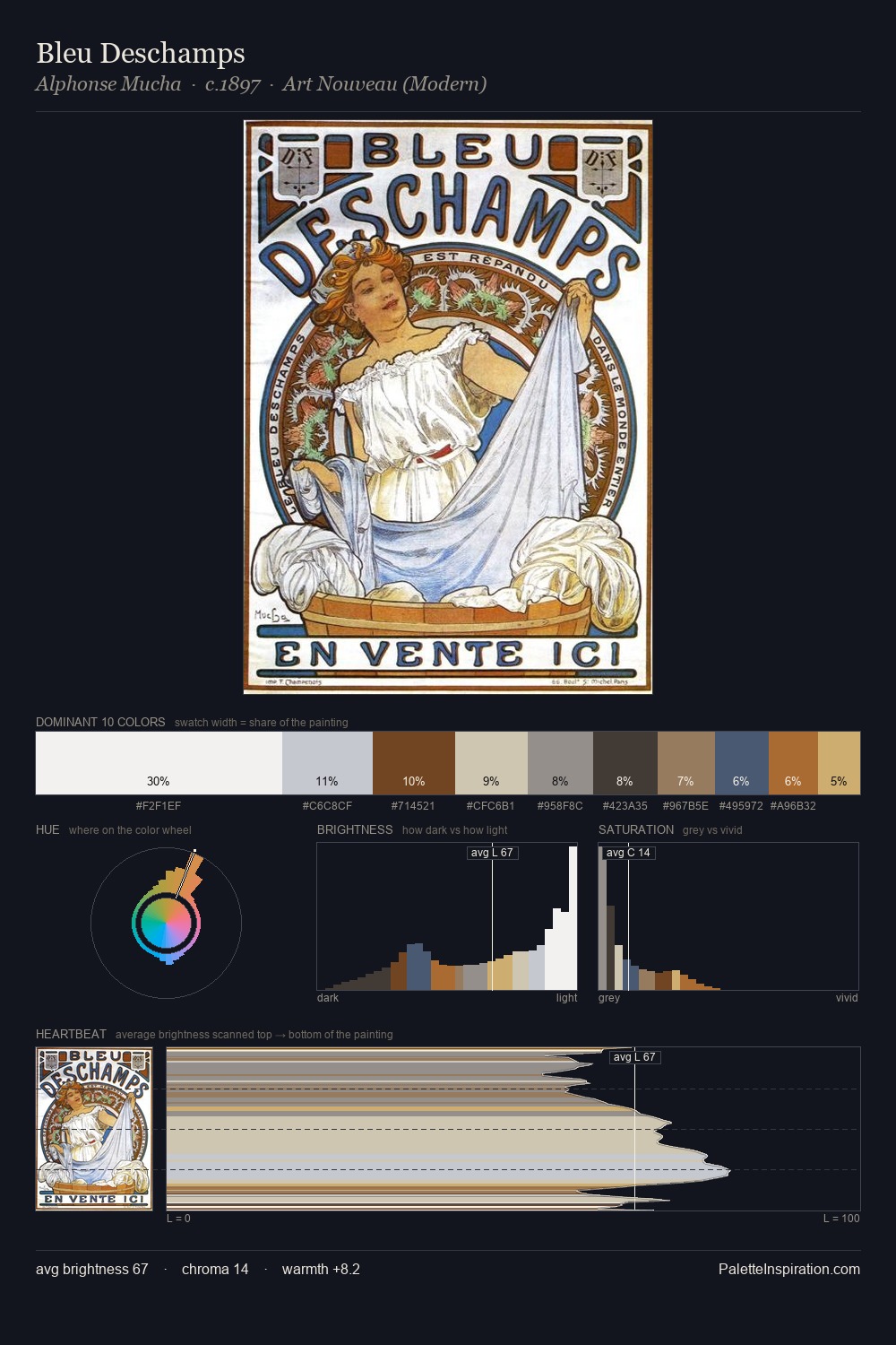
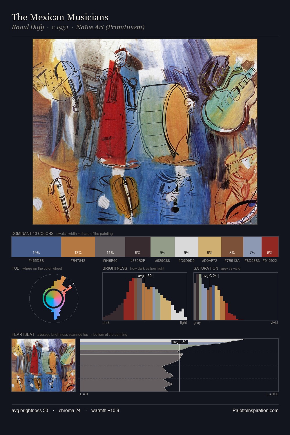
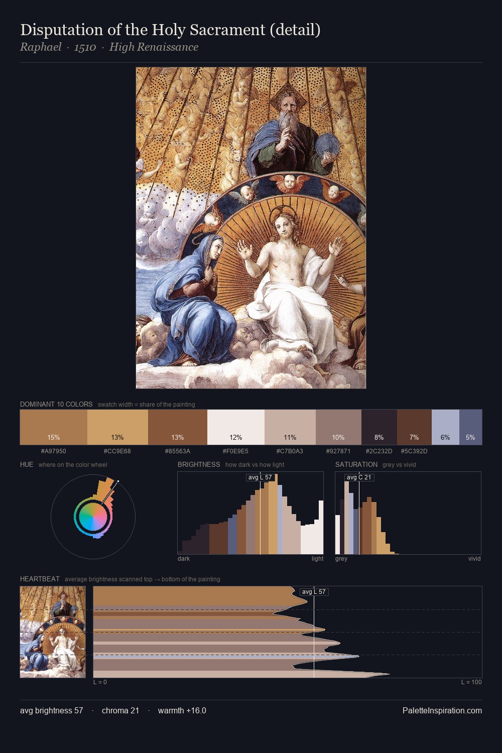
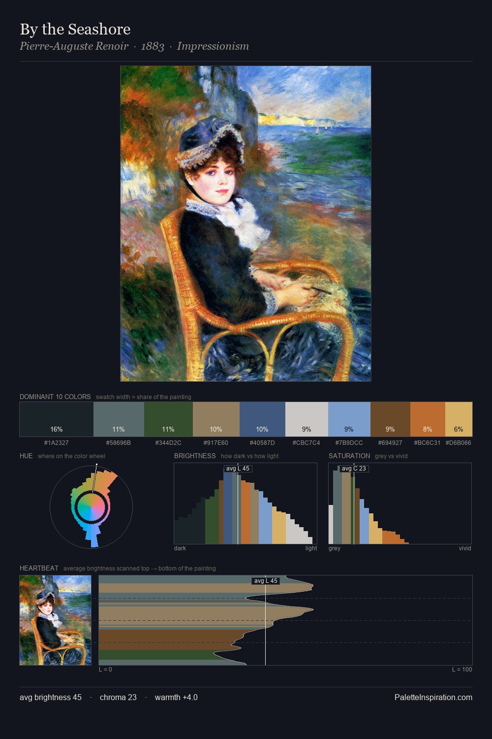
Light floods advertisement; the palette keeps values pale and airy across its range. The palette tilts toward cool - blues and silver-greys carry the structural weight. Saturation is deliberately withheld - the beauty here lies in the near-monochromatic gradations rather than colour difference. The dominant colour, #ECEBE9, takes 31.8% of the total area, establishing the overall mood before any other hue is introduced. #D1B072 delivers the chromatic peak at only 7.0% - a small shot of colour with outsized visual impact. From deepest dark to palest light, the palette traverses 57 units of the value scale - a span that creates natural depth. High luminosity and cool temperature suggest the plein-air condition: unfiltered daylight and open sky.
Example use cases
- florist branding
- event design
- real estate
- jewelry retail
- hospitality branding
I Love This!
Copy, export, or download for your project