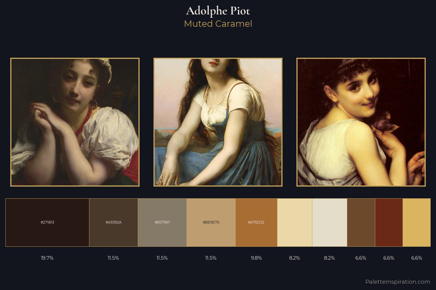
Adolphe Piot Master Palette
Muted Caramel
Muted Deliberately desaturated - chroma pulled toward gray, the restraint of tonal painting.
Caramel Warm mid-brown - the color of cooked sugar, smooth and amber-toned.
Palette Analysis
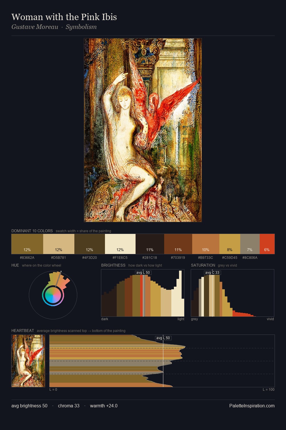
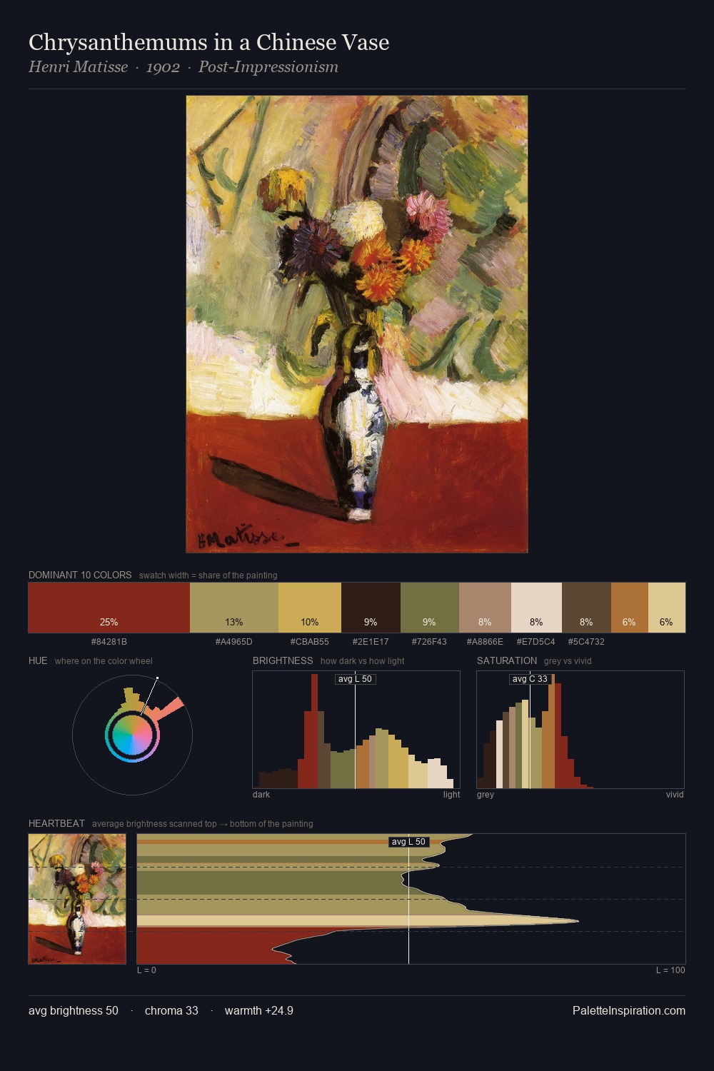
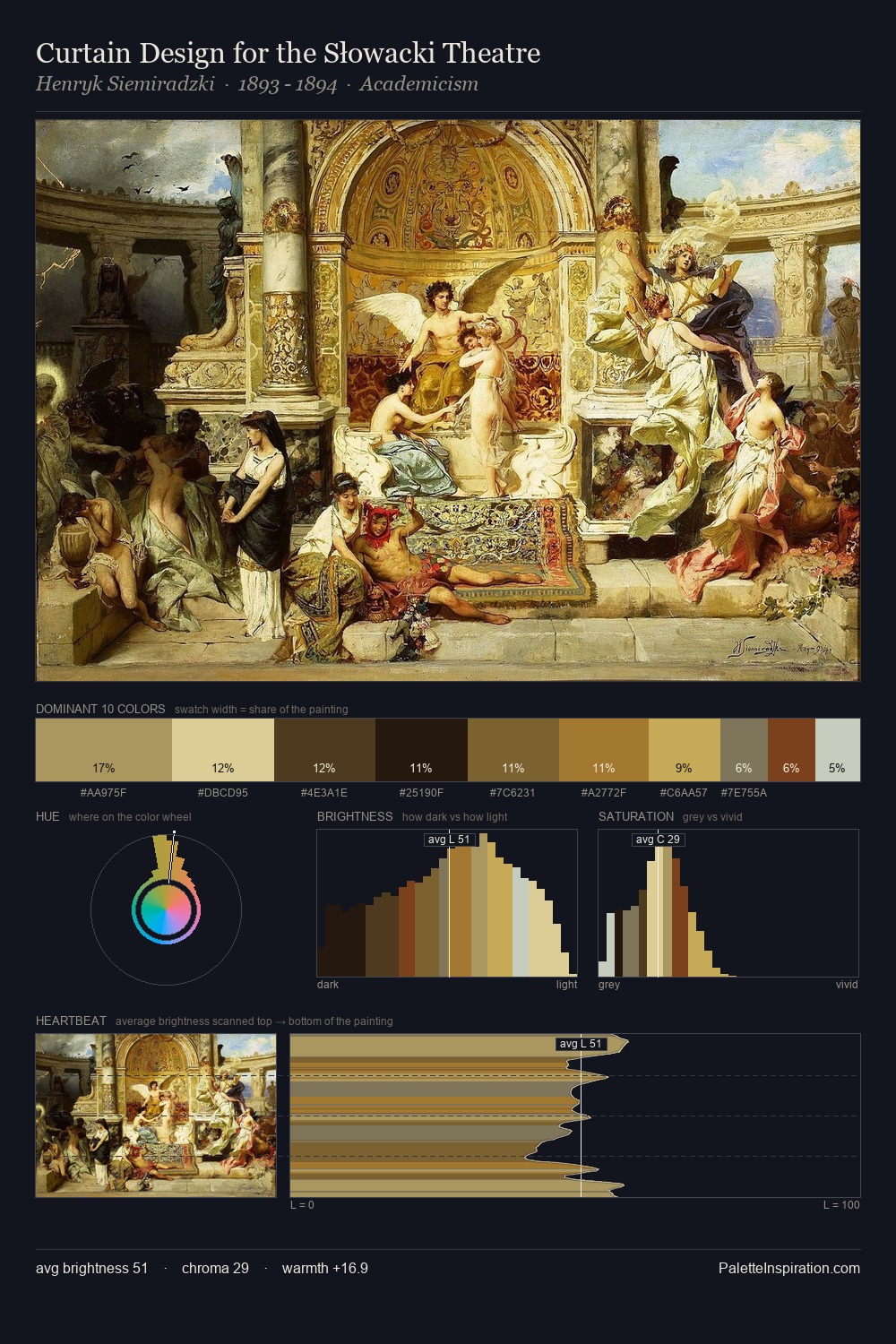
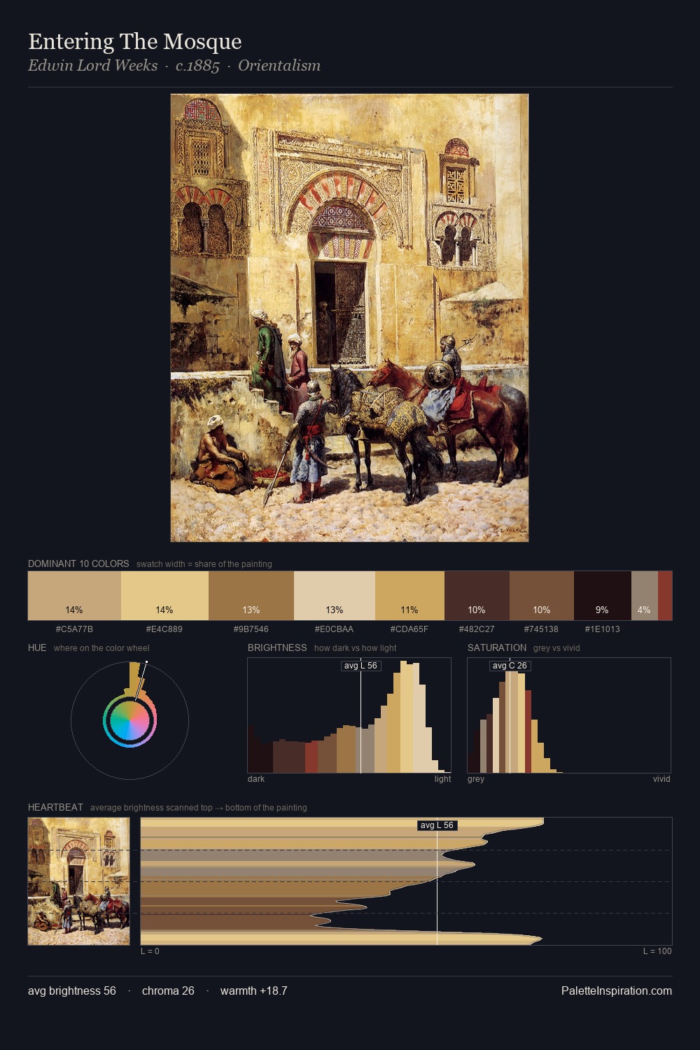
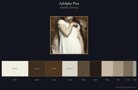
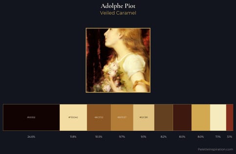
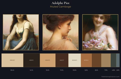
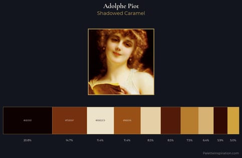
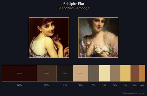
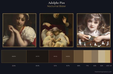
Adolphe Piot distributes its values across the middle register, creating harmony without high contrast. Warm and cool tones are held in careful balance - neither family dominates, creating tension and resolution simultaneously. All colours lean toward grey, building depth through value rather than colour punch. Only 6.6% is devoted to #DBB460, yet that small allocation delivers the palette's entire chromatic tension. 67 units of value range underpin the palette's structural clarity: the eye always knows where light falls. The palette is a signature: Adolphe Piot's particular sense of value, warmth, and colour weight made legible.
Example use cases
- food packaging
- leather accessories
- travel & outdoor
- natural cosmetics
- interior design
I Love This!
Use This Palette
Copy, export, or download for your project
Copy, export, or download for your project
Copy:
Download:
Share: