Adolf Hirémy-Hirschl Palette 5
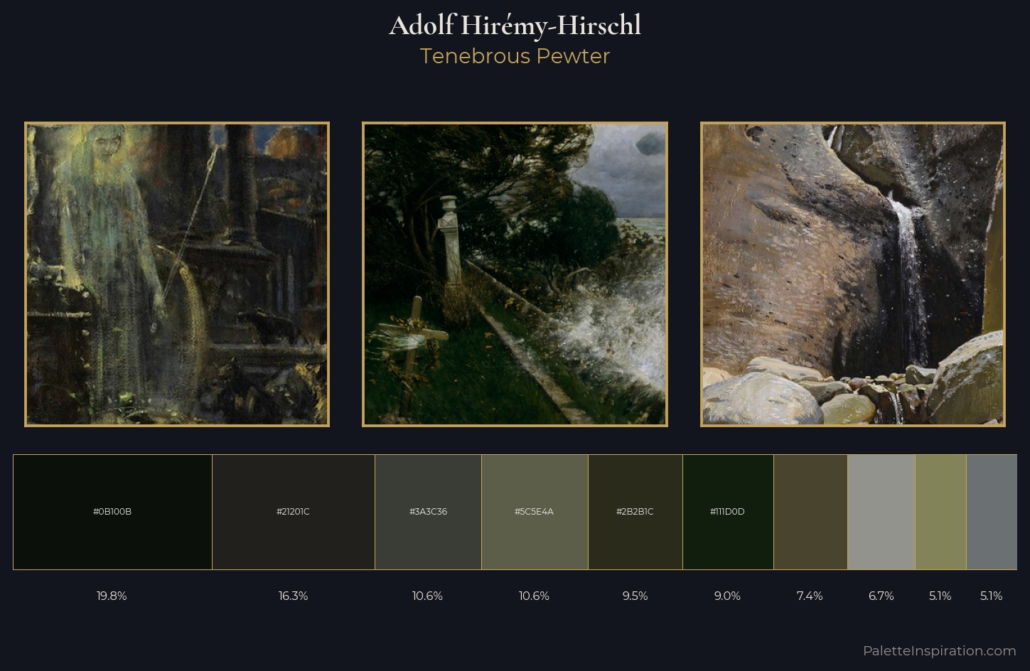
Palette Analysis
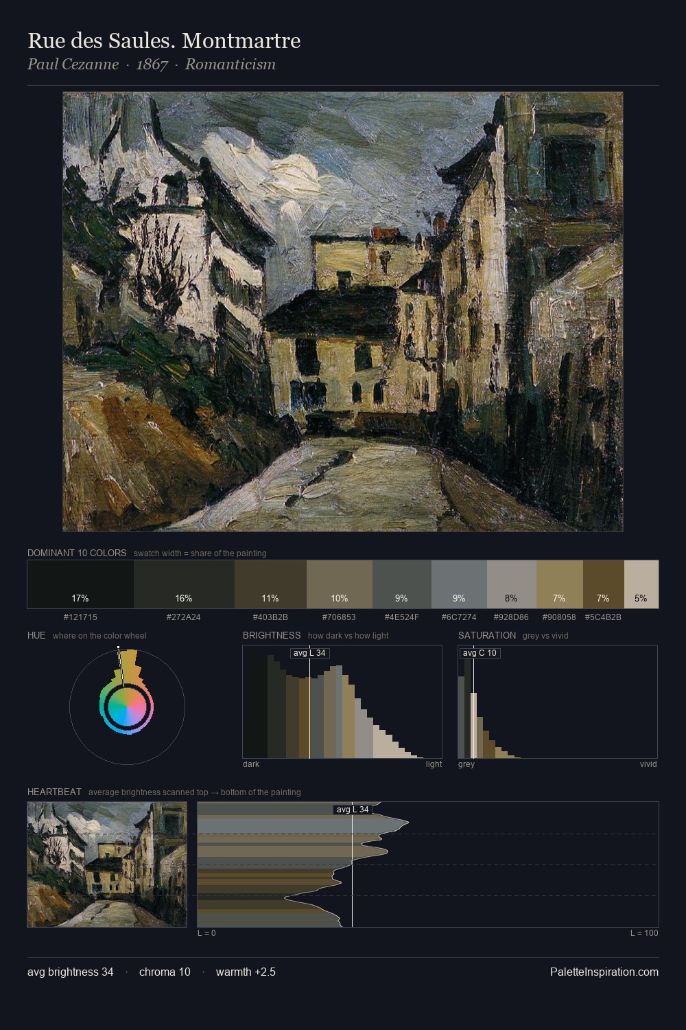
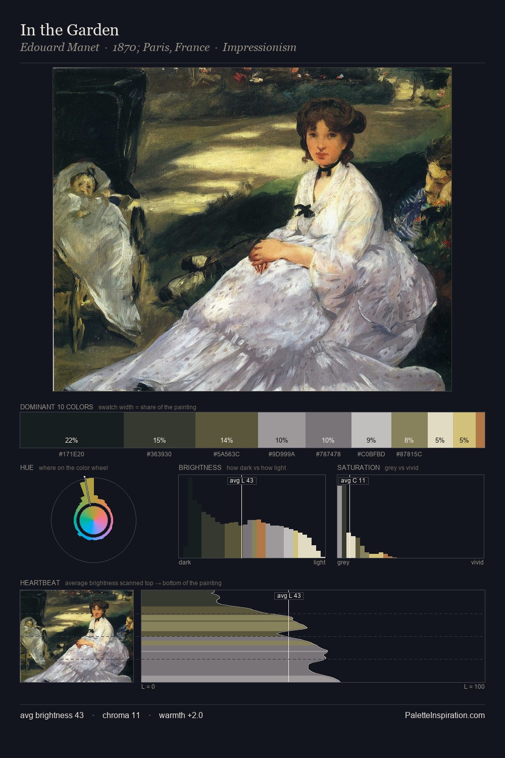
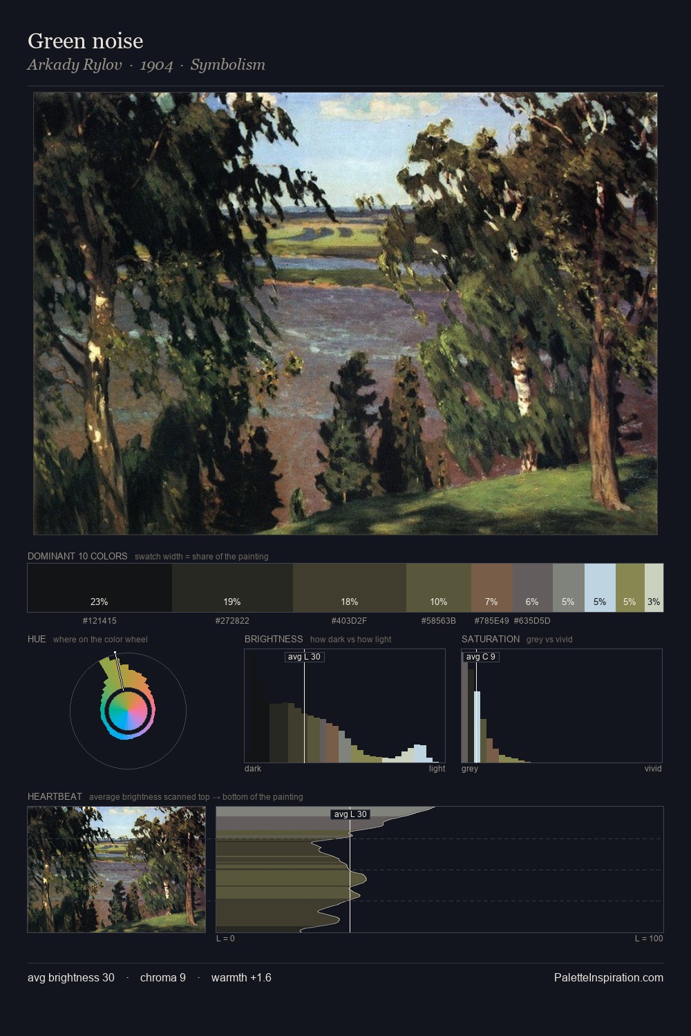
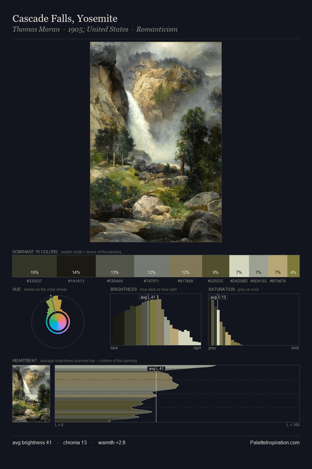
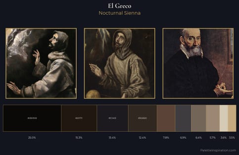
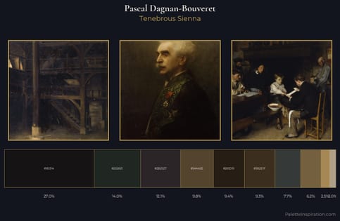
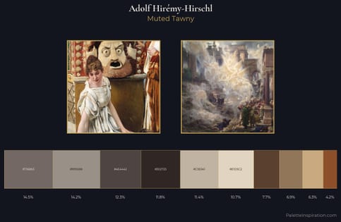
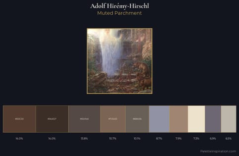
The palette of Adolf Hirémy-Hirschl sits in the lower register of the value scale - dense, contained, and weighted. Temperature is cool-dominant, with blue and green families claiming the largest areas. Saturation is deliberately withheld - the beauty here lies in the near-monochromatic gradations rather than colour difference. Only 7.4% is devoted to #48442D, yet that small allocation delivers the palette's entire chromatic tension. Spanning 49 units on the value axis, the palette achieves the balance between tonal flatness and fragmentation. Together these qualities place Adolf Hirémy-Hirschl firmly in the tonal tradition - concerned with mood and atmosphere rather than chromatic display. Adolf Hirémy-Hirschl's palette 5 carries its own internal logic while remaining in conversation with the artist's broader colour intelligence.
Example use cases
- music labels
- luxury hospitality
- editorial photography
- leather goods
- premium streaming
I Love This!
Copy, export, or download for your project