Adolf Eberle Master Palette
Shadowed Gamboge
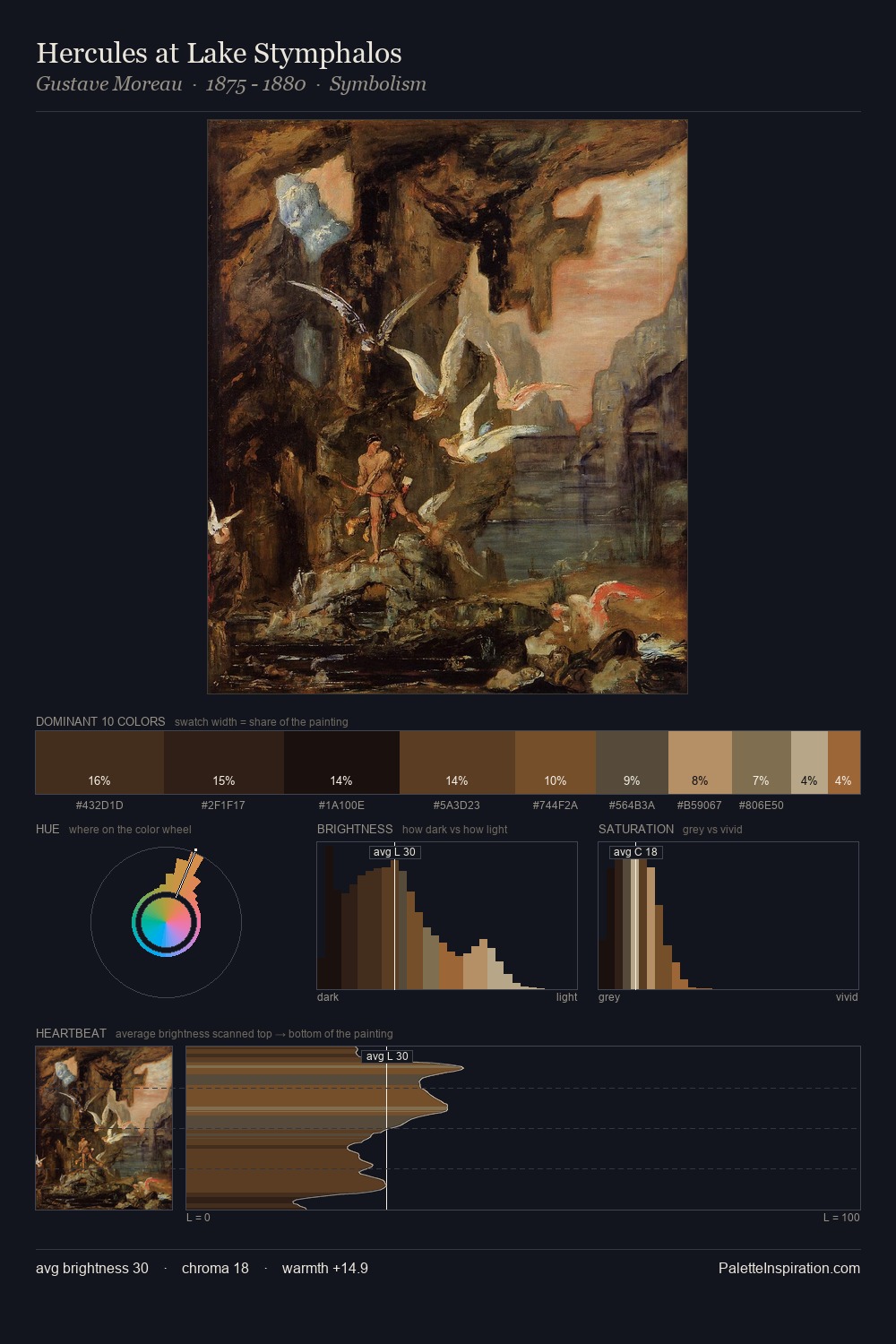
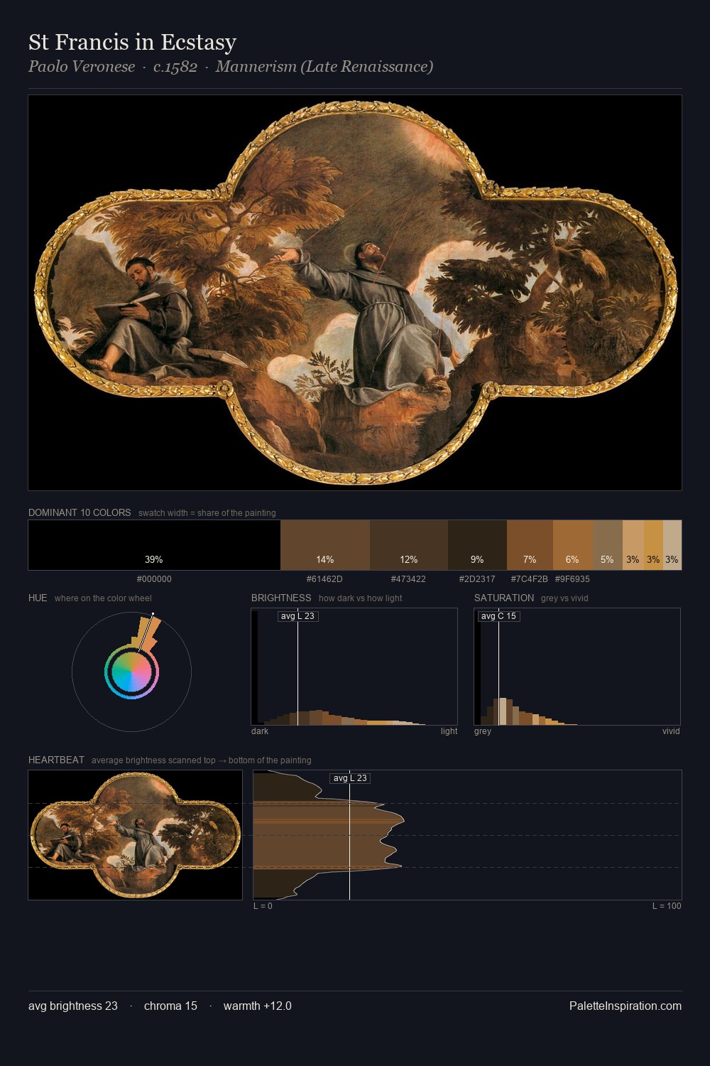
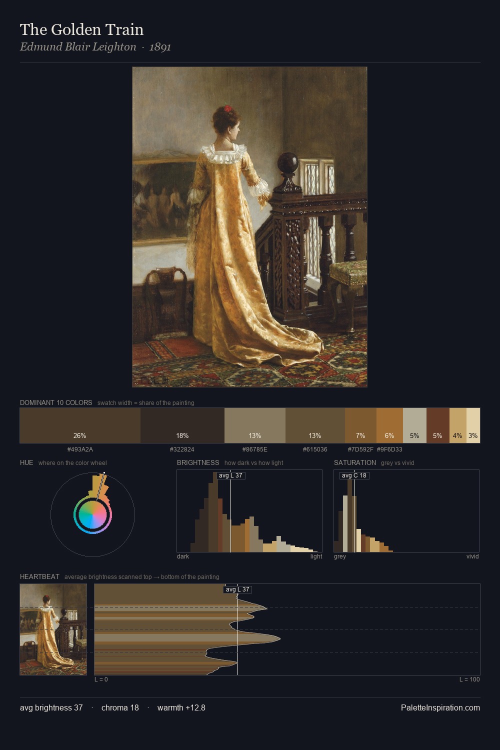
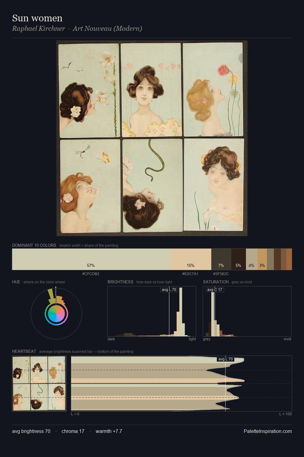
Shadowed Low-key - values weighted toward shadow, the palette of dim interiors and overcast skies.
Gamboge Deep golden yellow - a traditional warm pigment, rich amber-gold.

Palette Analysis
Adolf Eberle sits in the centre of the value range, lending the palette a sense of even, sustained light. Adolf Eberle orchestrates warmth above all else - reds, ambers, and siennas take the lead. Every colour is desaturated; the palette proceeds through near-neutrals and gently-coloured greys. The most saturated colour, #A15F2F, is reserved to 7.5% of the surface, where it acts as a focal punctuation. At 51 units across the value scale, the palette keeps contrast readable without letting it dominate. These proportions encode Adolf Eberle's instinctive sense of how much of each quality the eye can hold.
Example use cases
- theater design
- jewelry brands
- tobacco-adjacent retail
- event branding
- film & entertainment
I Love This!
Use This Palette
Copy, export, or download for your project
Copy, export, or download for your project
Copy:
Download:
Share: