Abstract Art Palette 2

Palette Analysis
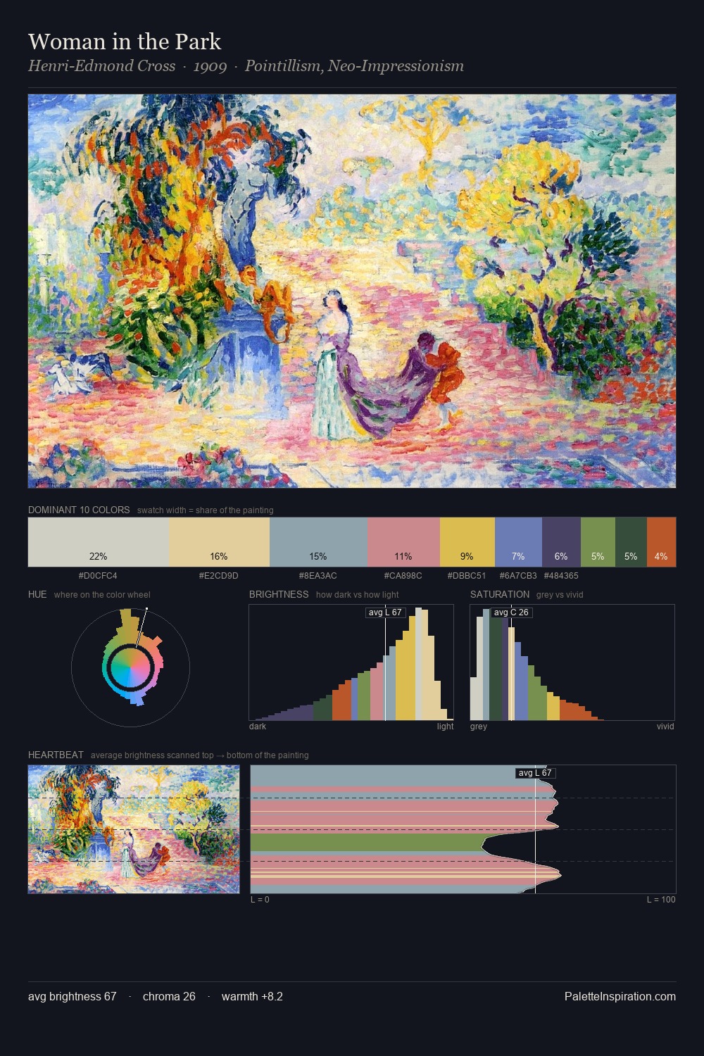
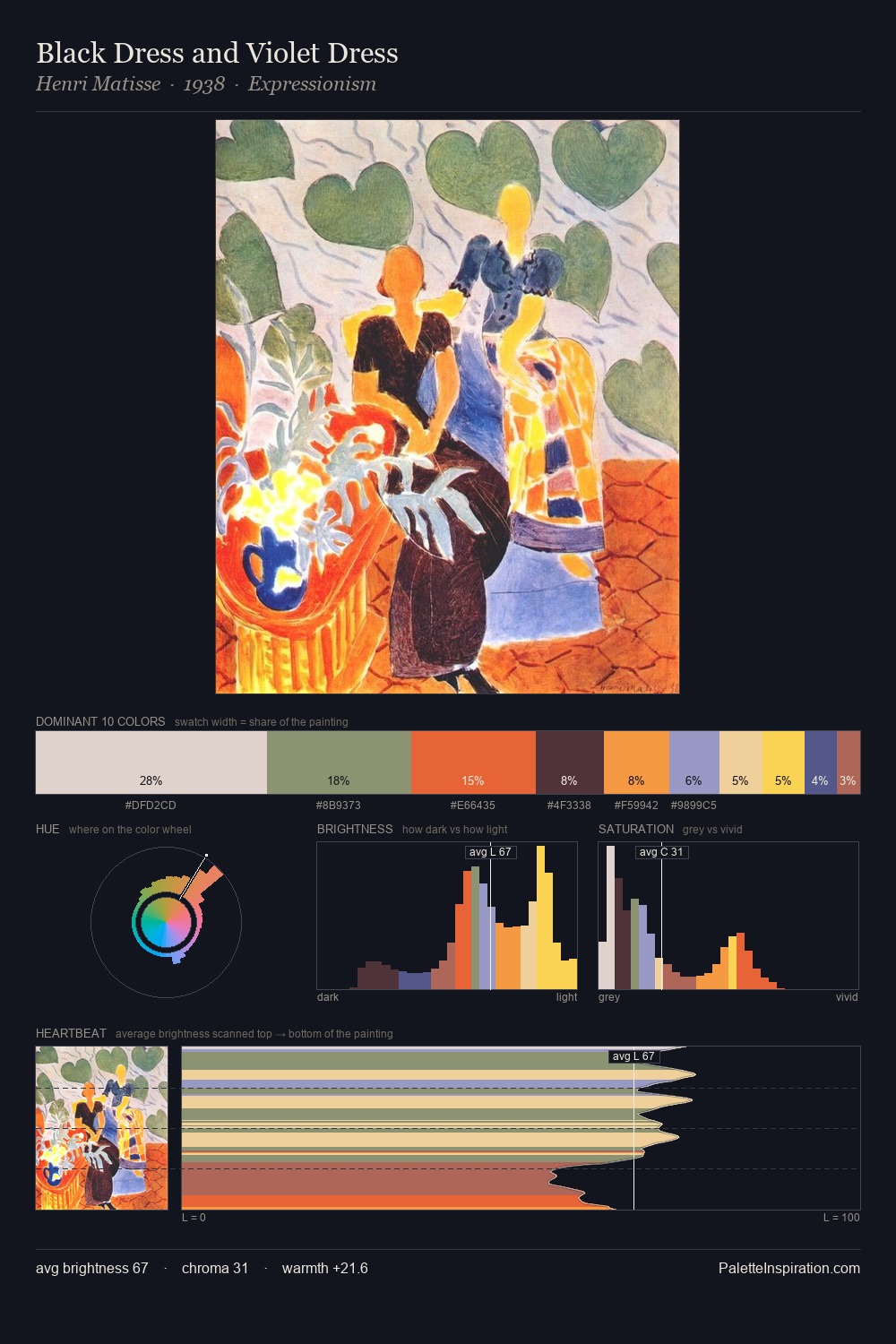
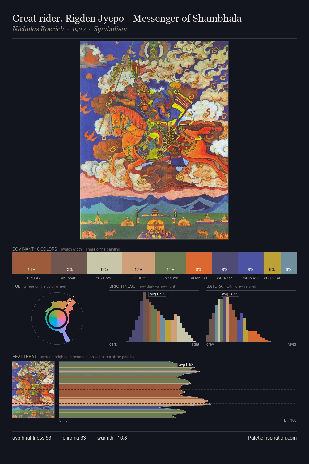
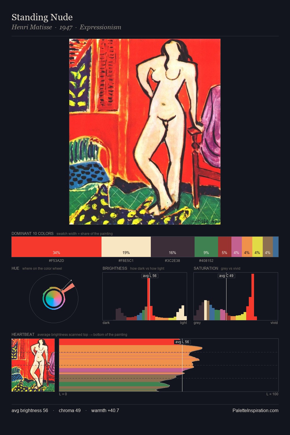
Abstract Art works in the upper reaches of the value scale, creating an atmosphere of brightness and expansiveness. The palette tilts toward cool - blues and silver-greys carry the structural weight. Colours are neither washed out nor blazing; they occupy the productive middle ground of the chroma scale. 38.6% of the palette belongs to #6FA36E, a concentration that makes it the unmistakable visual centre. At 3.9%, #E6CF41 carries the palette's sharpest chromatic charge: an accent that earns its place precisely because it is withheld. The palette spans 48 value units: a measured range that delivers coherence over drama. The palette has the character of outdoor light: cool, mid-bright, with colour rendered faithfully rather than expressively.
Example use cases
- garden centers
- natural beauty
- park & rec design
- sustainable fashion
- sustainability
I Love This!
Copy, export, or download for your project