Abstract Art Palette 19
Shadowed Tawny
Shadowed Low-key - values weighted toward shadow, the palette of dim interiors and overcast skies.
Tawny Warm orange-brown - a traditional term for the color of tanned leather or lion fur.

Palette Analysis
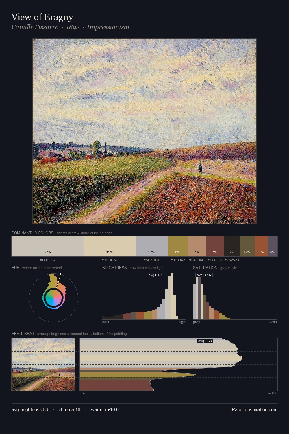
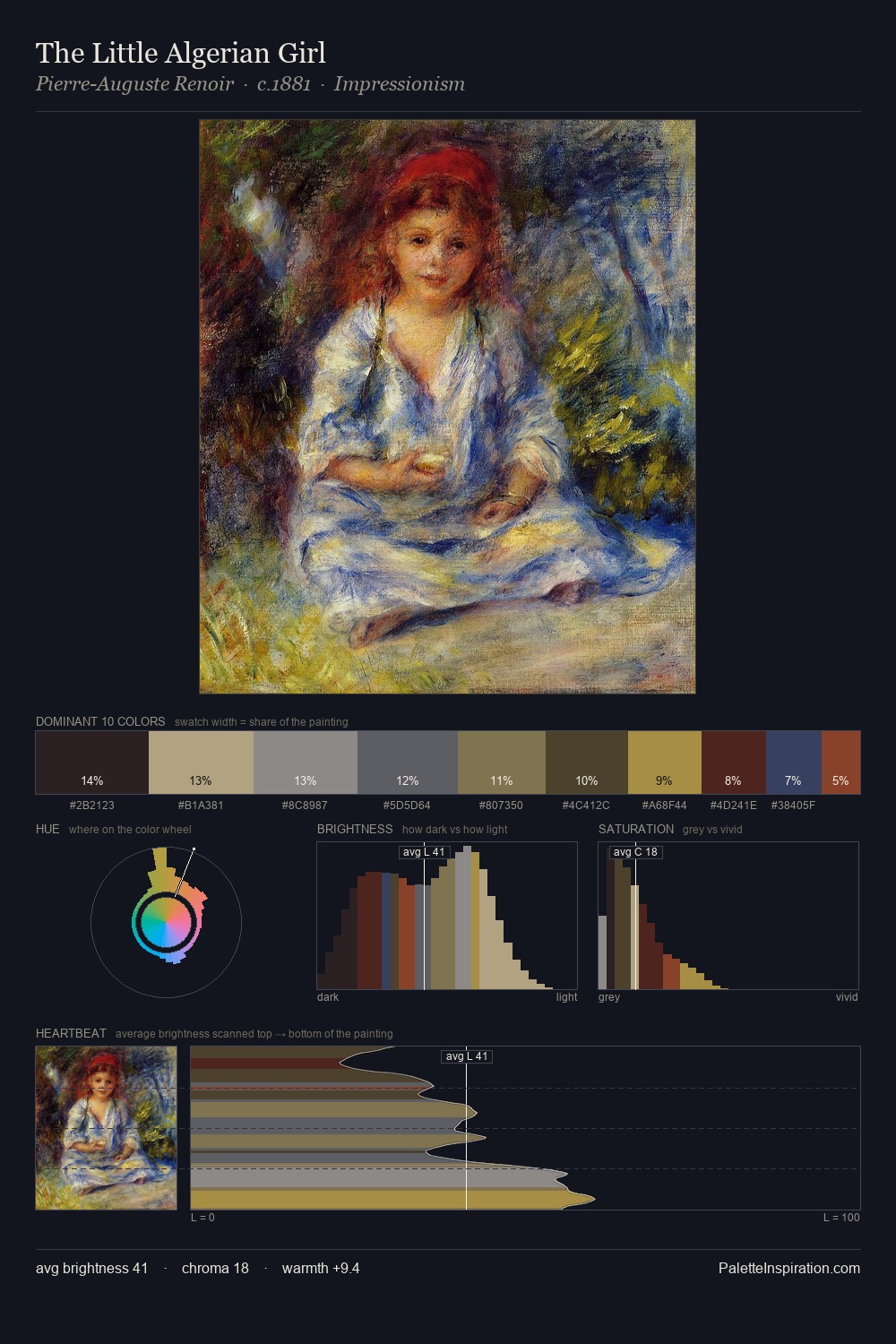
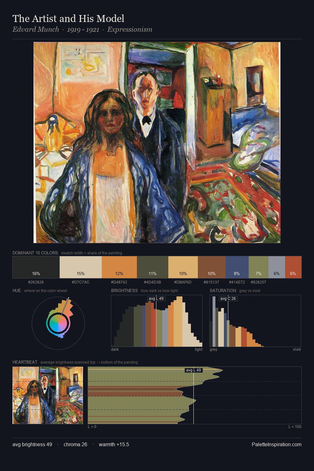
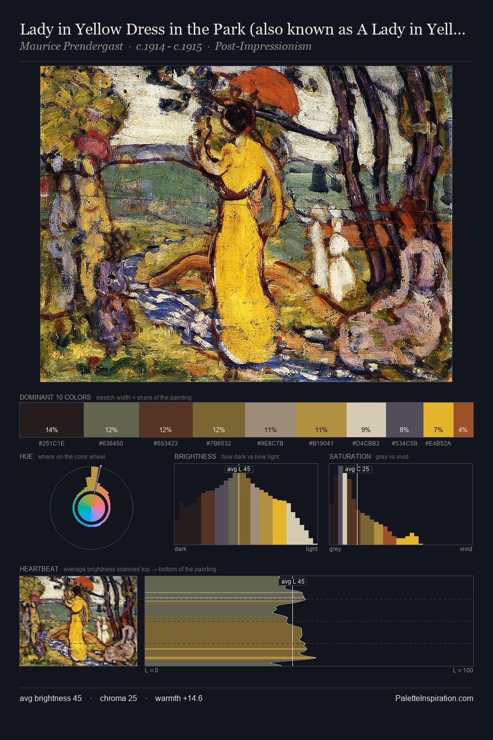
Abstract Art occupies the comfortable middle of the value scale, avoiding both extremes to hold the eye in a sustained middle grey. Temperature reads distinctly warm: the reds and earth tones carry the compositional weight. Chroma hovers near zero; colour declares itself through subtle shifts in hue rather than outright saturation. A single dominant - #221E1A at 25.4% - sets the character of the whole composition. The highest-chroma note - #A6553E - appears at just 4.9%, deployed as a precision accent against the quieter ground. At 59 units of value range, the palette has the tonal breadth to sustain complex spatial readings.
Example use cases
- theater design
- jewelry brands
- tobacco-adjacent retail
- event branding
- film & entertainment
I Love This!
Use This Palette
Copy, export, or download for your project
Copy, export, or download for your project
Copy:
Download:
Share: