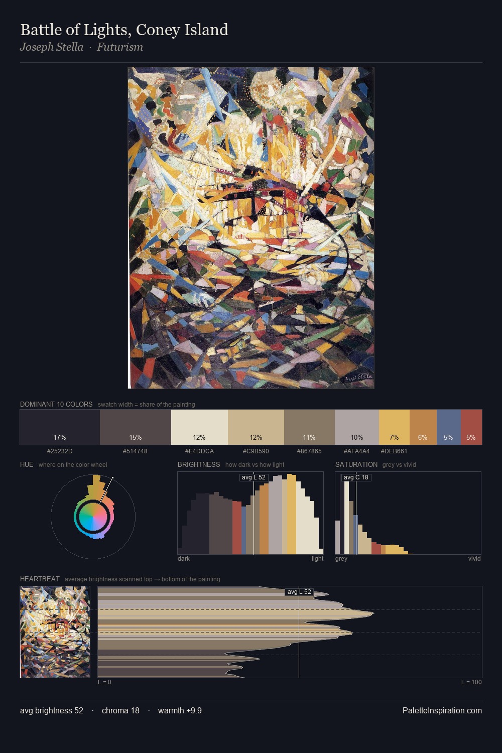
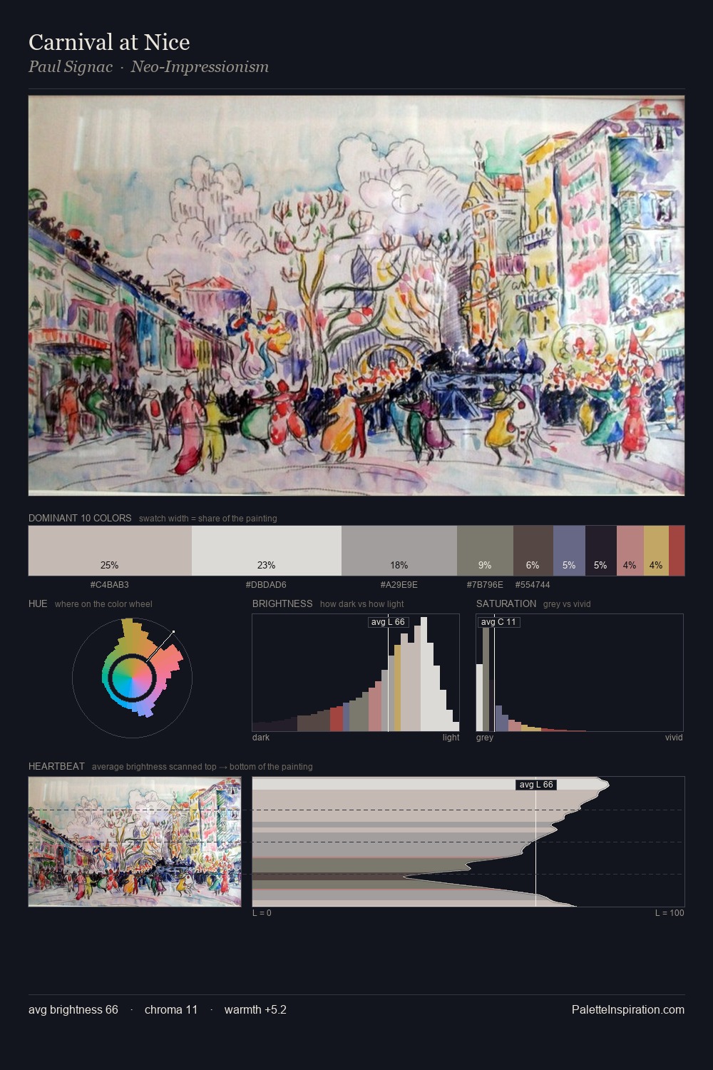
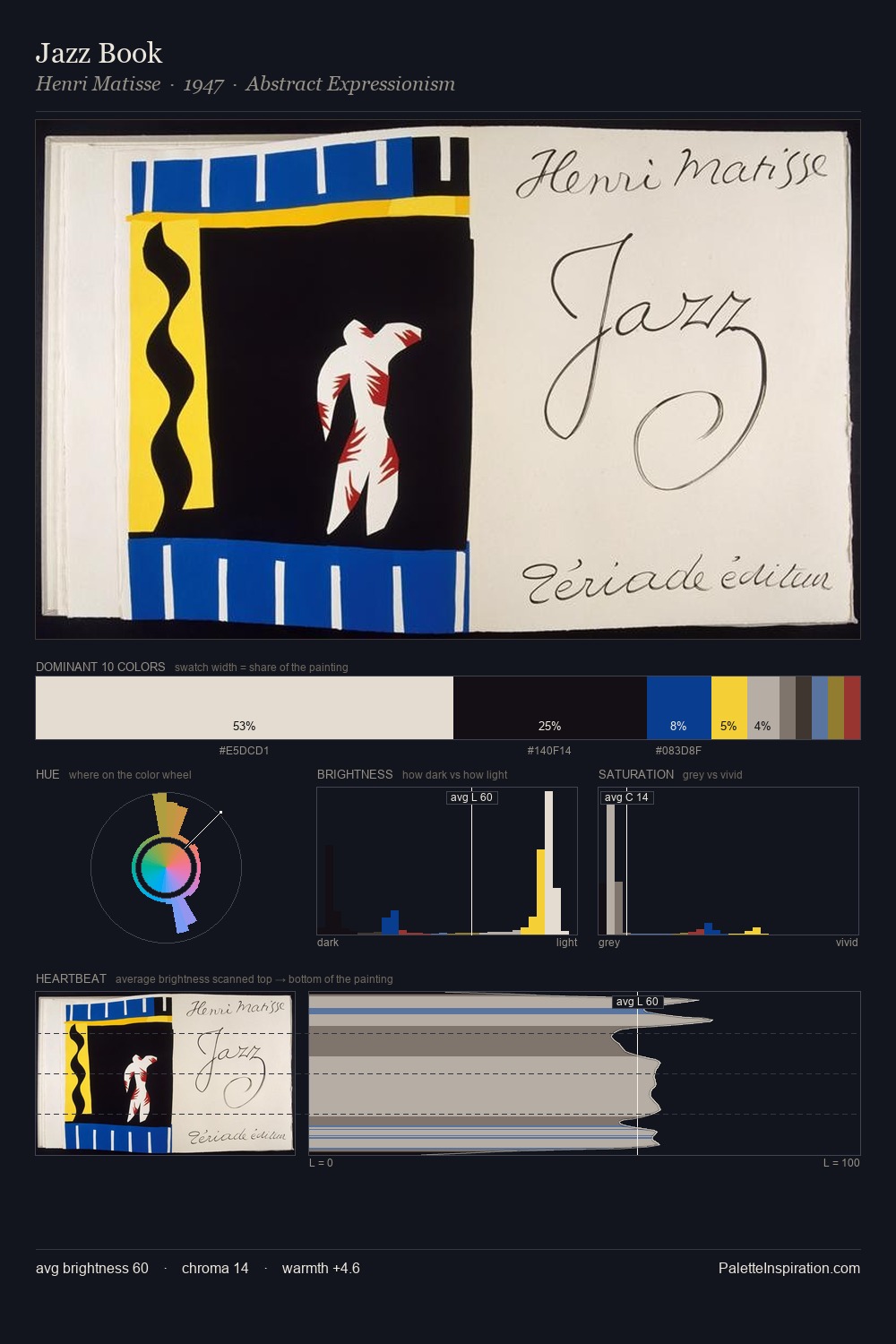
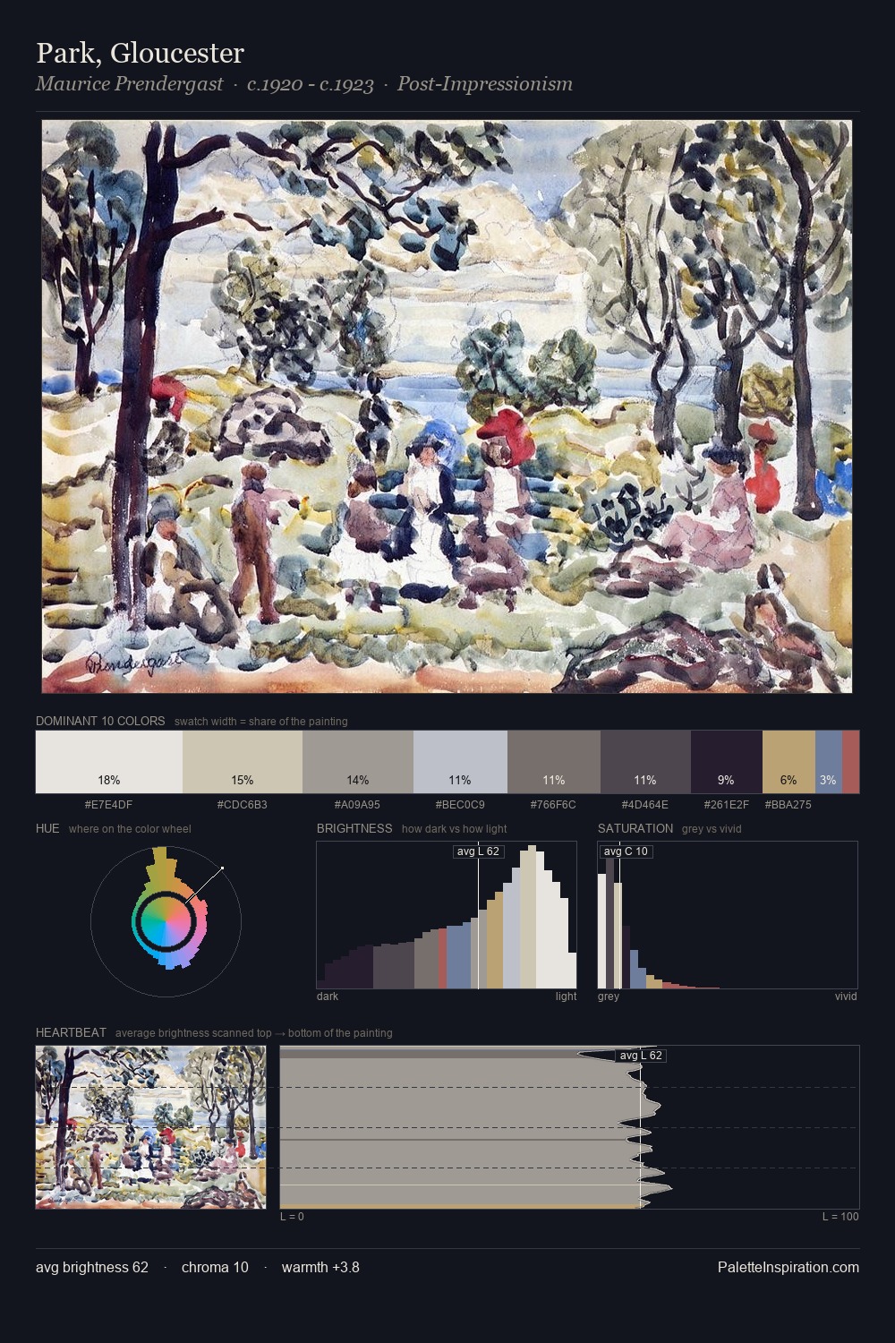
Abstract Art Palette 10
Soft Ivory
Soft Low-contrast, gentle chroma - mid-key values and low saturation, approachable and calm.
Ivory Warm creamy white - the color of natural ivory, warmer than pure white.

Palette Analysis
Light floods Abstract Art; the palette keeps values pale and airy across its range. The artist keeps warm and cool in parity, a balance that lends the work a perceptual shimmer. The absence of saturated colour is itself an expressive choice: this is a palette of restraint and atmosphere. The saturated accent, #A78050, registers at 2.5% - sparse enough to feel like a deliberate surprise. 67 units of value range underpin the palette's structural clarity: the eye always knows where light falls.
Example use cases
- exhibition design
- foundation branding
- estate management
- art education
- museums & galleries
I Love This!
Use This Palette
Copy, export, or download for your project
Copy, export, or download for your project
Copy:
Download:
Share: