Abraham van Strij Palette 6
Muted Apricot
Muted Deliberately desaturated - chroma pulled toward gray, the restraint of tonal painting.
Apricot Soft warm orange - peach-adjacent, the color of ripe stone fruit.

Palette Analysis
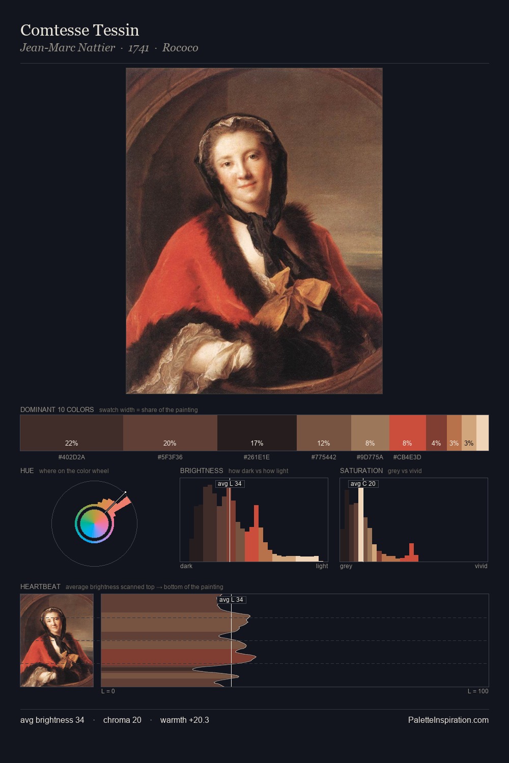
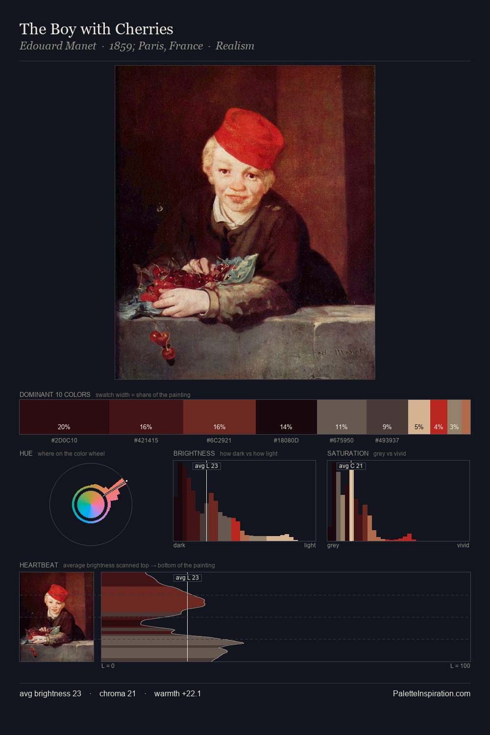
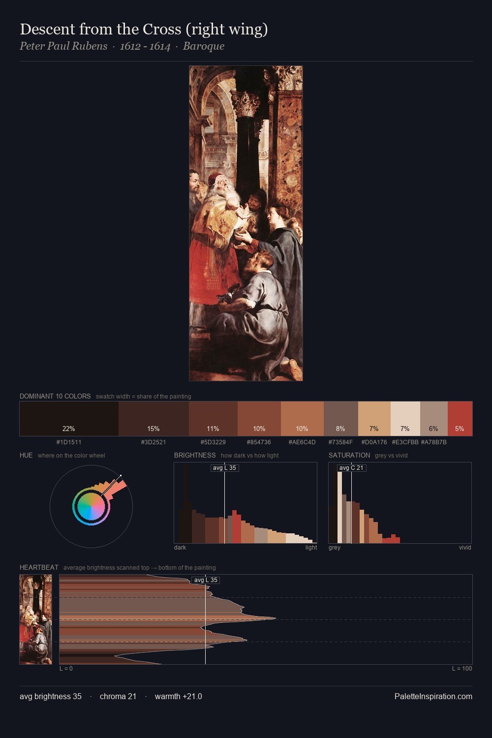
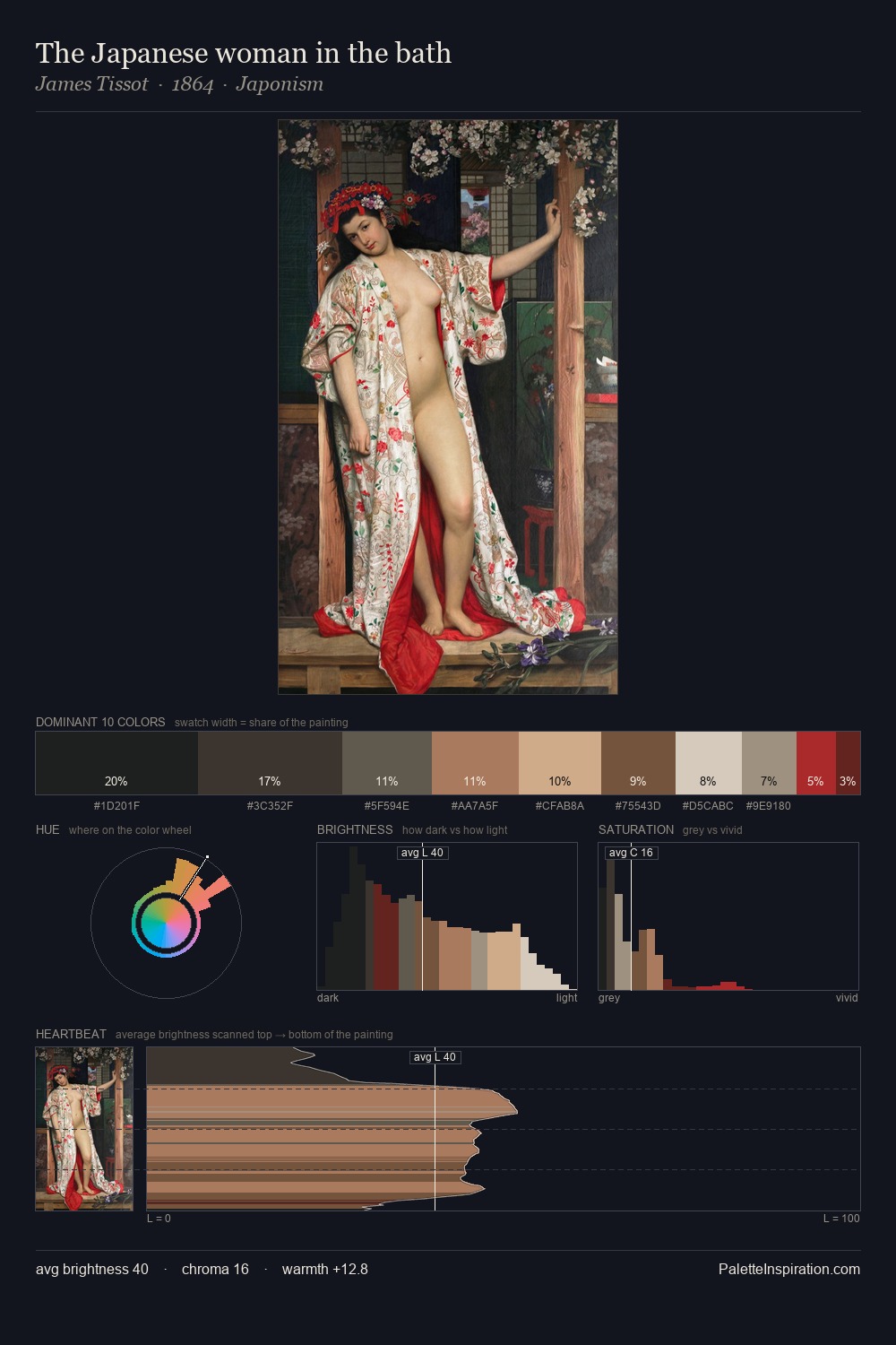
Abraham van Strij distributes its values across the middle register, creating harmony without high contrast. The dominant temperature is warm, with earth tones and fire-hues setting the emotional key. Mid-range chroma keeps the palette grounded - colourful but not strident. Only 5.1% is devoted to #762D29, yet that small allocation delivers the palette's entire chromatic tension. 70 units of value range underpin the palette's structural clarity: the eye always knows where light falls. In the context of Abraham van Strij's full range of palettes, group 6 represents one movement in an ongoing chromatic dialogue.
Example use cases
- ceramics & pottery
- boutique hospitality
- menswear
- heritage food brands
- craft & artisan brands
I Love This!
Use This Palette
Copy, export, or download for your project
Copy, export, or download for your project
Copy:
Download:
Share: