Abbott Handerson Thayer Palette 4

Palette Analysis
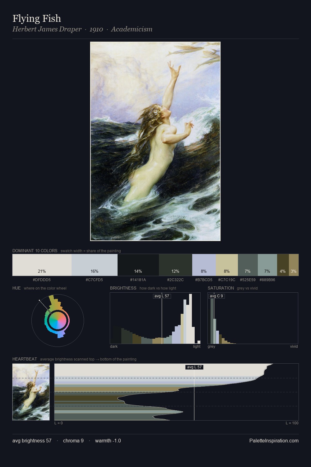
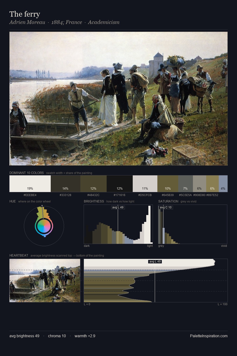
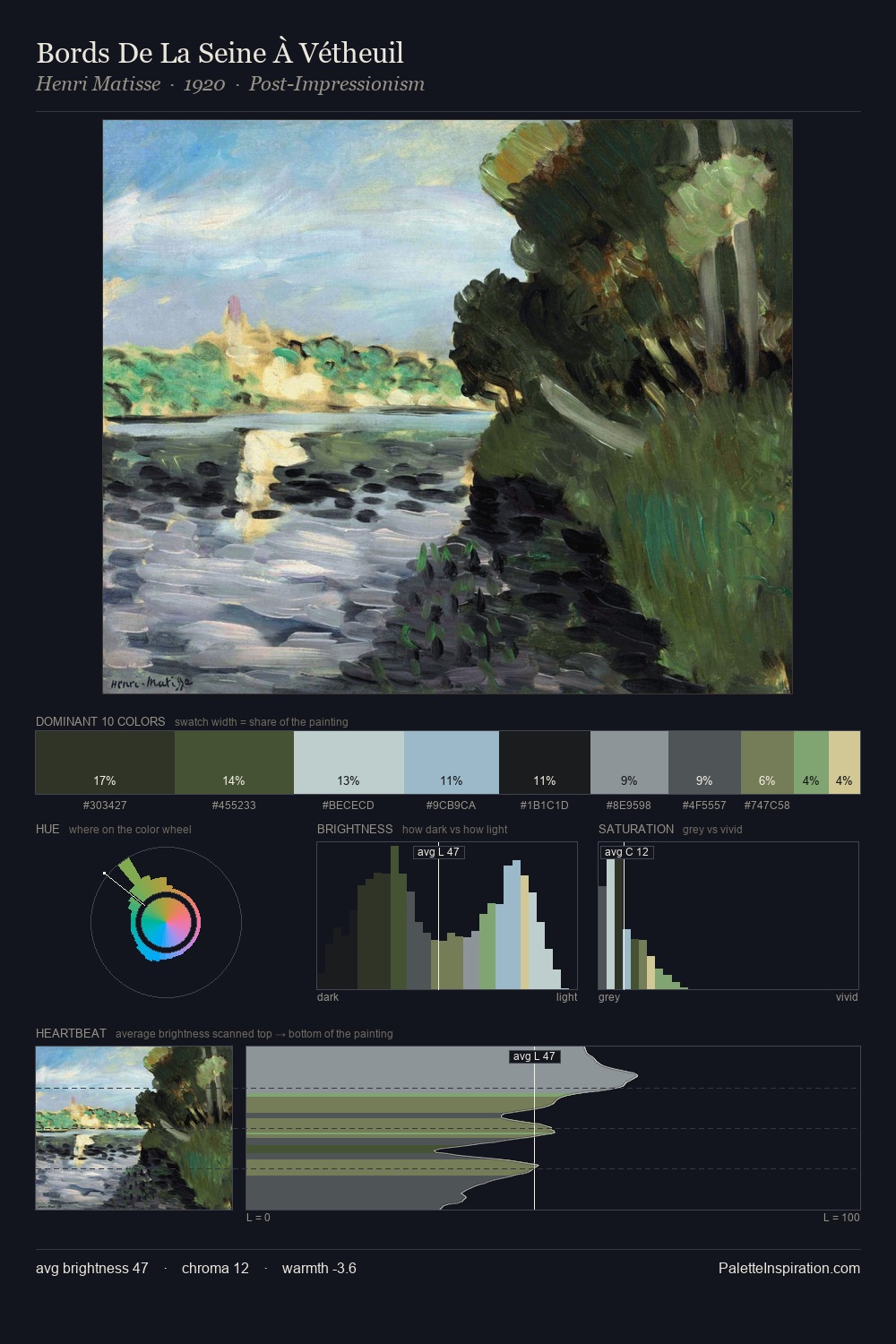
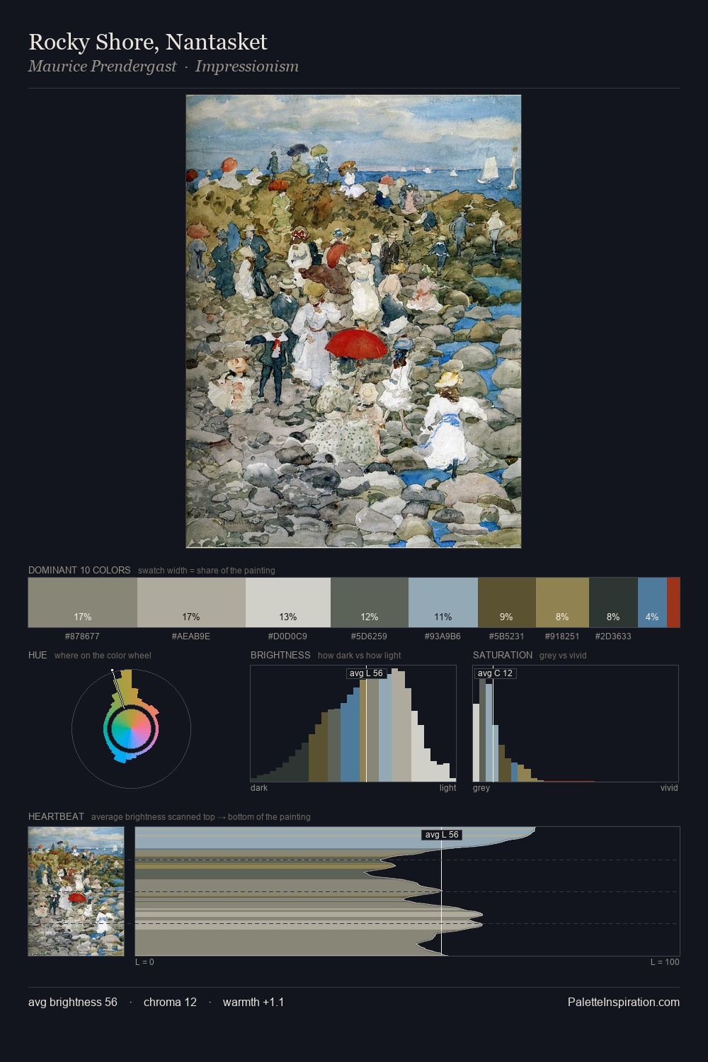
Light floods Abbott Handerson Thayer; the palette keeps values pale and airy across its range. Abbott Handerson Thayer builds on cool foundations: the palette favours the blue-cyan-green arc. All colours lean toward grey, building depth through value rather than colour punch. #E9EBE5 at 26.3% of the palette: an overwhelming presence that pulls all other colours into its gravitational field. The highest-chroma note - #AEC7D0 - appears at just 13.2%, deployed as a precision accent against the quieter ground. At 70 units of value range, the palette has the tonal breadth to sustain complex spatial readings. The mid-to-high key, cool bias, and moderate chroma point to outdoor observation - sky and diffused daylight as the dominant light source. In the context of Abbott Handerson Thayer's full range of palettes, group 4 represents one movement in an ongoing chromatic dialogue.
Example use cases
- print magazines
- beauty brands
- real estate
- high-end packaging
- editorial design
I Love This!
Copy, export, or download for your project