Yakusha-e Palette 4
Soft Apricot
Soft Low-contrast, gentle chroma - mid-key values and low saturation, approachable and calm.
Apricot Soft warm orange - peach-adjacent, the color of ripe stone fruit.

Palette Analysis
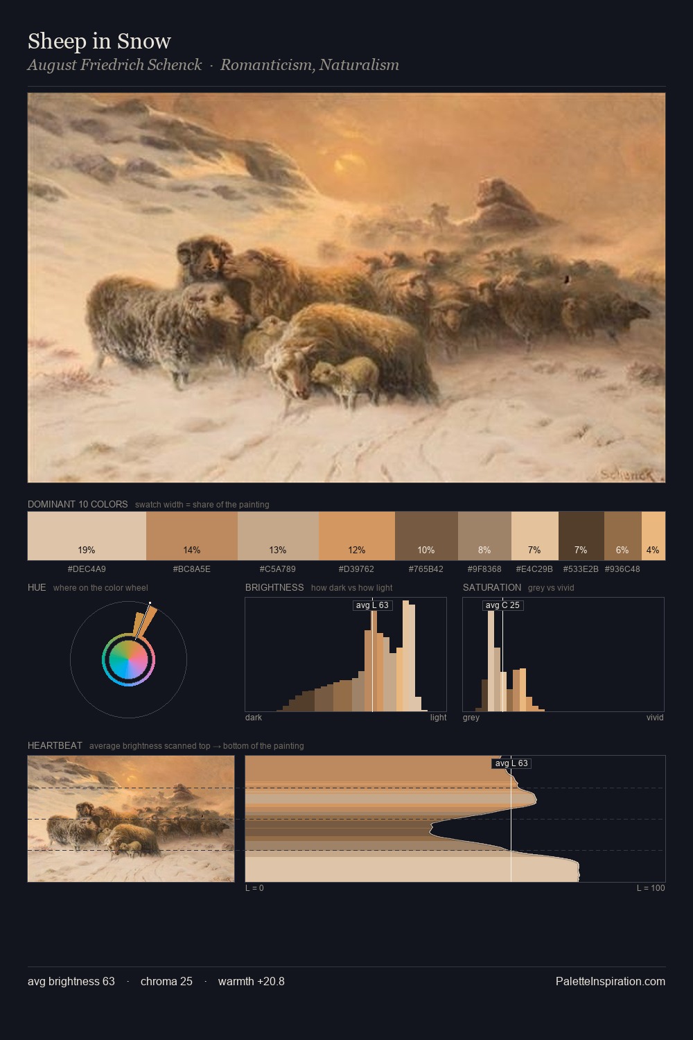
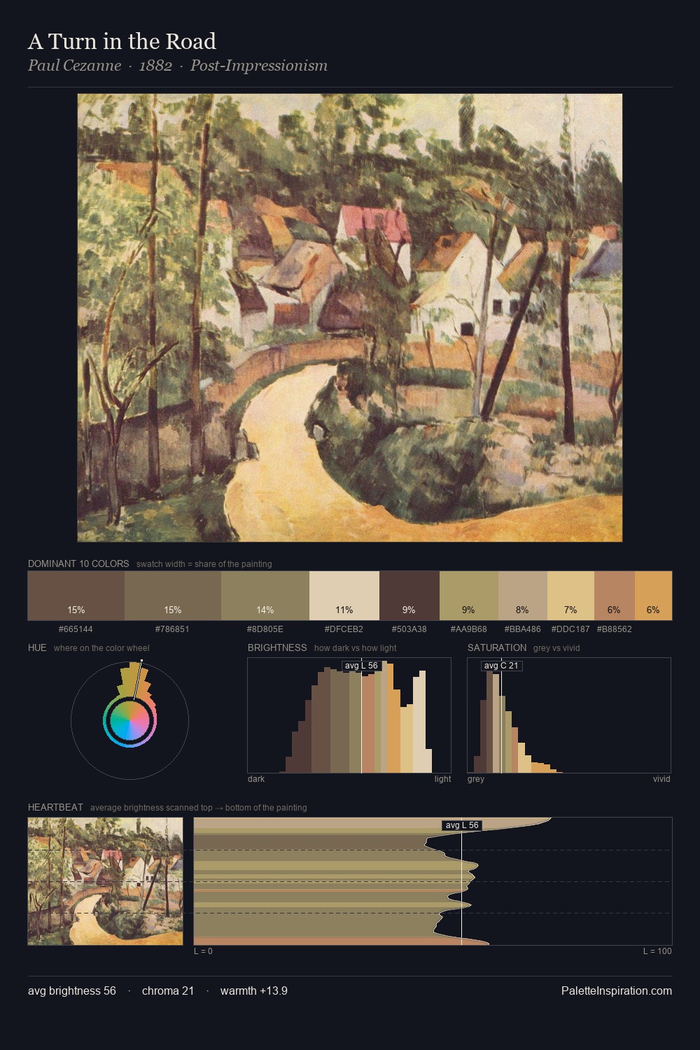
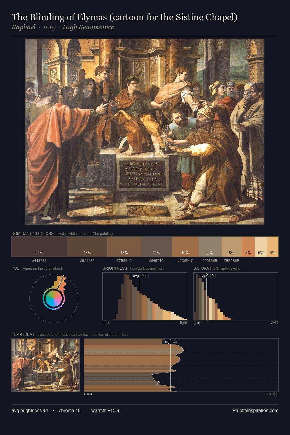
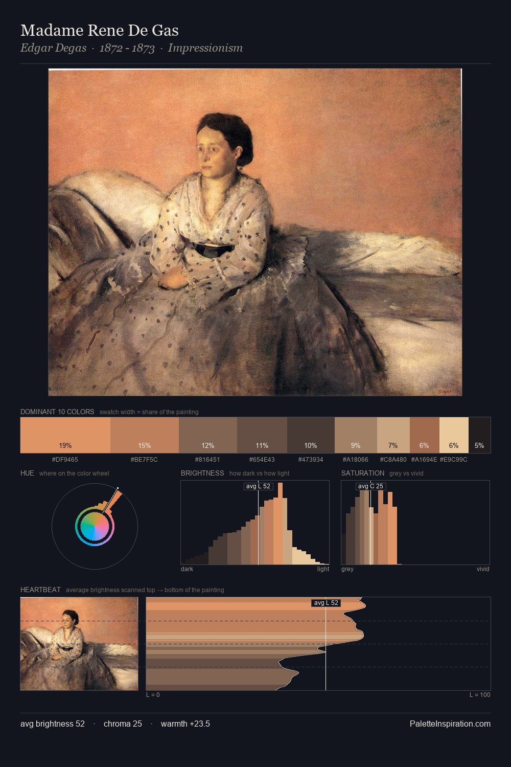
yakusha-e is strongly light-biased - shadow is suggested rather than declared. Temperature reads distinctly warm: the reds and earth tones carry the compositional weight. Saturation is deliberately withheld - the beauty here lies in the near-monochromatic gradations rather than colour difference. The highest-chroma note - #E4CFAF - appears at just 14.7%, deployed as a precision accent against the quieter ground. 50 units of value spread create a palette that is varied but unified - contrast in the service of harmony.
Example use cases
- ceramics & pottery
- boutique hospitality
- menswear
- heritage food brands
- craft & artisan brands
I Love This!
Use This Palette
Copy, export, or download for your project
Copy, export, or download for your project
Copy:
Download:
Share: