Wladyslaw Strzeminski Palette 5

Palette Analysis
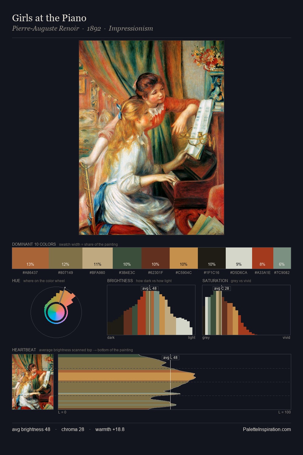
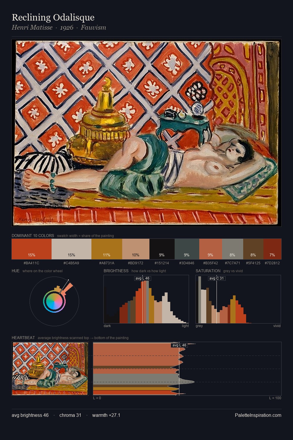
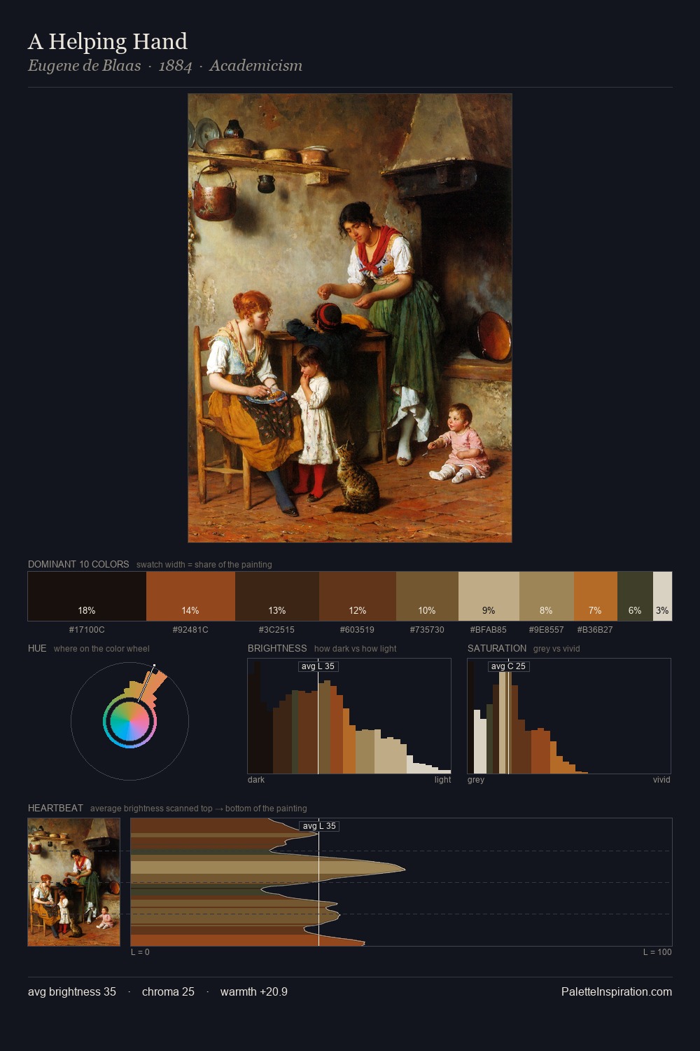
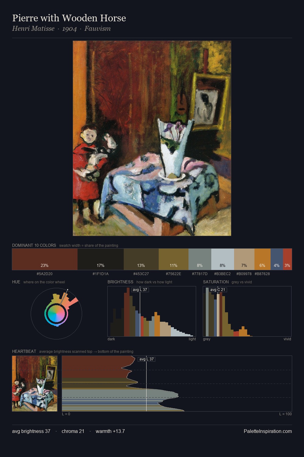
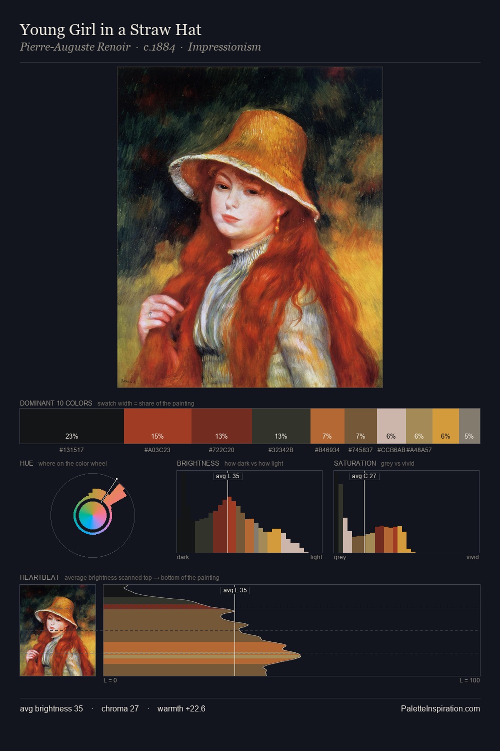
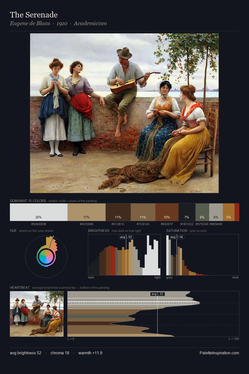
The value structure of Wladyslaw Strzeminski is mid-key: quiet, controlled, and cohesive. Warm and cool are kept in productive tension, creating the kind of chromatic harmony that sustains the eye. Colours are neither washed out nor blazing; they occupy the productive middle ground of the chroma scale. #941D16 is not a small accent - at 26.8% it qualifies as a major presence and gives the palette its chromatic identity. A value spread of 74 units gives the palette both depth and air - shadows are genuinely dark, lights genuinely light. Together these qualities point to the open-air Impressionist method: recording light rather than local colour. Palette 5 sits within the larger chromatic argument that Wladyslaw Strzeminski's complete body of work advances.
Example use cases
- publishing
- corporate identity
- consumer apps
- hospitality
- design agencies
I Love This!
Copy, export, or download for your project