Wladyslaw Strzeminski Palette 1

Palette Analysis
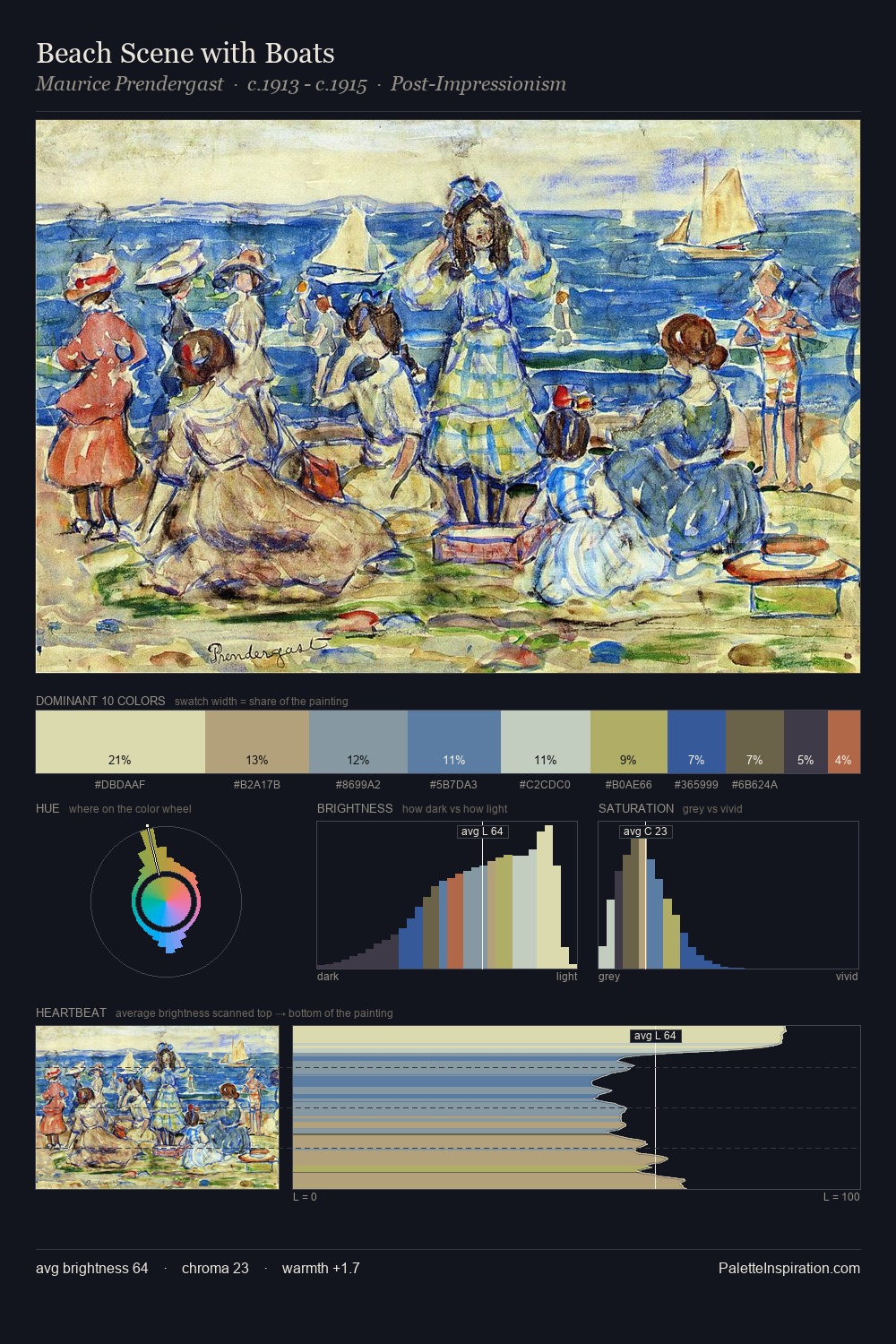
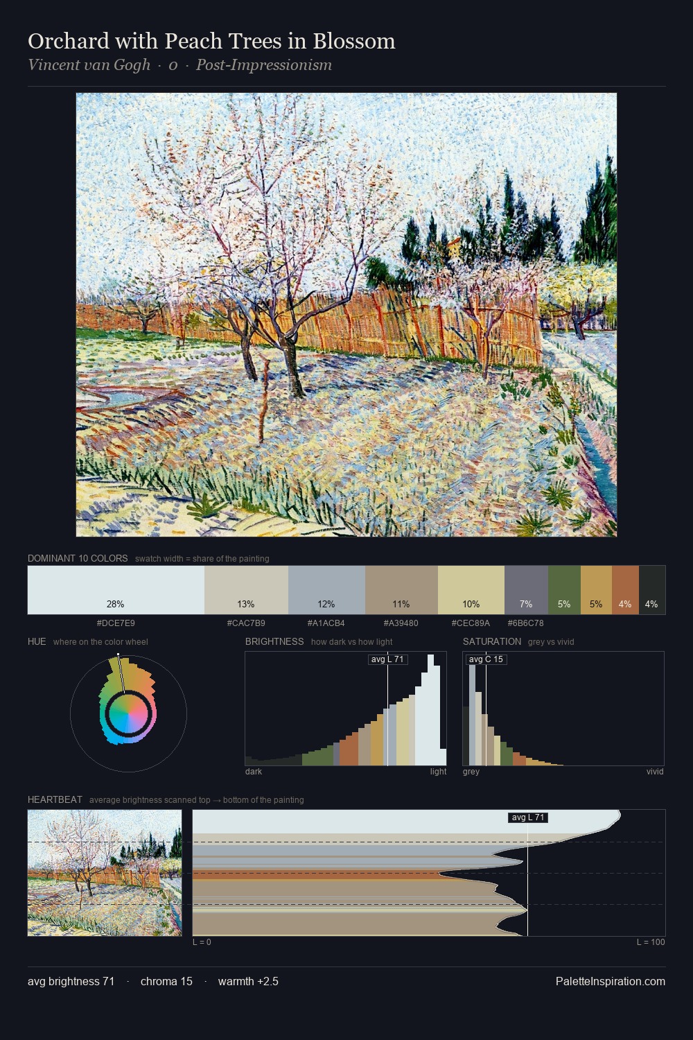
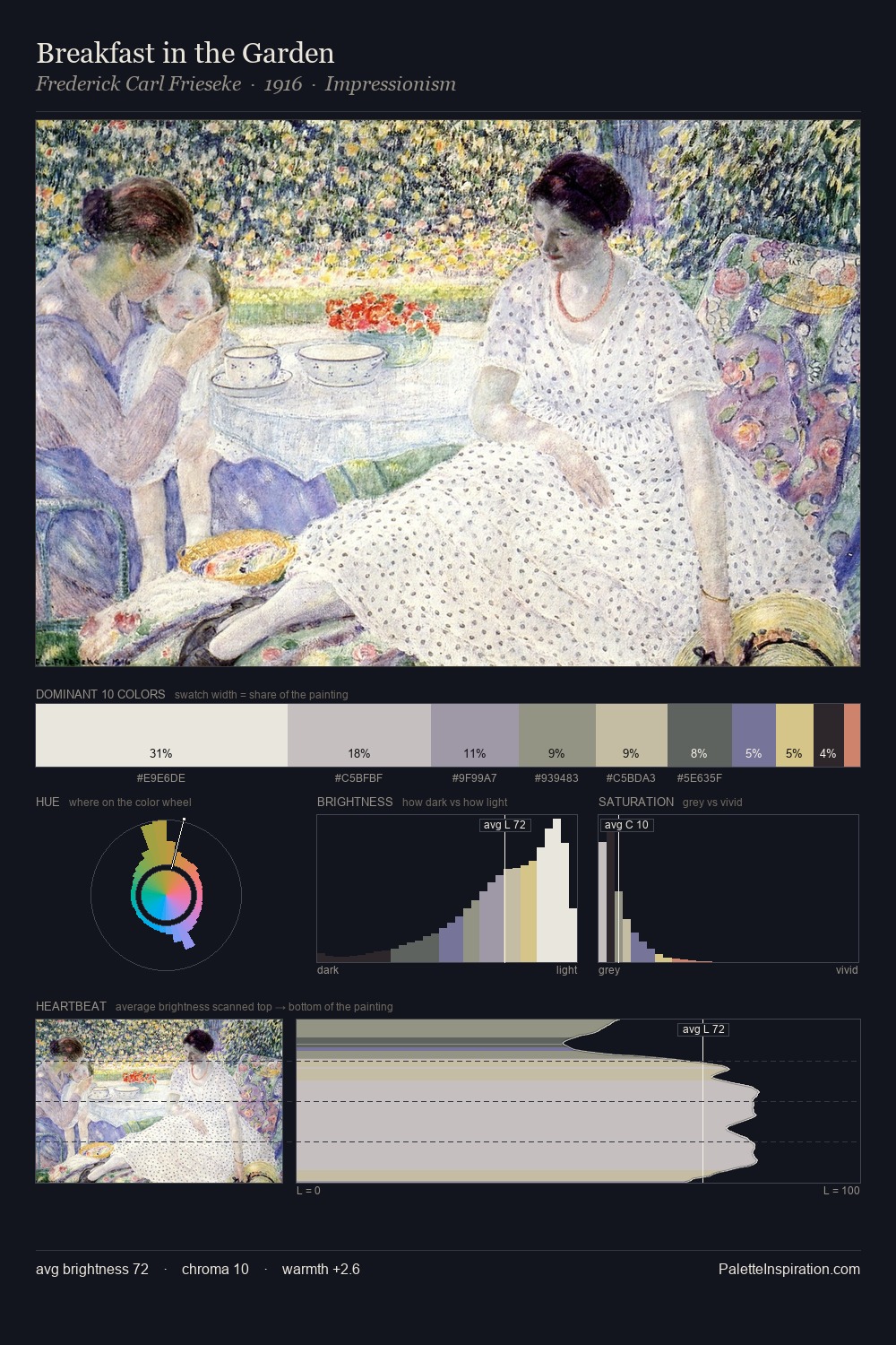
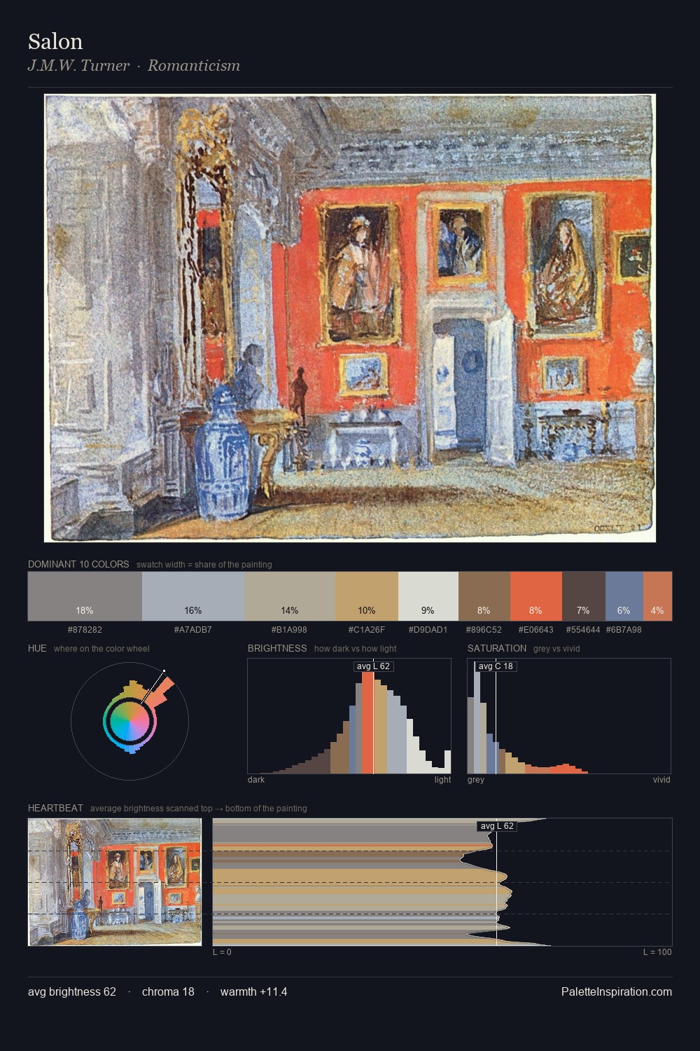
Wladyslaw Strzeminski is high in key: pale, luminous, and filled with optical air. Wladyslaw Strzeminski builds on cool foundations: the palette favours the blue-cyan-green arc. Muted throughout, the palette achieves its effects through value and temperature rather than chromatic force. #C8C8C3 at 30.6% of the palette: an overwhelming presence that pulls all other colours into its gravitational field. #B6664C functions as the palette's exclamation mark: highest chroma, lowest percentage (1.7%). The value range spans 59 units across the palette, providing the full gamut from deep shadow to near-white and ensuring clear tonal hierarchy. The palette has the character of outdoor light: cool, mid-bright, with colour rendered faithfully rather than expressively. In the context of Wladyslaw Strzeminski's full range of palettes, group 1 represents one movement in an ongoing chromatic dialogue.
Example use cases
- florist branding
- event design
- real estate
- jewelry retail
- hospitality branding
I Love This!
Copy, export, or download for your project