William Powell Frith Master Palette

Palette Analysis
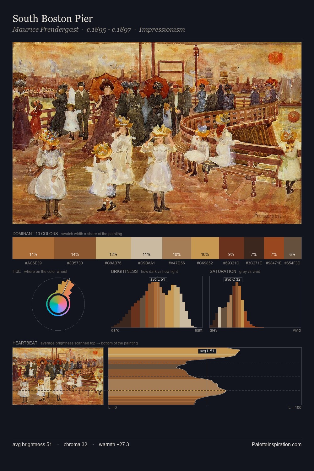
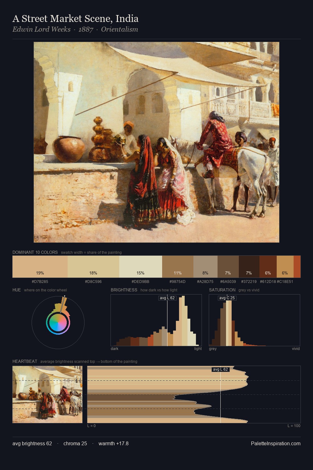
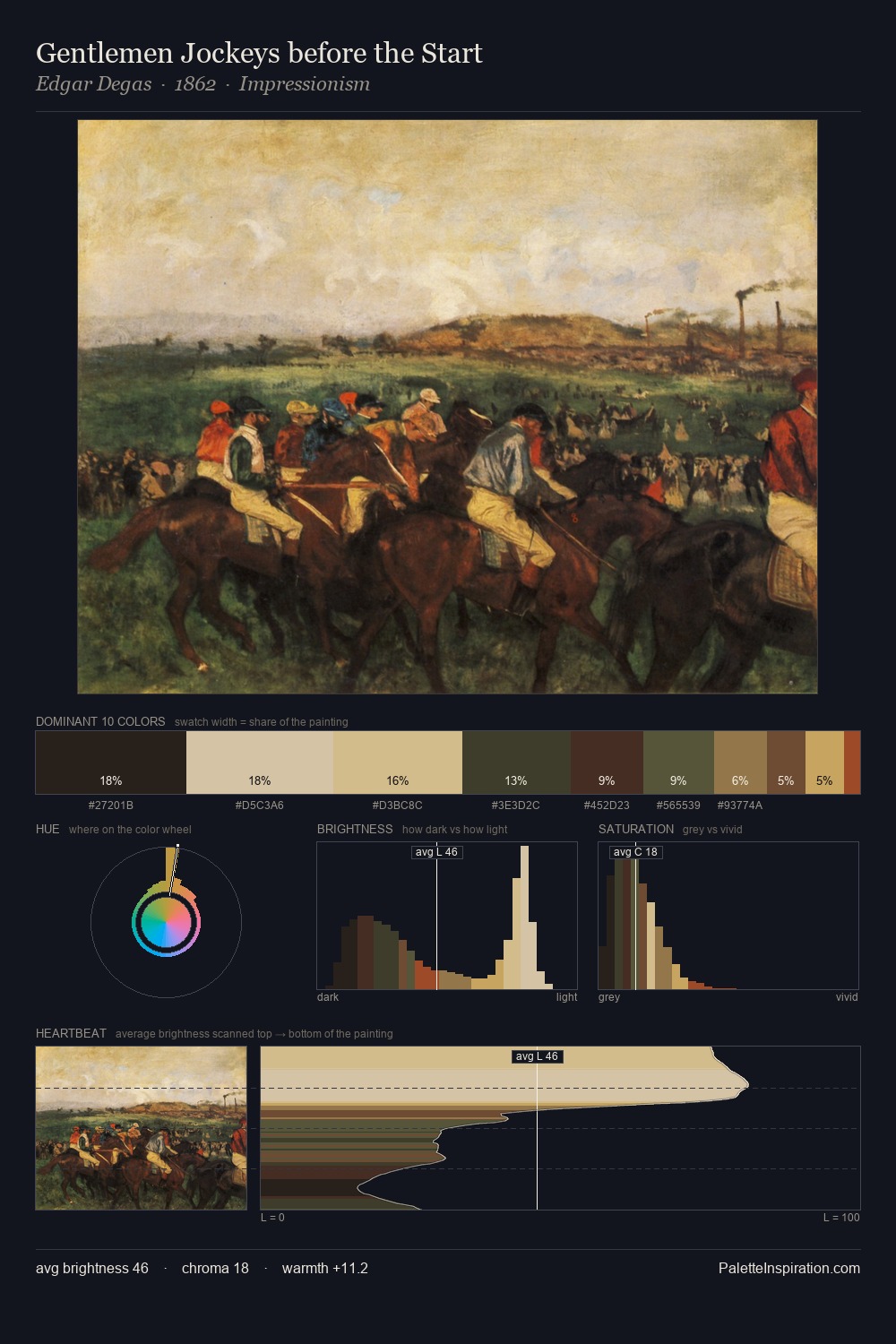
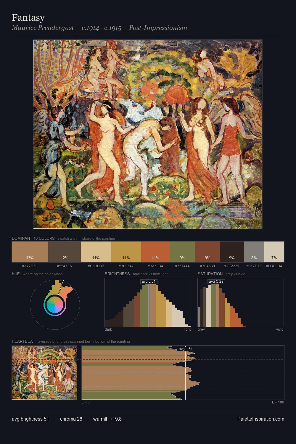
William Powell Frith occupies the comfortable middle of the value scale, avoiding both extremes to hold the eye in a sustained middle grey. Warm and cool tones are held in careful balance - neither family dominates, creating tension and resolution simultaneously. Saturation is measured and controlled, giving the palette presence without visual aggression. The most saturated colour, #582518, is reserved to 7.5% of the surface, where it acts as a focal punctuation. The value range spans 58 units across the palette, providing the full gamut from deep shadow to near-white and ensuring clear tonal hierarchy. The palette reads as an Impressionist one - light-biased, chromatically direct, and built on temperature contrast rather than value opposition. The palette is a signature: William Powell Frith's particular sense of value, warmth, and colour weight made legible.
Example use cases
- ceramics & pottery
- boutique hospitality
- menswear
- heritage food brands
- craft & artisan brands
I Love This!
Copy, export, or download for your project