William Michael Harnett Master Palette

Palette Analysis
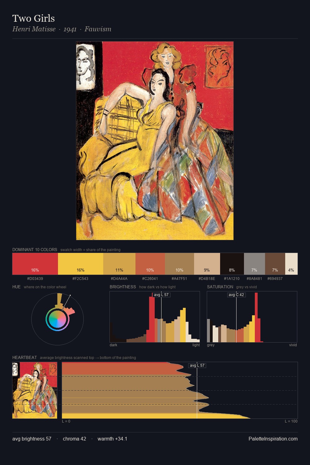
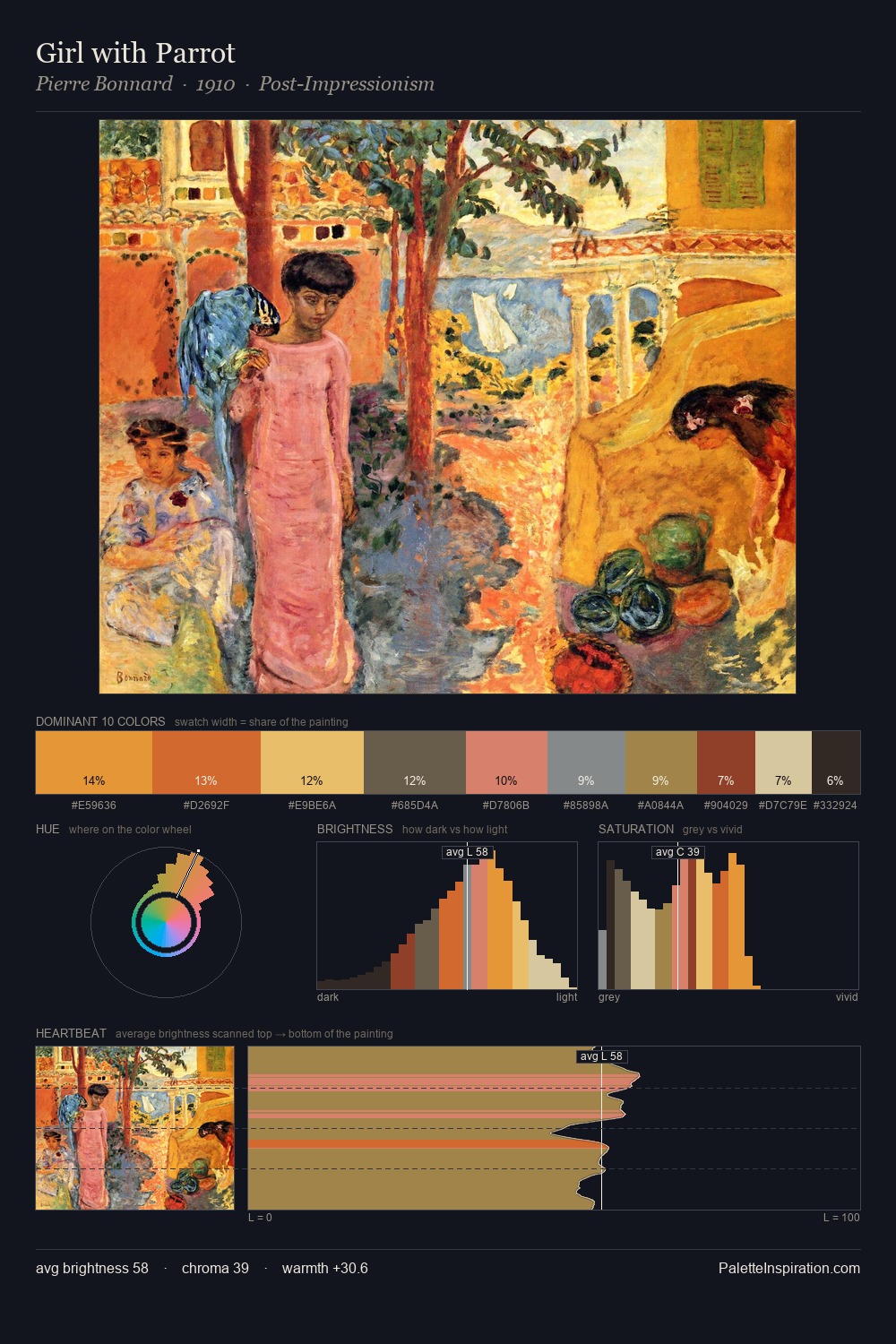
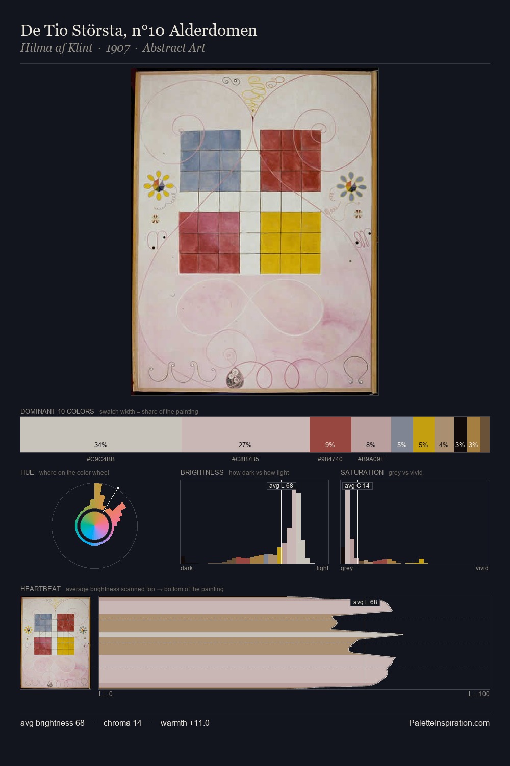
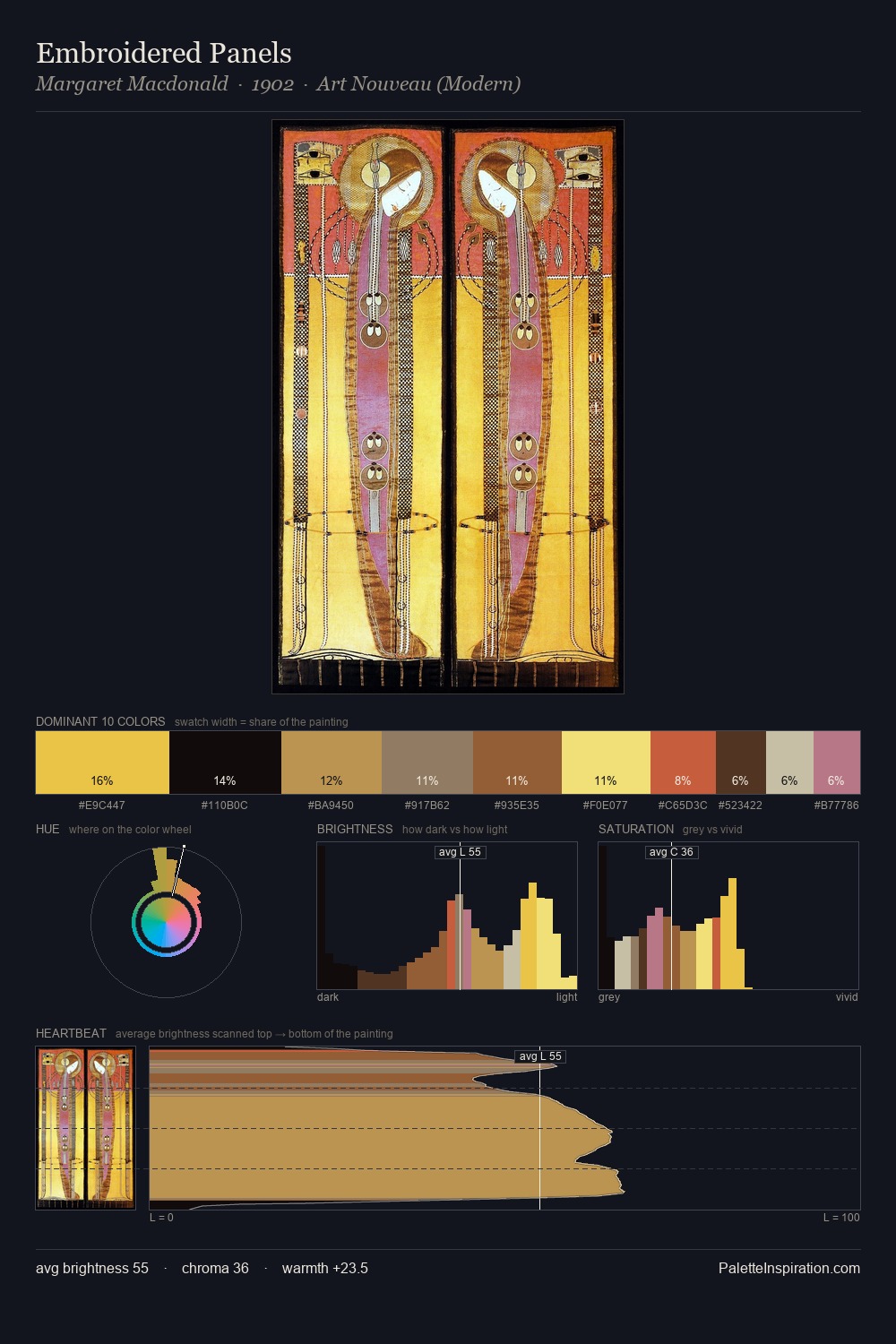
Values in William Michael Harnett rest in the mid-range - neither dramatically lit nor steeped in shadow. Neither warm nor cool has the upper hand here; the equilibrium between the two generates the palette's visual energy. Chroma is moderate: colours carry enough saturation to be read as colour, but the palette stops well short of garish intensity. The highest-chroma note - #F2B628 - appears at just 2.4%, deployed as a precision accent against the quieter ground. The full value range is 57 units: broad enough to build convincing three-dimensional form. The palette reads as an Impressionist one - light-biased, chromatically direct, and built on temperature contrast rather than value opposition. The palette is recognisably William Michael Harnett's own: particular in its temperature, chroma, and the economy of its brightest note.
Example use cases
- ceramics & pottery
- boutique hospitality
- menswear
- heritage food brands
- craft & artisan brands
I Love This!
Copy, export, or download for your project