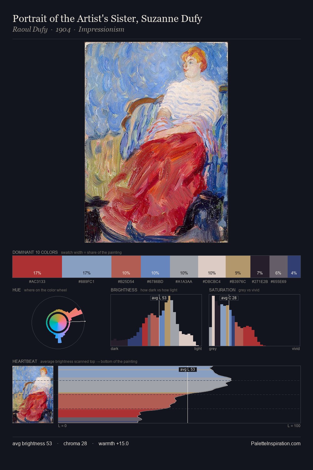
William James Glackens Palette 5
Dimmed Parchment
Dimmed Moderate shadow - values pulled toward mid-dark, as if a light source has been reduced.
Parchment Aged warm neutral - the color of old manuscript parchment, tan and slightly yellowed.

Palette Analysis
The value structure of William James Glackens is mid-key: quiet, controlled, and cohesive. Warm and cool tones are held in careful balance - neither family dominates, creating tension and resolution simultaneously. All colours lean toward grey, building depth through value rather than colour punch. Only 10.7% is devoted to #B5946D, yet that small allocation delivers the palette's entire chromatic tension. The value range spans 59 units across the palette, providing the full gamut from deep shadow to near-white and ensuring clear tonal hierarchy. Palette 5 sits within the larger chromatic argument that William James Glackens's complete body of work advances.
Example use cases
- exhibition design
- foundation branding
- estate management
- art education
- museums & galleries
I Love This!
Use This Palette
Copy, export, or download for your project
Copy, export, or download for your project
Copy:
Download:
Share: