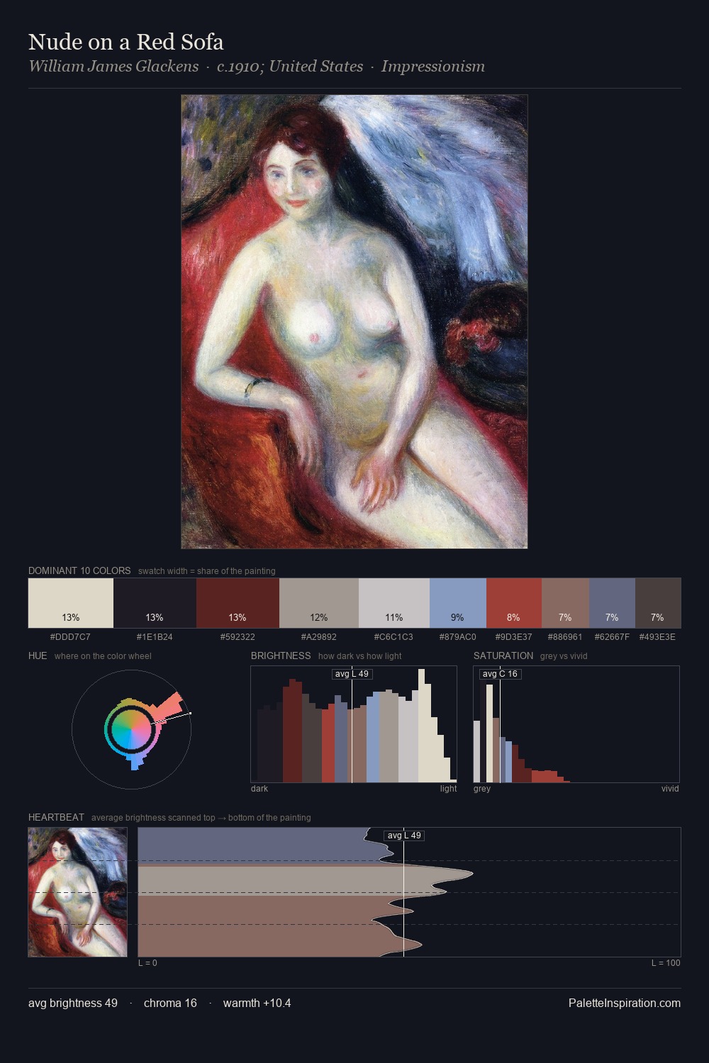
William James Glackens Palette 3

Palette Analysis
The high-key values of William James Glackens give it an effulgent, almost bleached quality. Blues and teal-greys govern the palette, lending it an aquatic or atmospheric quality. Muted throughout, the palette achieves its effects through value and temperature rather than chromatic force. The highest-chroma note - #7B8FBE - appears at just 8.7%, deployed as a precision accent against the quieter ground. The full value range is 62 units: broad enough to build convincing three-dimensional form. The mid-to-high key, cool bias, and moderate chroma point to outdoor observation - sky and diffused daylight as the dominant light source. William James Glackens's palette 3 carries its own internal logic while remaining in conversation with the artist's broader colour intelligence.
Example use cases
- publishing
- corporate identity
- consumer apps
- hospitality
- design agencies
I Love This!
Copy, export, or download for your project