Willem Kalf Palette 1

Palette Analysis
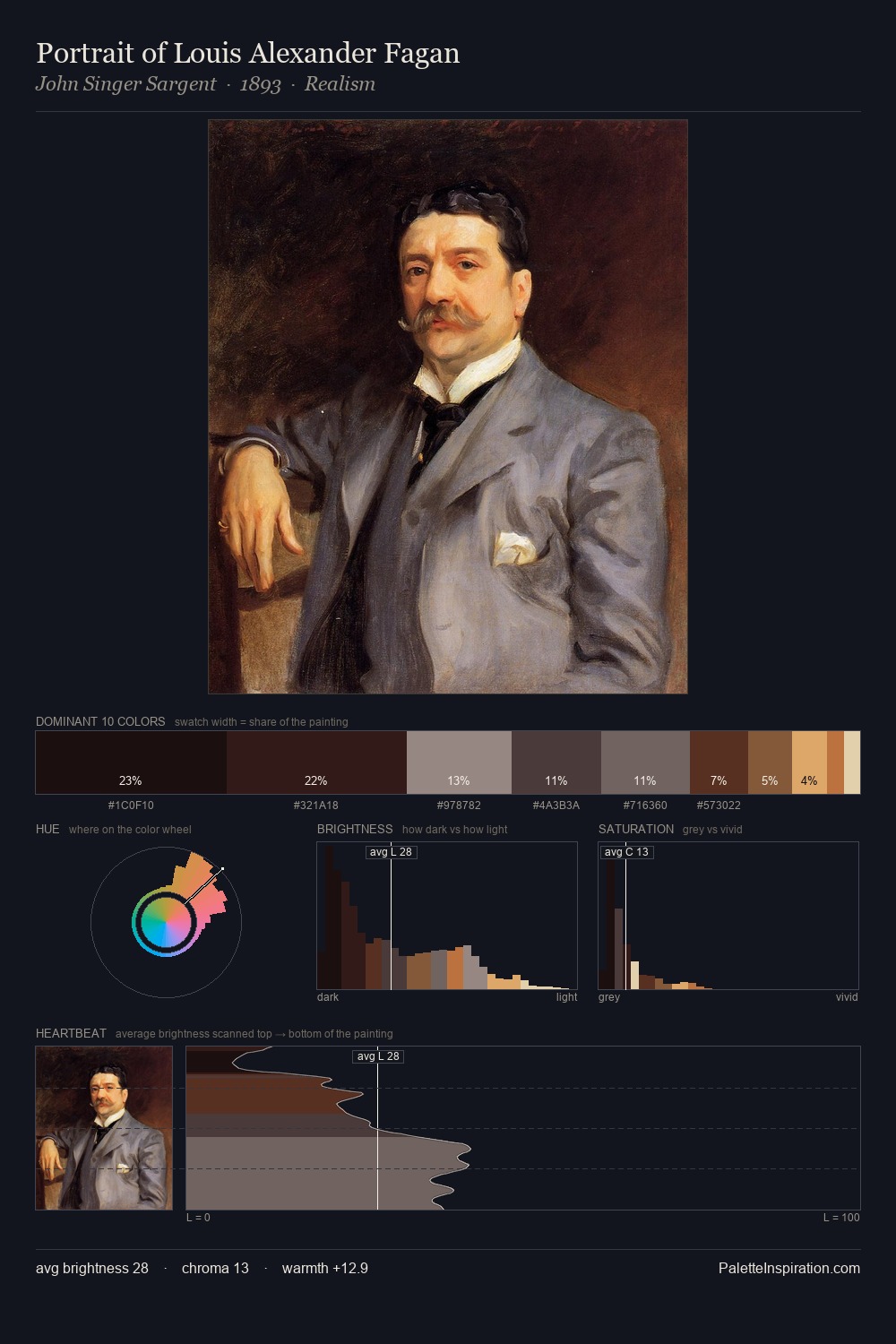
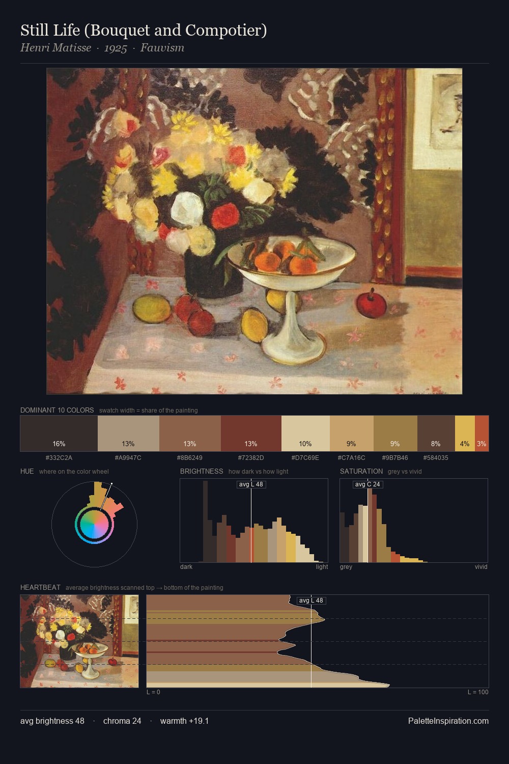
Willem Kalf occupies the comfortable middle of the value scale, avoiding both extremes to hold the eye in a sustained middle grey. Warmth dominates - the palette of Willem Kalf leans heavily on the yellow-orange-red arc of the colour wheel. Chroma hovers near zero; colour declares itself through subtle shifts in hue rather than outright saturation. The dominant colour, #38292C, takes 31.8% of the total area, establishing the overall mood before any other hue is introduced. The most saturated colour, #DFDBAE, is reserved to 2.2% of the surface, where it acts as a focal punctuation. From deepest dark to palest light, the palette traverses 63 units of the value scale - a span that creates natural depth. In the context of Willem Kalf's full range of palettes, group 1 represents one movement in an ongoing chromatic dialogue.
Example use cases
- music labels
- luxury hospitality
- editorial photography
- leather goods
- premium streaming
I Love This!
Copy, export, or download for your project