Willem Danielsz van Tetrode Master Palette

Palette Analysis
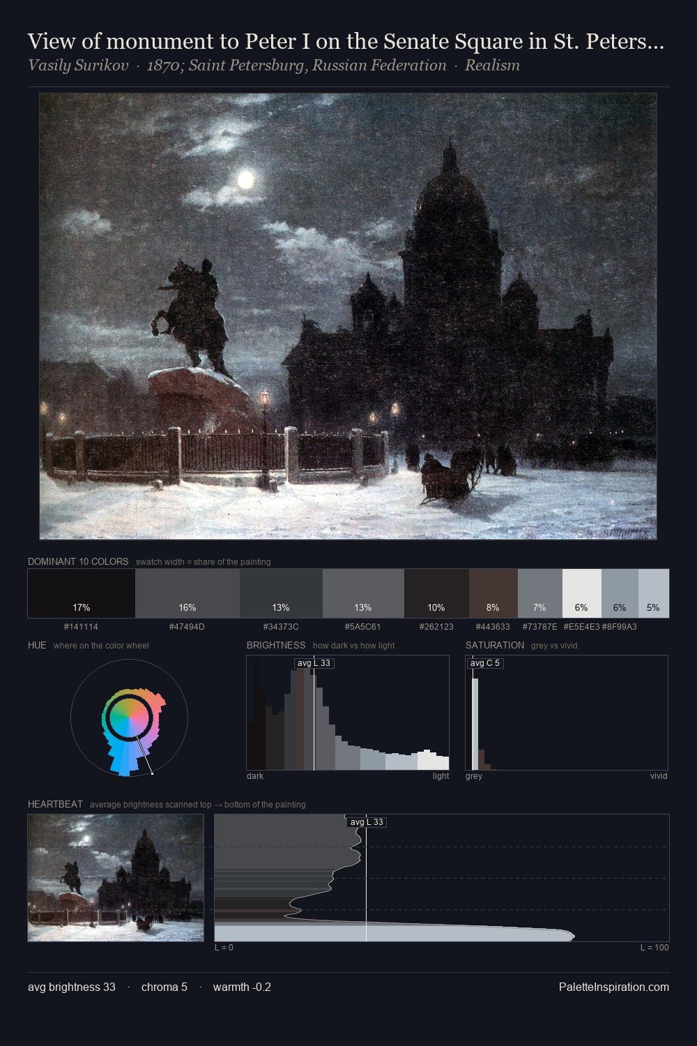
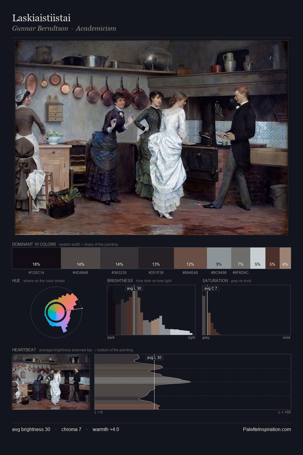
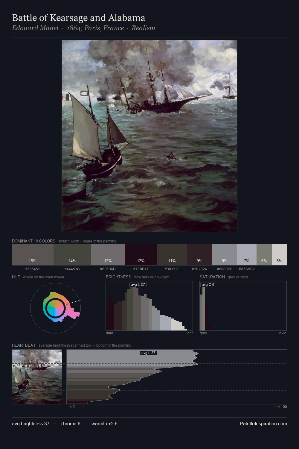
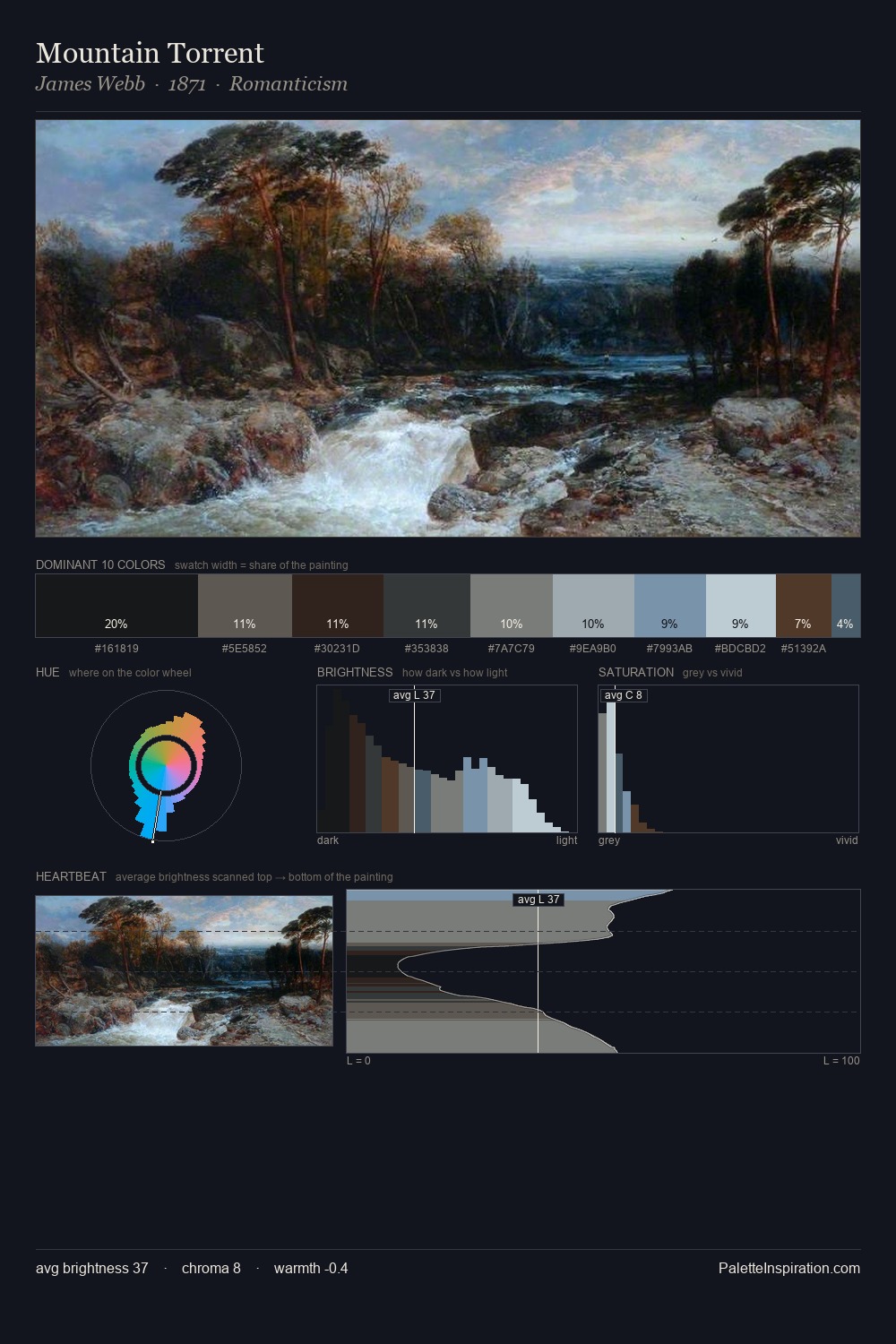
Willem Danielsz van Tetrode occupies the comfortable middle of the value scale, avoiding both extremes to hold the eye in a sustained middle grey. Cool hues prevail: blues, greens, and greys anchor the palette's emotional temperature. The absence of saturated colour is itself an expressive choice: this is a palette of restraint and atmosphere. #A3B3BF claims 26.2% of the surface, functioning as the work's tonal foundation. #5A443C delivers the chromatic peak at only 4.0% - a small shot of colour with outsized visual impact. From deepest dark to palest light, the palette traverses 70 units of the value scale - a span that creates natural depth. High luminosity and cool temperature suggest the plein-air condition: unfiltered daylight and open sky. Willem Danielsz van Tetrode arrived at this balance through long practice; the palette carries the weight of that experience.
Example use cases
- nonprofit identity
- public libraries
- historical sites
- literary journals
- archival print
I Love This!
Copy, export, or download for your project