Vittorio Corcos Palette 4

Palette Analysis
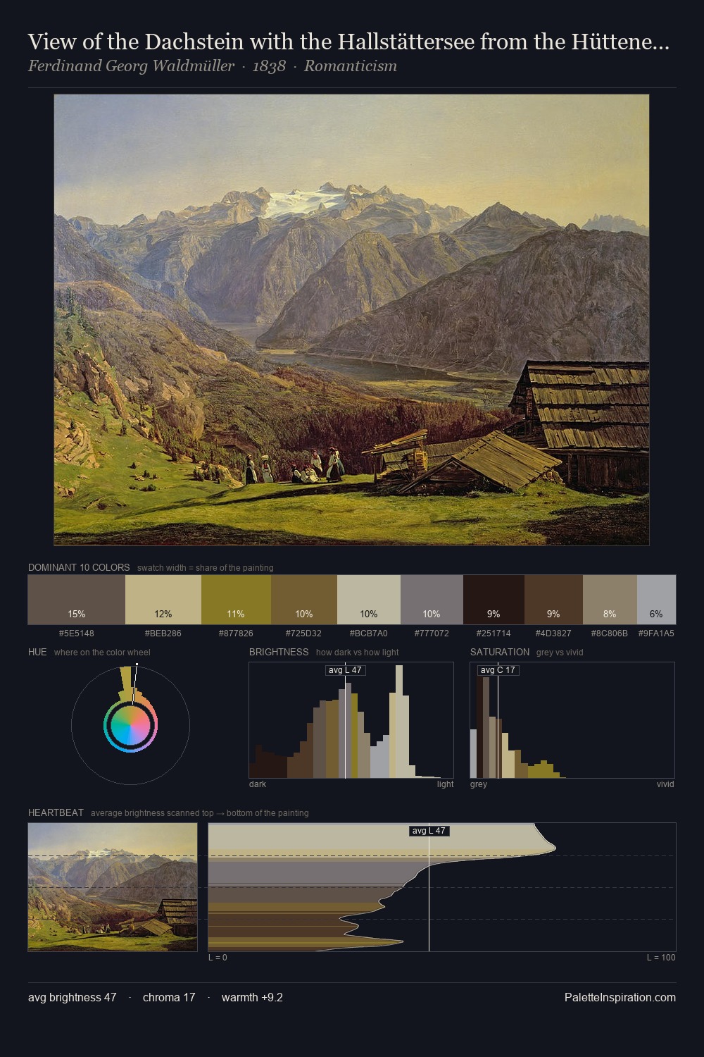
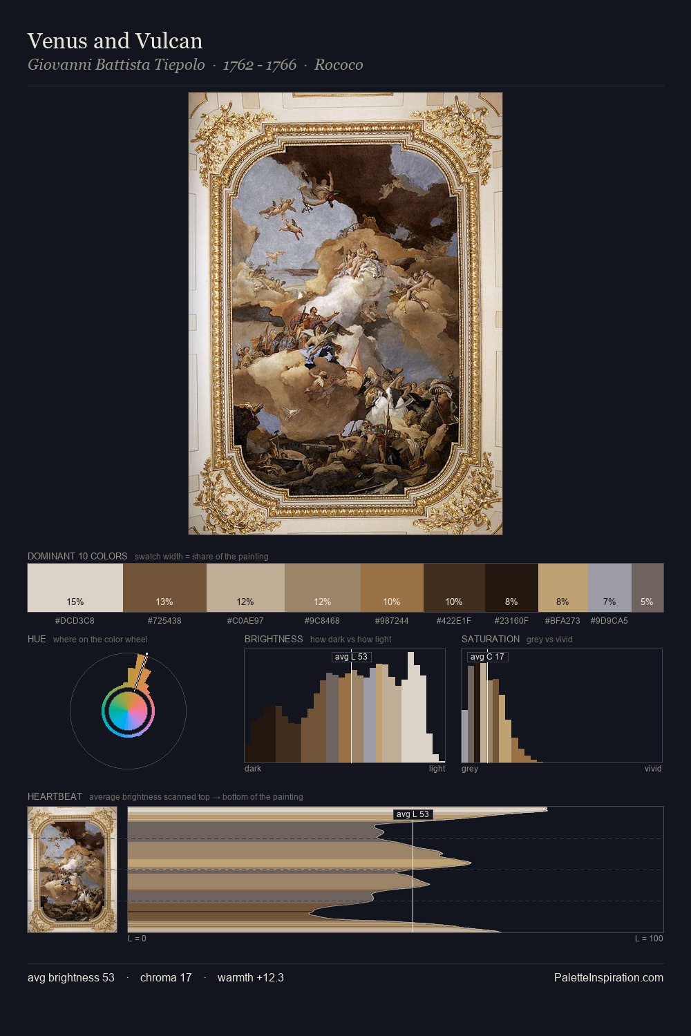
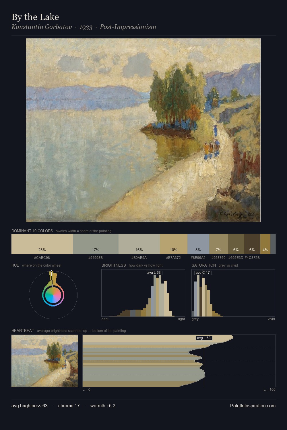
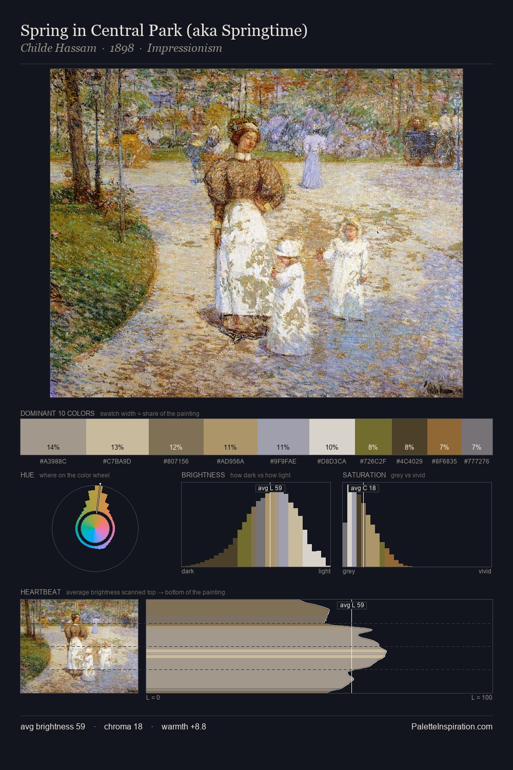
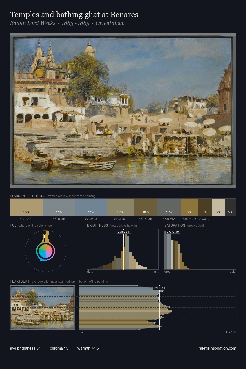
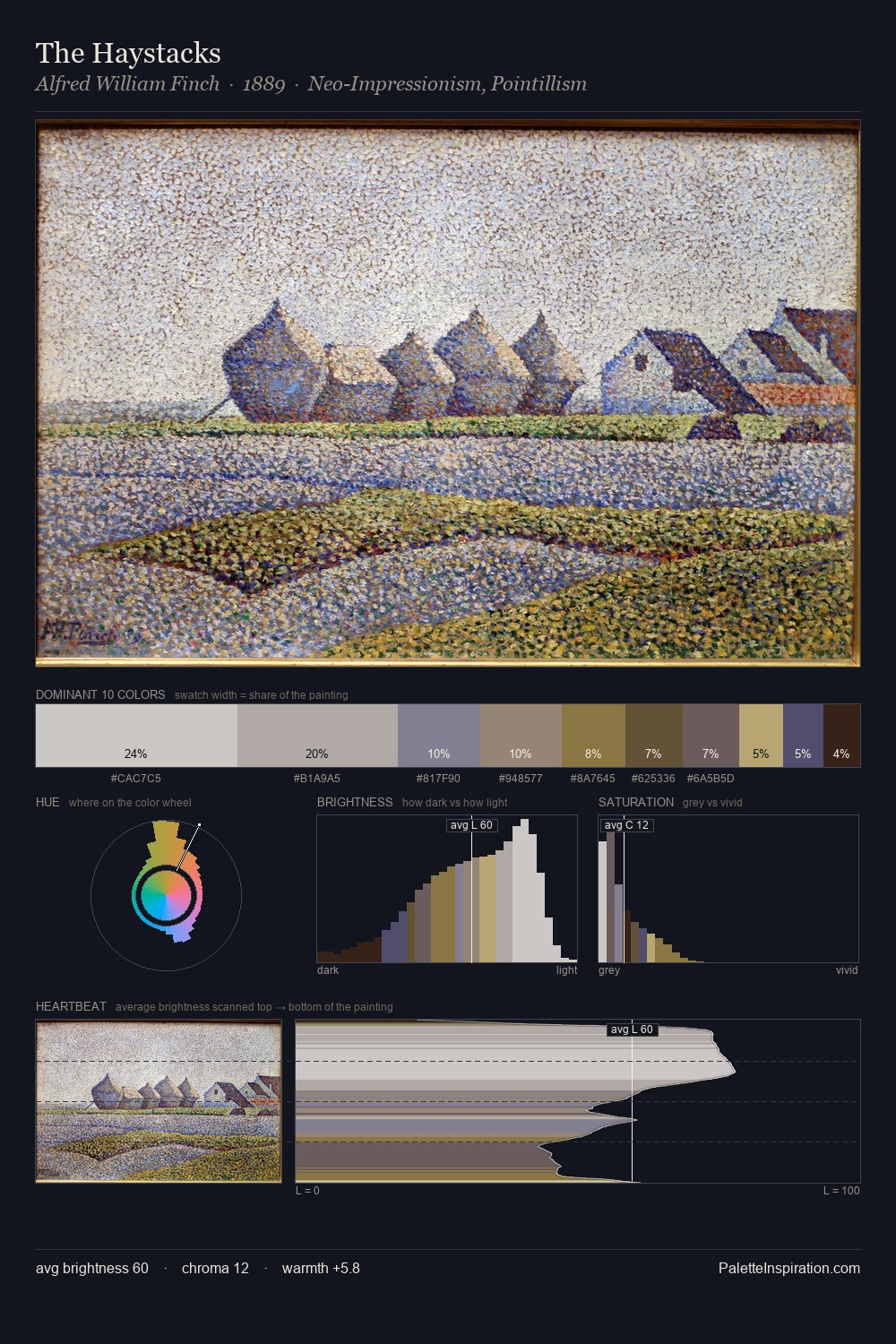
Vittorio Corcos is high-key - luminous, open, and weighted toward light. Vittorio Corcos tilts toward cool - blues and silver-greys carry the structural weight. Chroma hovers near zero; colour declares itself through subtle shifts in hue rather than outright saturation. A single dominant - #B0A991 at 26.5% - sets the character of the whole composition. The highest-chroma note - #B9A477 - appears at just 5.6%, deployed as a precision accent against the quieter ground. Value range is moderate at 50 units - enough contrast for legibility, not so much as to fragment the tonal unity. The palette has the character of outdoor light: cool, mid-bright, with colour rendered faithfully rather than expressively. Vittorio Corcos's palette 4 carries its own internal logic while remaining in conversation with the artist's broader colour intelligence.
Example use cases
- exhibition design
- foundation branding
- estate management
- art education
- museums & galleries
I Love This!
Copy, export, or download for your project