Vincenzo Caprile Palette 4
Muted Tawny
Muted Deliberately desaturated - chroma pulled toward gray, the restraint of tonal painting.
Tawny Warm orange-brown - a traditional term for the color of tanned leather or lion fur.

Palette Analysis
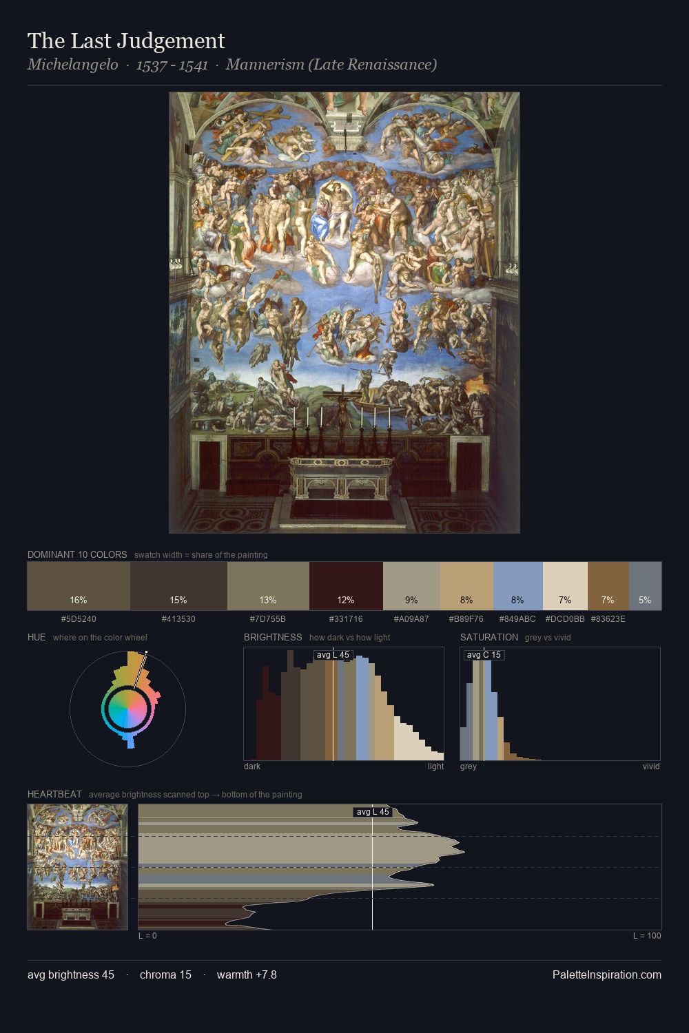
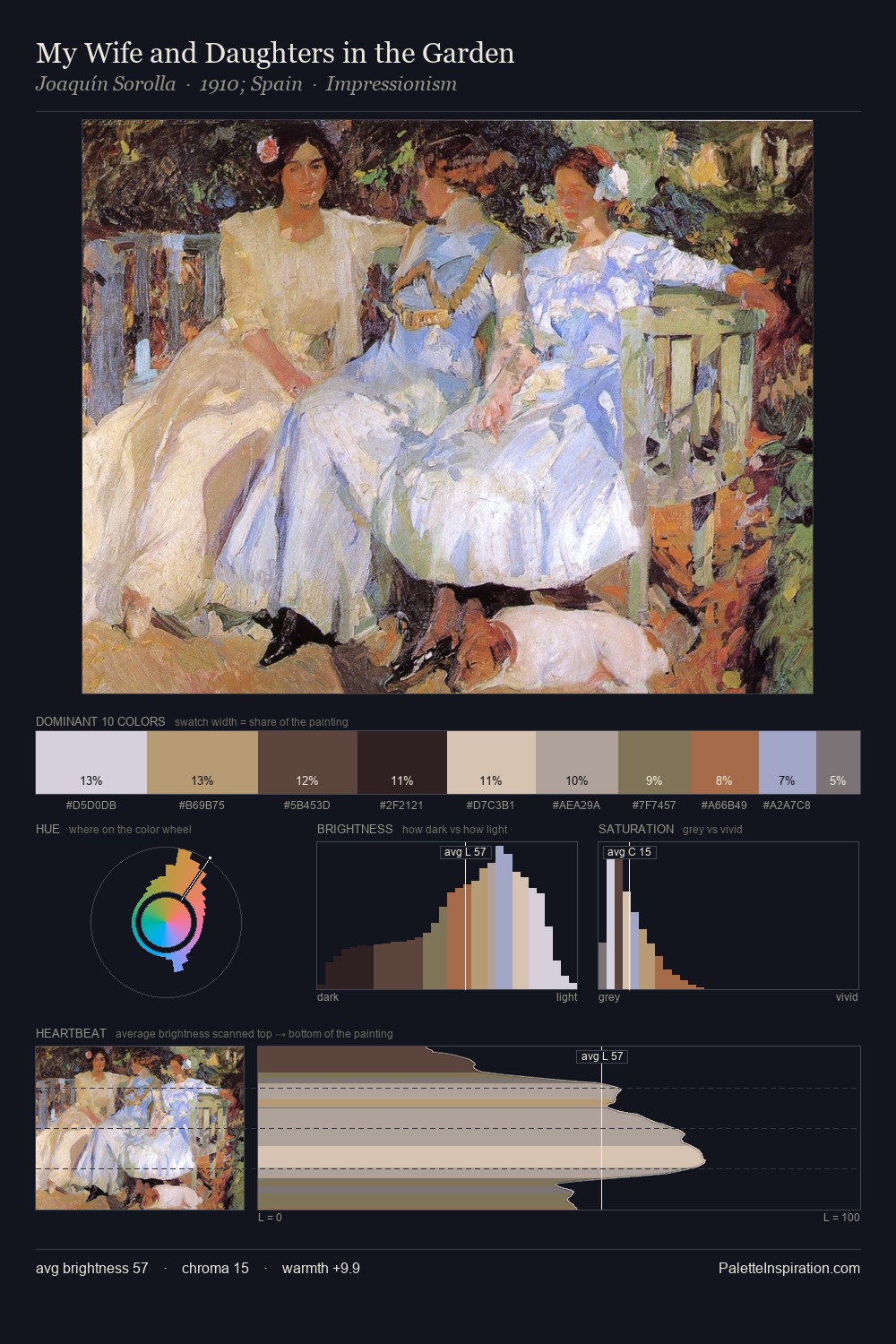
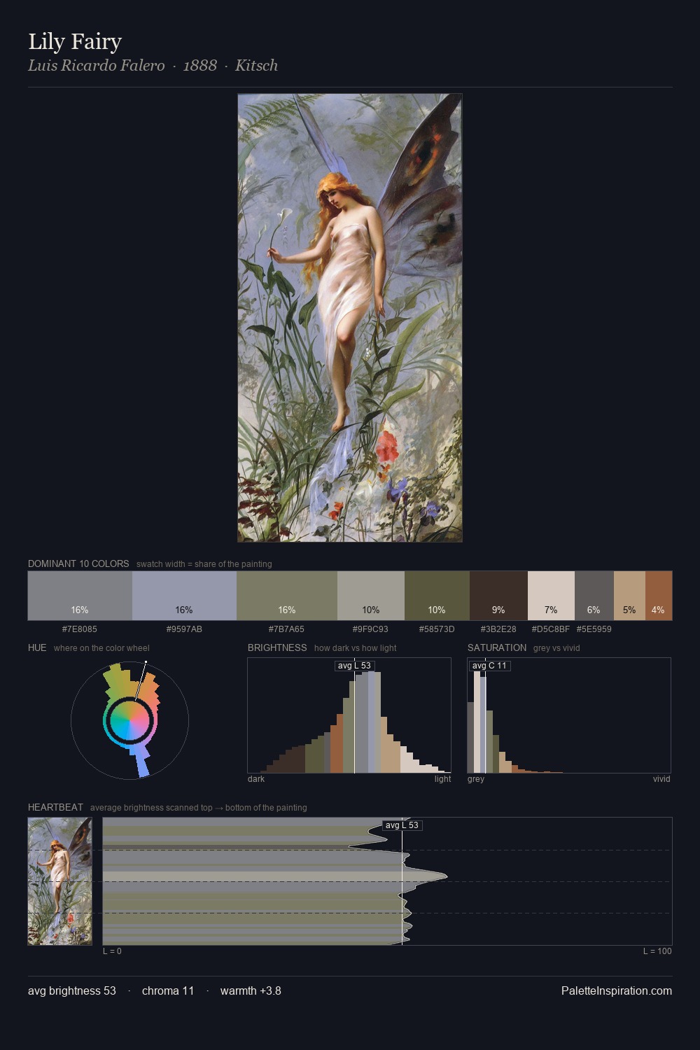
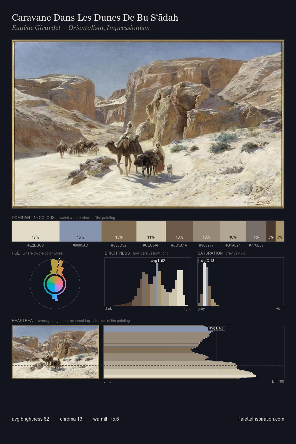
The value structure of Vincenzo Caprile is mid-key: quiet, controlled, and cohesive. Vincenzo Caprile orchestrates warmth above all else - reds, ambers, and siennas take the lead. All colours lean toward grey, building depth through value rather than colour punch. Only 9.0% is devoted to #BEA385, yet that small allocation delivers the palette's entire chromatic tension. The palette spans 51 value units: a measured range that delivers coherence over drama. Palette 4 sits within the larger chromatic argument that Vincenzo Caprile's complete body of work advances.
Example use cases
- exhibition design
- foundation branding
- estate management
- art education
- museums & galleries
I Love This!
Use This Palette
Copy, export, or download for your project
Copy, export, or download for your project
Copy:
Download:
Share: