Vasily Vereshchagin Palette 1

Palette Analysis
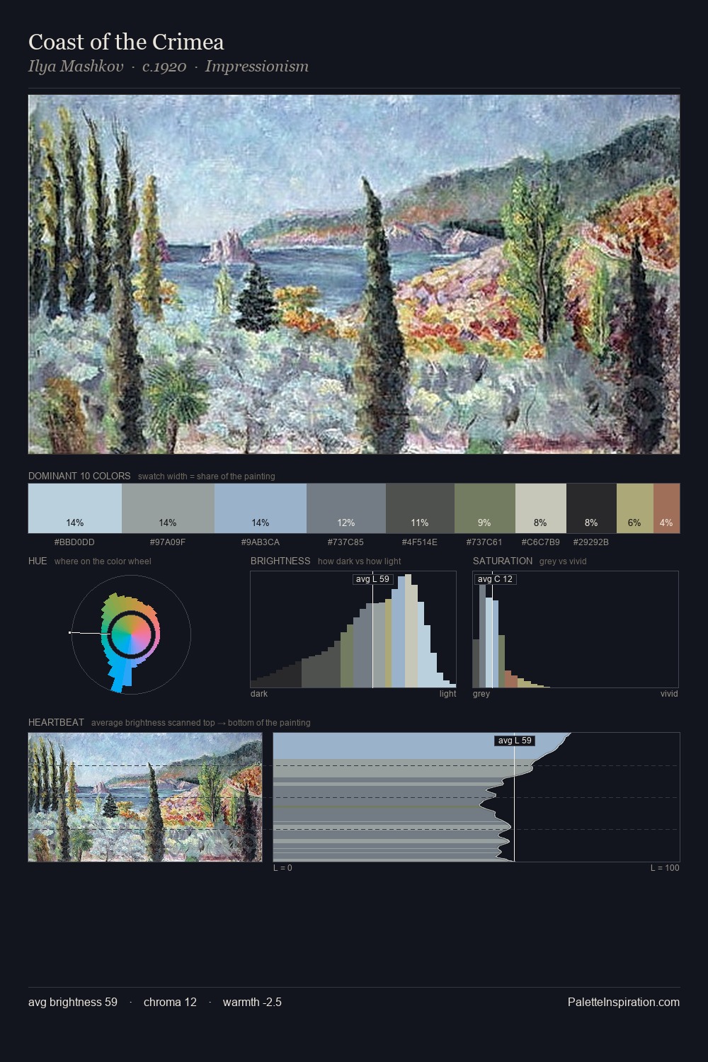
Vasily Vereshchagin is high in key: pale, luminous, and filled with optical air. Temperature is cool-dominant, with blue and green families claiming the largest areas. Saturation is deliberately withheld - the beauty here lies in the near-monochromatic gradations rather than colour difference. The most saturated colour, #ADA466, covers 4.2% of the surface: too much to call an accent, too strong to ignore. 57 units of value range underpin the palette's structural clarity: the eye always knows where light falls. The mid-to-high key, cool bias, and moderate chroma point to outdoor observation - sky and diffused daylight as the dominant light source. Vasily Vereshchagin's palette 1 carries its own internal logic while remaining in conversation with the artist's broader colour intelligence.
Example use cases
- garden centers
- natural beauty
- park & rec design
- sustainable fashion
- sustainability
I Love This!
Copy, export, or download for your project