Vasily Polenov Palette 14

Palette Analysis
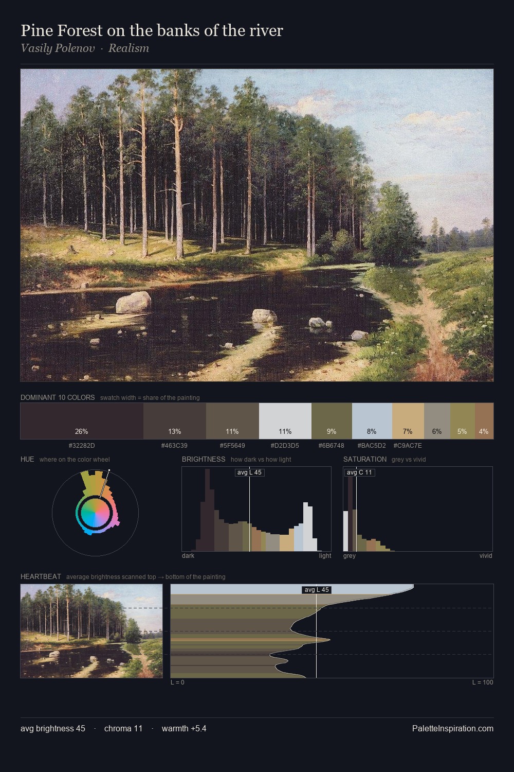
Vasily Polenov occupies the comfortable middle of the value scale, avoiding both extremes to hold the eye in a sustained middle grey. Cool tones set the register here - the blues and greens easily outweigh any warm accents. Saturation is deliberately withheld - the beauty here lies in the near-monochromatic gradations rather than colour difference. At 4.2%, #B49F6A carries the palette's sharpest chromatic charge: an accent that earns its place precisely because it is withheld. At 62 units of value range, the palette has the tonal breadth to sustain complex spatial readings. High luminosity and cool temperature suggest the plein-air condition: unfiltered daylight and open sky. Palette 14 sits within the larger chromatic argument that Vasily Polenov's complete body of work advances.
Example use cases
- film & entertainment
- fine dining
- spirits branding
- menswear
- theater design
I Love This!
Copy, export, or download for your project