Tintoretto Palette 3
Shadowed Gamboge
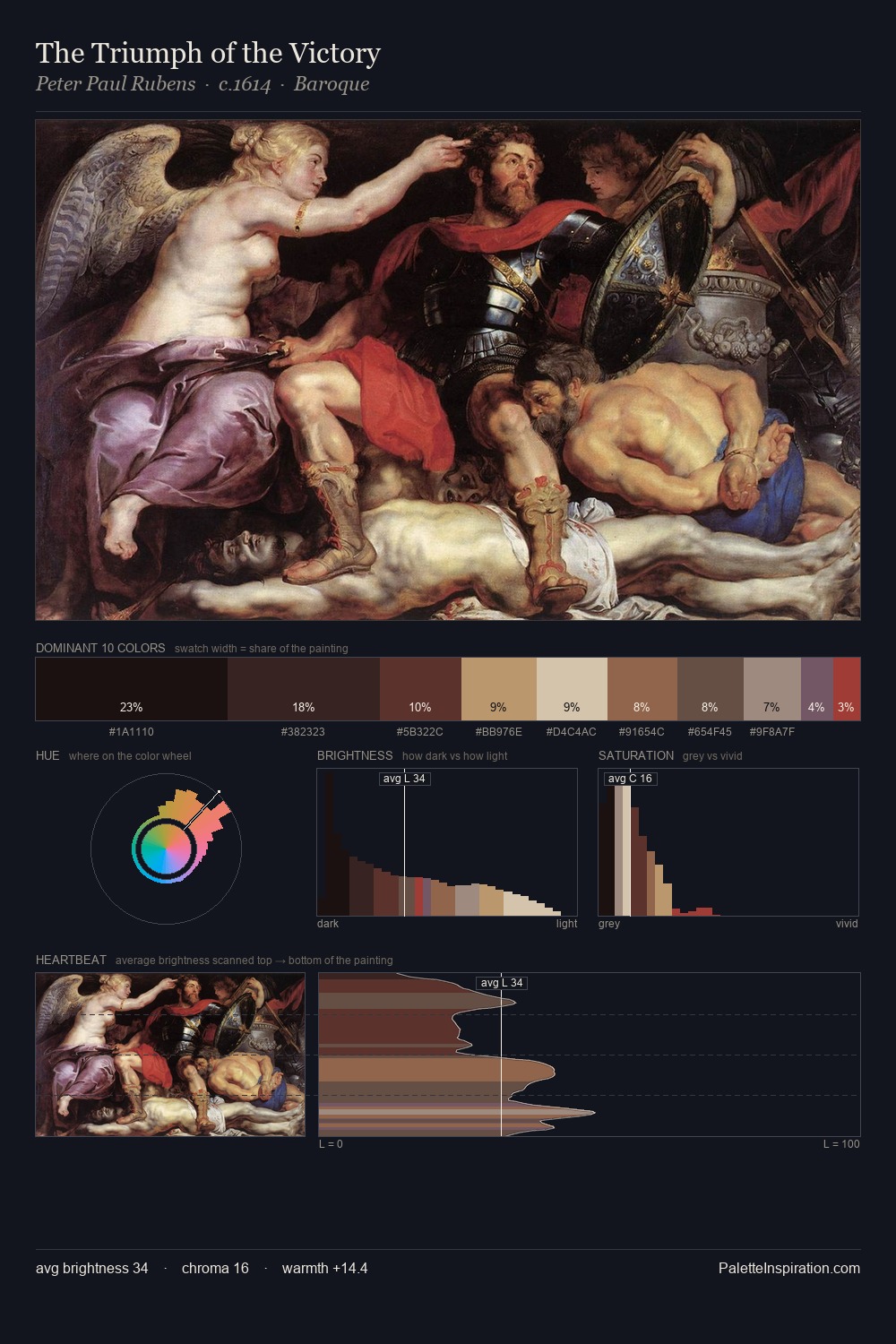
Shadowed Low-key - values weighted toward shadow, the palette of dim interiors and overcast skies.
Gamboge Deep golden yellow - a traditional warm pigment, rich amber-gold.

Palette Analysis
The value structure of Tintoretto is mid-key: quiet, controlled, and cohesive. Warm hues command this palette; Tintoretto favours the reds, oranges, and yellows of firelight and earth. Chroma hovers near zero; colour declares itself through subtle shifts in hue rather than outright saturation. #D9C7B2 delivers the chromatic peak at only 4.1% - a small shot of colour with outsized visual impact. 54 units of value spread create a palette that is varied but unified - contrast in the service of harmony. In the context of Tintoretto's full range of palettes, group 3 represents one movement in an ongoing chromatic dialogue.
Example use cases
- music labels
- luxury hospitality
- editorial photography
- leather goods
- premium streaming
I Love This!
Use This Palette
Copy, export, or download for your project
Copy, export, or download for your project
Copy:
Download:
Share: