Thomas Theodor Heine Palette 3

Palette Analysis
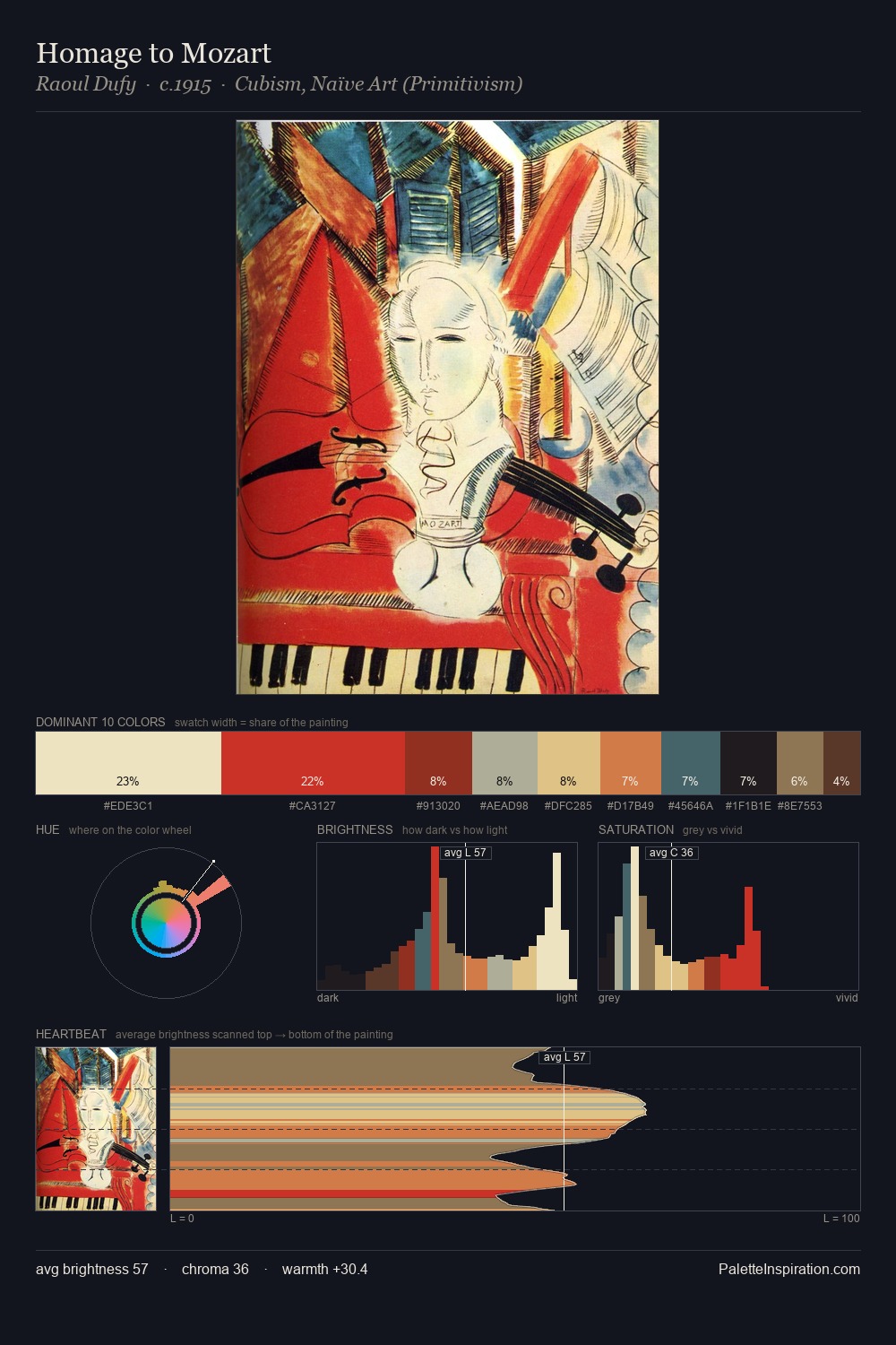
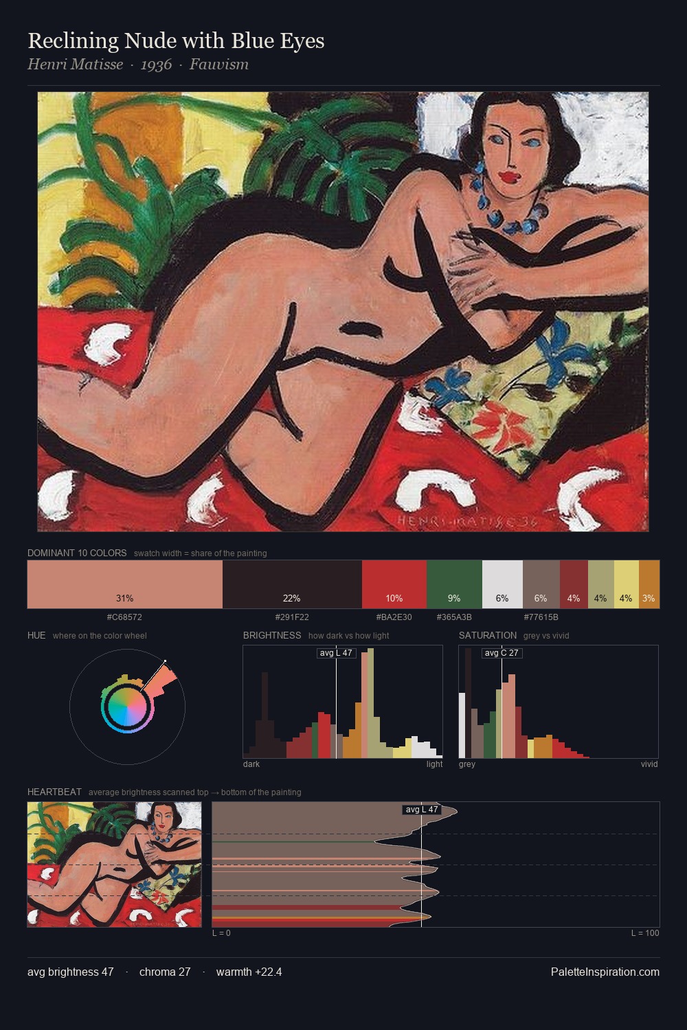
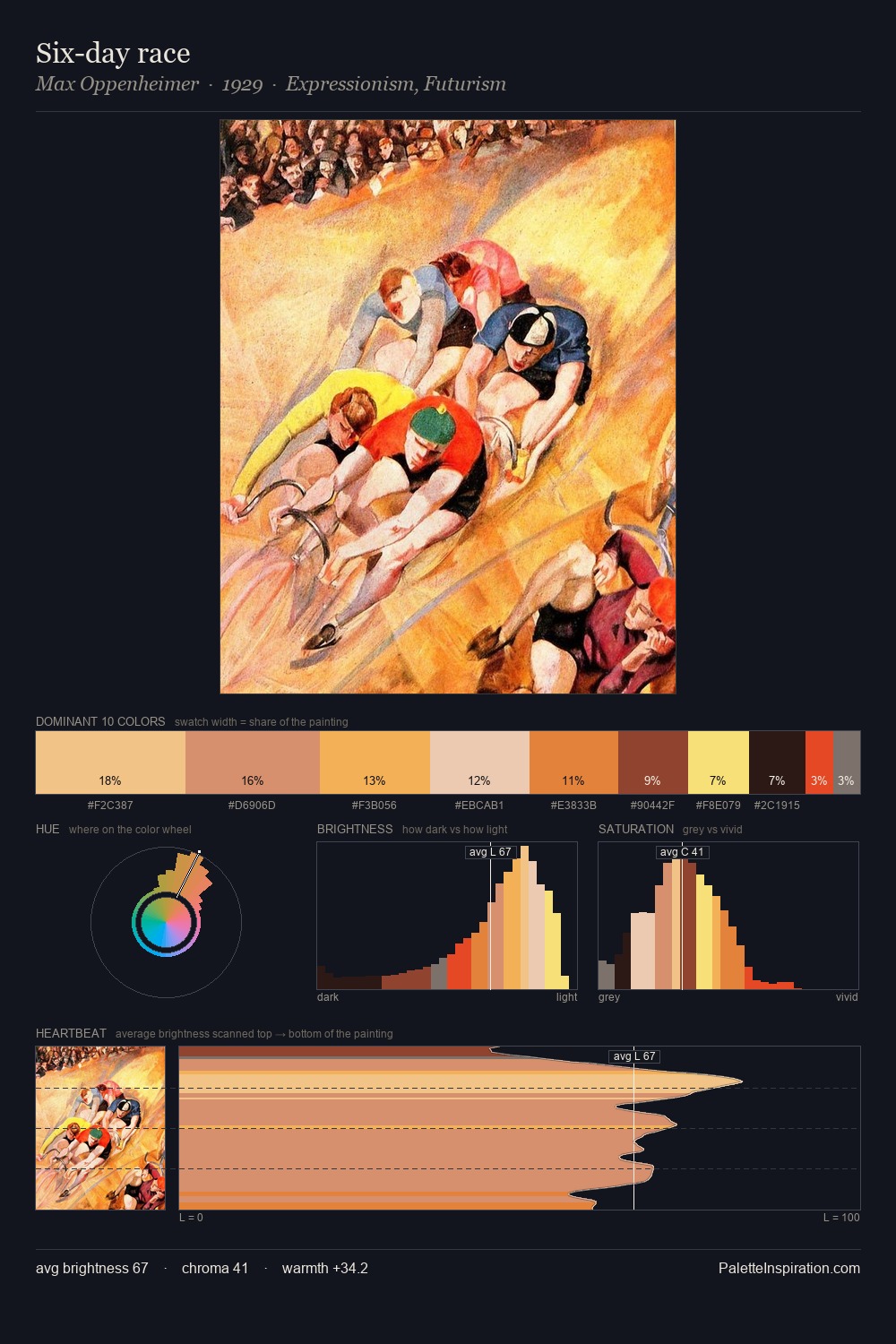
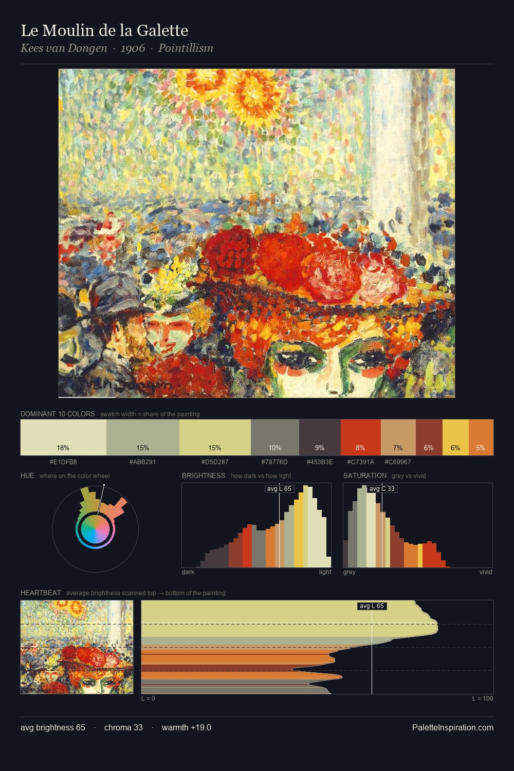
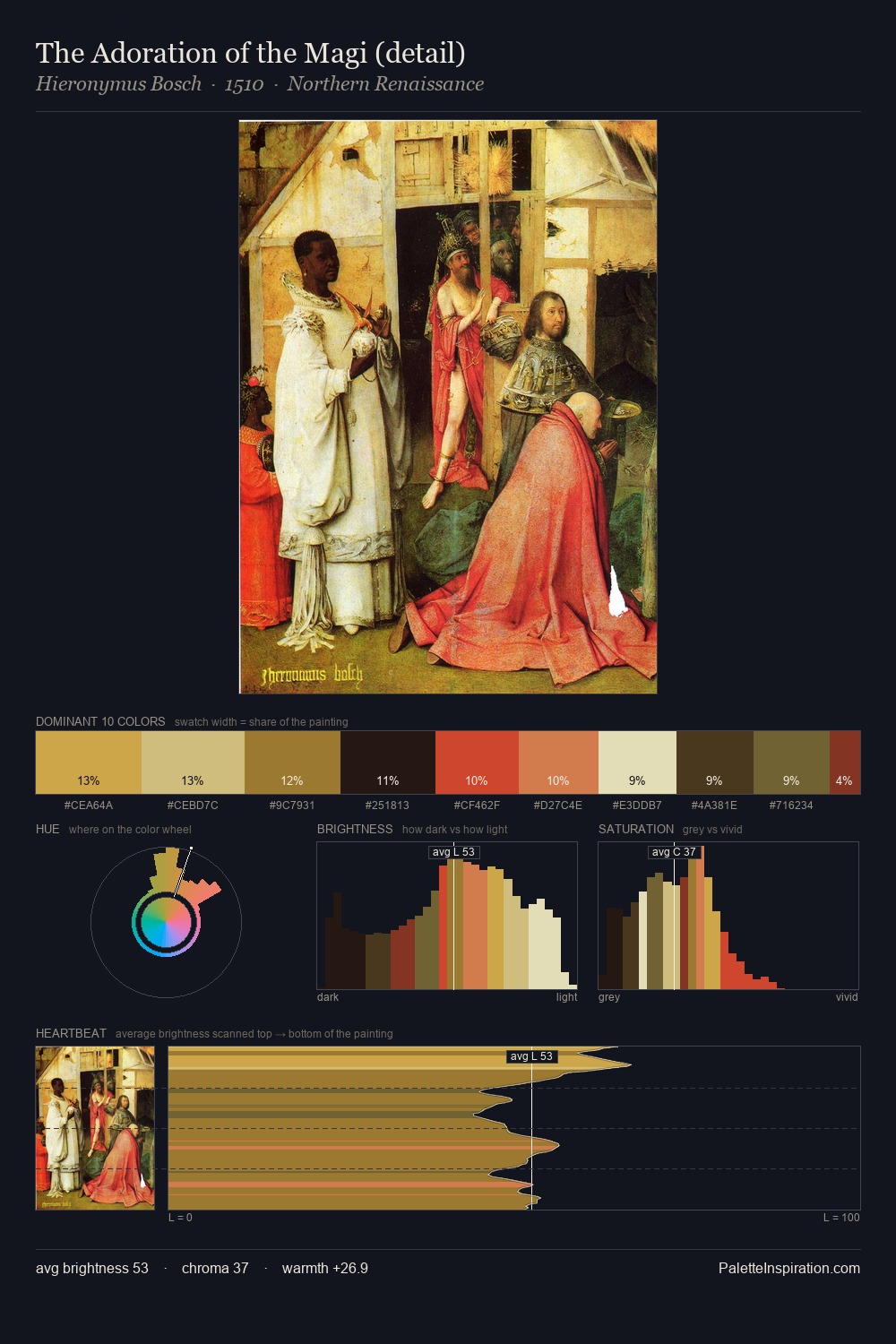
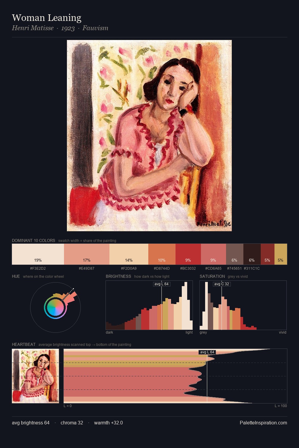
Thomas Theodor Heine occupies the comfortable middle of the value scale, avoiding both extremes to hold the eye in a sustained middle grey. Warm and cool tones are held in careful balance - neither family dominates, creating tension and resolution simultaneously. Saturation is measured and controlled, giving the palette presence without visual aggression. At 3.9%, #822223 carries the palette's sharpest chromatic charge: an accent that earns its place precisely because it is withheld. 78 units of value range underpin the palette's structural clarity: the eye always knows where light falls. The combination of mid-to-high key, balanced temperature, and elevated chroma is characteristic of Impressionist observation: light broken into its component hues. Palette 3 sits within the larger chromatic argument that Thomas Theodor Heine's complete body of work advances.
Example use cases
- publishing
- corporate identity
- consumer apps
- hospitality
- design agencies
I Love This!
Copy, export, or download for your project