Thomas Cole Palette 7

Palette Analysis
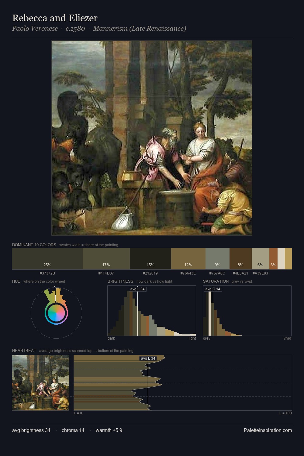
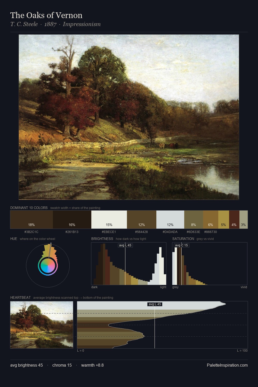
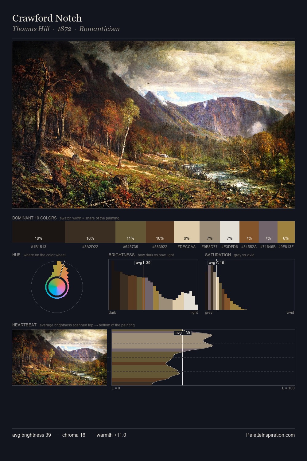
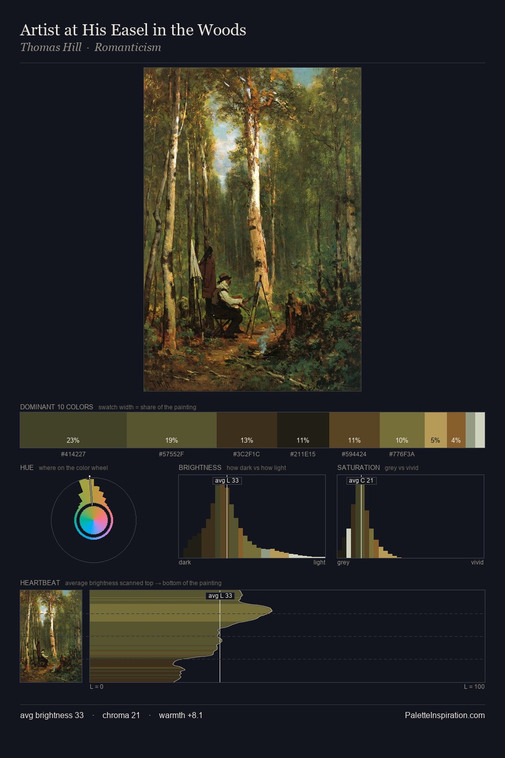
Thomas Cole occupies the comfortable middle of the value scale, avoiding both extremes to hold the eye in a sustained middle grey. Thomas Cole tilts toward cool - blues and silver-greys carry the structural weight. Saturation is deliberately withheld - the beauty here lies in the near-monochromatic gradations rather than colour difference. #A28D4B delivers the chromatic peak at only 3.1% - a small shot of colour with outsized visual impact. A value spread of 71 units gives the palette both depth and air - shadows are genuinely dark, lights genuinely light. The palette has the character of outdoor light: cool, mid-bright, with colour rendered faithfully rather than expressively. Palette 7 sits within the larger chromatic argument that Thomas Cole's complete body of work advances.
Example use cases
- theater design
- jewelry brands
- tobacco-adjacent retail
- event branding
- film & entertainment
I Love This!
Copy, export, or download for your project