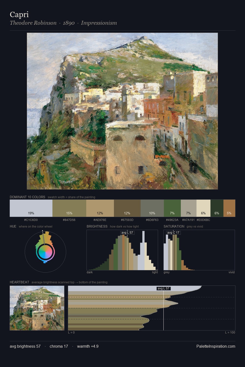
Theodore Robinson Palette 3

Palette Analysis
Theodore Robinson is strongly light-biased - shadow is suggested rather than declared. Theodore Robinson builds on cool foundations: the palette favours the blue-cyan-green arc. Muted throughout, the palette achieves its effects through value and temperature rather than chromatic force. The most saturated colour, #4C5B34, is reserved to 8.4% of the surface, where it acts as a focal punctuation. At 58 units of value range, the palette has the tonal breadth to sustain complex spatial readings. The mid-to-high key, cool bias, and moderate chroma point to outdoor observation - sky and diffused daylight as the dominant light source. Theodore Robinson's palette 3 carries its own internal logic while remaining in conversation with the artist's broader colour intelligence.
Example use cases
- boutique hospitality
- film production
- menswear
- art prints & posters
- heritage brands
I Love This!
Copy, export, or download for your project