Simone Martini Master Palette
Muted Caramel
Muted Deliberately desaturated - chroma pulled toward gray, the restraint of tonal painting.
Caramel Warm mid-brown - the color of cooked sugar, smooth and amber-toned.

Palette Analysis
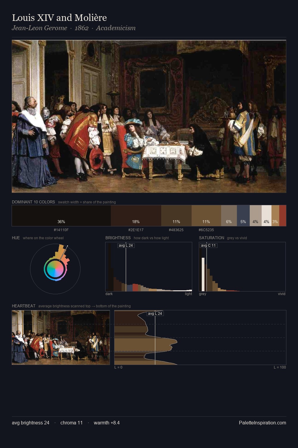
Simone Martini occupies the comfortable middle of the value scale, avoiding both extremes to hold the eye in a sustained middle grey. Warm hues command this palette; Simone Martini favours the reds, oranges, and yellows of firelight and earth. Colours are neither washed out nor blazing; they occupy the productive middle ground of the chroma scale. #A1462E delivers the chromatic peak at only 8.0% - a small shot of colour with outsized visual impact. At 69 units of value range, the palette has the tonal breadth to sustain complex spatial readings. These proportions encode Simone Martini's instinctive sense of how much of each quality the eye can hold.
Example use cases
- interior design
- furniture brands
- cookbook publishing
- wine & spirits
- food packaging
I Love This!
Use This Palette
Copy, export, or download for your project
Copy, export, or download for your project
Copy:
Download:
Share: