Simon Pietersz Verelst Palette 4

Palette Analysis
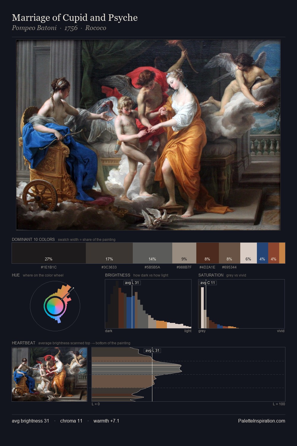
Darkness anchors Simon Pietersz Verelst; light is rationed, creating dramatic contrast rather than open air. The palette achieves thermal balance - reds and blues, ochres and greens, each holding the other in check. All colours lean toward grey, building depth through value rather than colour punch. At 35.9%, #231F1B functions less as a colour accent and more as a complete atmospheric environment. #4D3524 delivers the chromatic peak at only 8.8% - a small shot of colour with outsized visual impact. 56 units of value range underpin the palette's structural clarity: the eye always knows where light falls. Together these qualities place Simon Pietersz Verelst firmly in the tonal tradition - concerned with mood and atmosphere rather than chromatic display. In the context of Simon Pietersz Verelst's full range of palettes, group 4 represents one movement in an ongoing chromatic dialogue.
Example use cases
- theater design
- jewelry brands
- tobacco-adjacent retail
- event branding
- film & entertainment
I Love This!
Copy, export, or download for your project