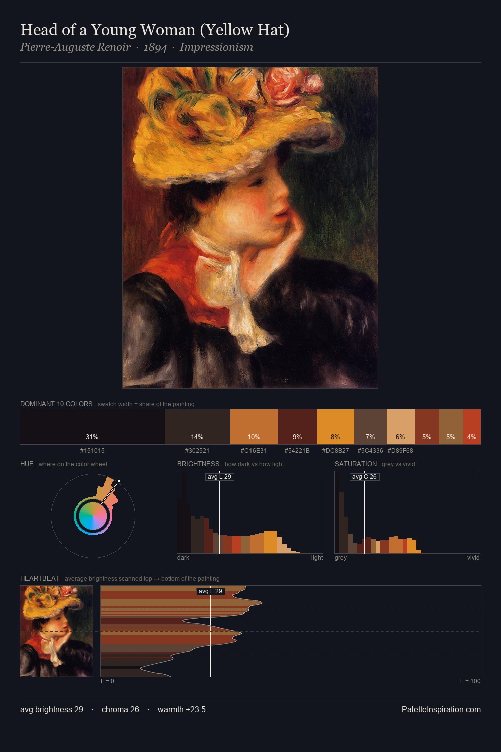
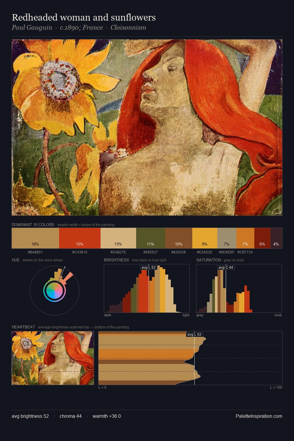
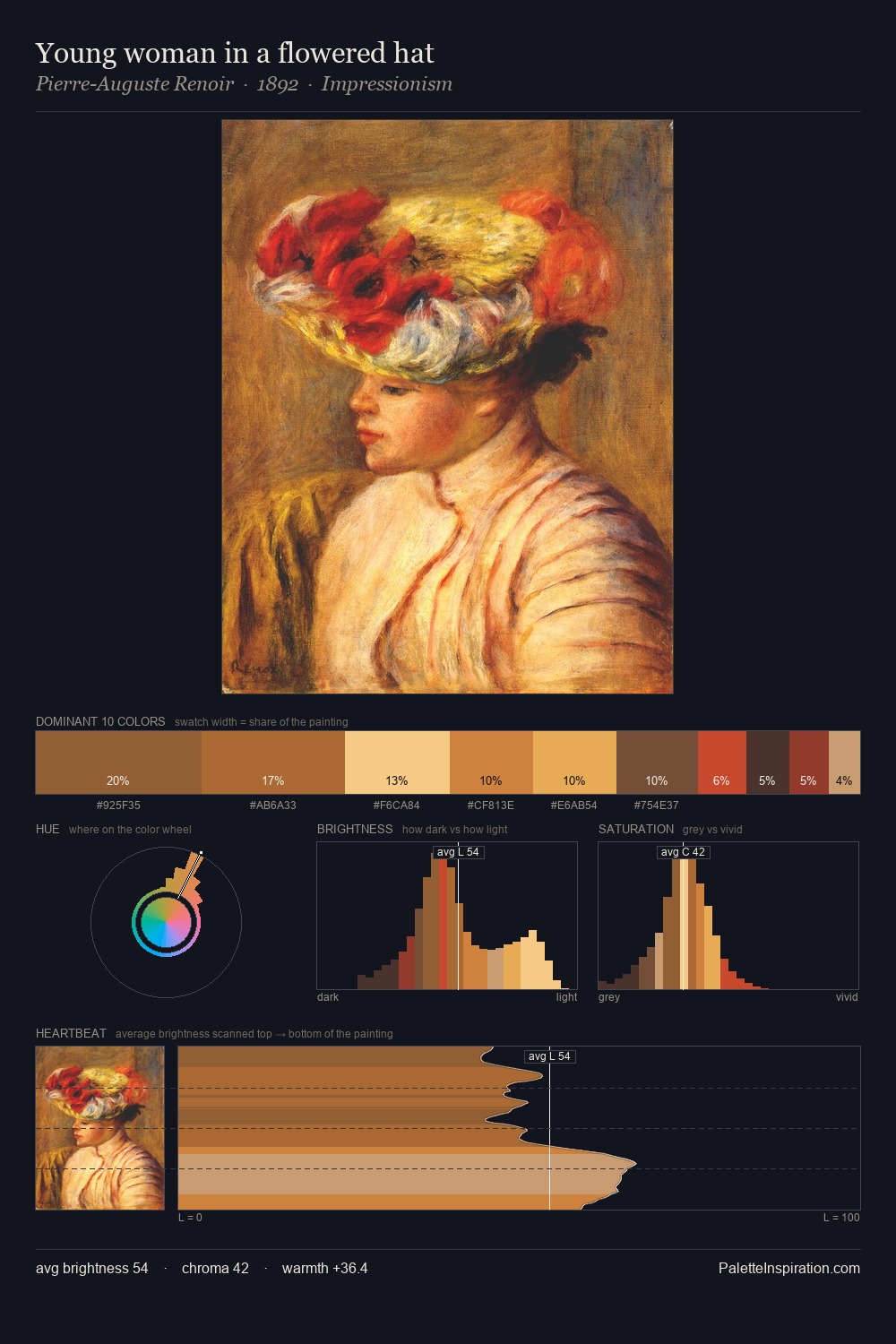
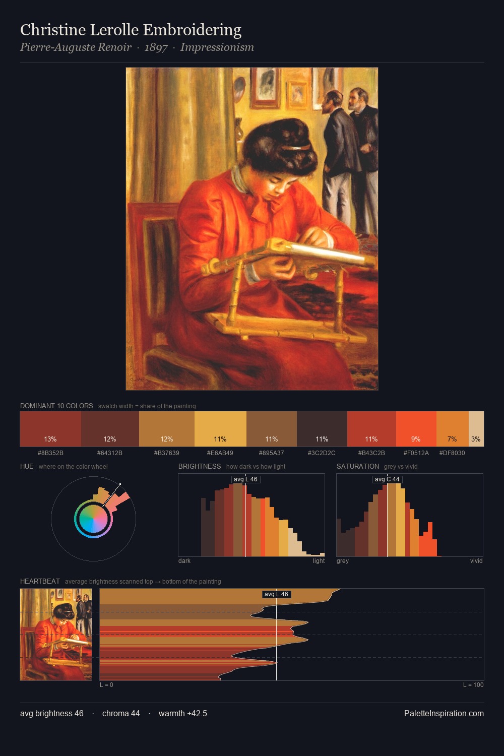
Seraphine Louis Palette 2
Muted Vermillion
Muted Deliberately desaturated - chroma pulled toward gray, the restraint of tonal painting.
Vermillion Brilliant red-orange - the classic mercury sulfide pigment, vivid and warm.

Palette Analysis
Seraphine Louis occupies the comfortable middle of the value scale, avoiding both extremes to hold the eye in a sustained middle grey. Seraphine Louis orchestrates warmth above all else - reds, ambers, and siennas take the lead. Chroma is moderate: colours carry enough saturation to be read as colour, but the palette stops well short of garish intensity. #EEB87C is not a small accent - at 9.4% it qualifies as a major presence and gives the palette its chromatic identity. Value range is moderate at 52 units - enough contrast for legibility, not so much as to fragment the tonal unity. Seraphine Louis's palette 2 carries its own internal logic while remaining in conversation with the artist's broader colour intelligence.
Example use cases
- publishing
- corporate identity
- consumer apps
- hospitality
- design agencies
I Love This!
Use This Palette
Copy, export, or download for your project
Copy, export, or download for your project
Copy:
Download:
Share: