Roger de La Fresnaye Palette 5
Dusky Crepuscule
Dusky Twilight register - warm mid-darks, the palette of dusk and fading light.
Crepuscule Twilight purple-gray - the color of the sky in the minutes after sunset.

Palette Analysis
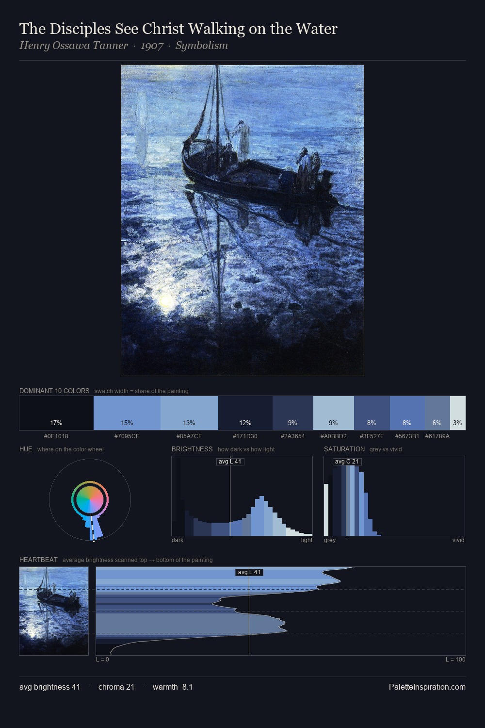
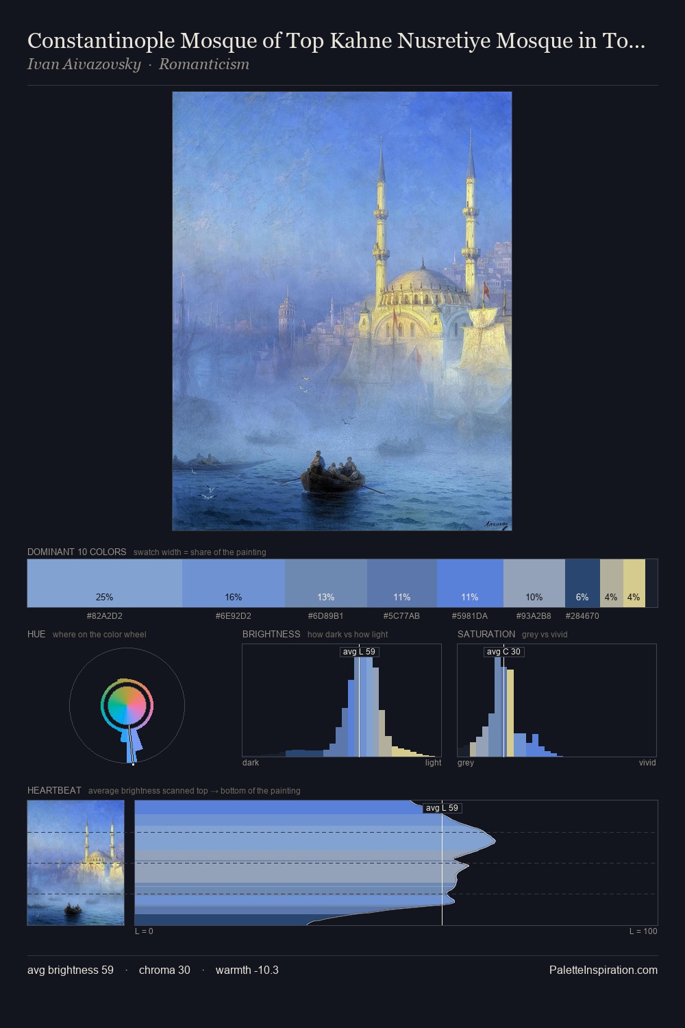
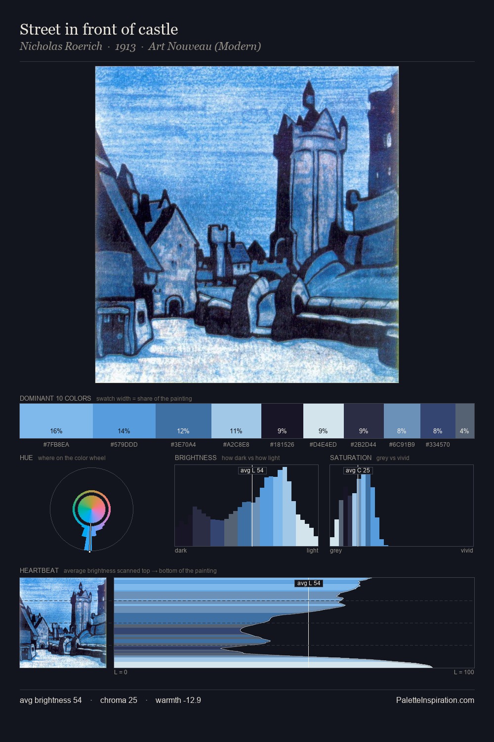
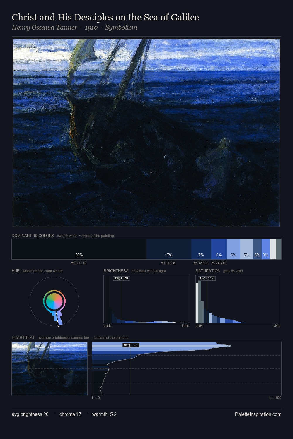
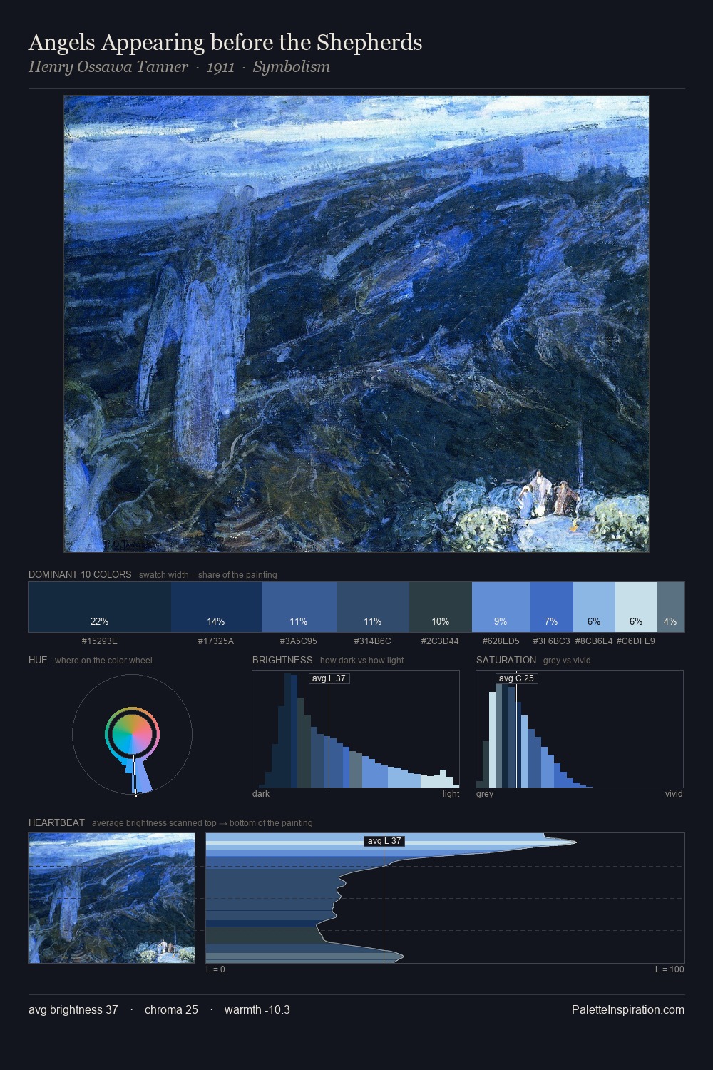
Roger de La Fresnaye distributes its values across the middle register, creating harmony without high contrast. Cool hues prevail: blues, greens, and greys anchor the palette's emotional temperature. Chroma is moderate: colours carry enough saturation to be read as colour, but the palette stops well short of garish intensity. #1B2B44 functions as the palette's exclamation mark: highest chroma, lowest percentage (4.8%). 53 units of value spread create a palette that is varied but unified - contrast in the service of harmony. High luminosity and cool temperature suggest the plein-air condition: unfiltered daylight and open sky. Palette 5 sits within the larger chromatic argument that Roger de La Fresnaye's complete body of work advances.
Example use cases
- publishing
- corporate identity
- consumer apps
- hospitality
- design agencies
I Love This!
Use This Palette
Copy, export, or download for your project
Copy, export, or download for your project
Copy:
Download:
Share: