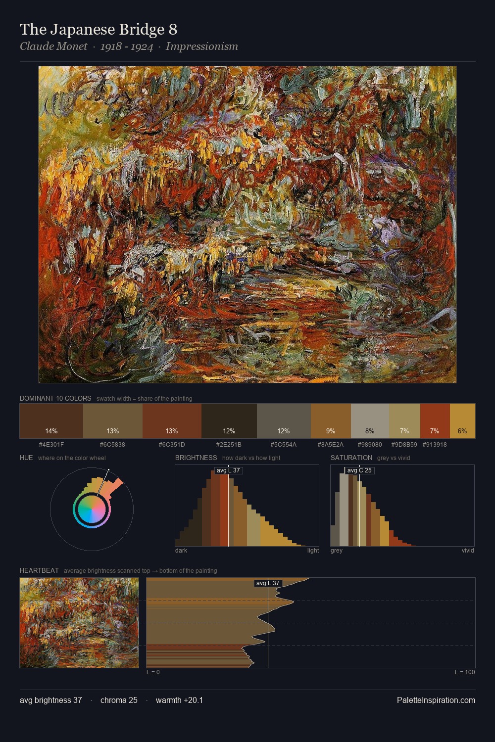
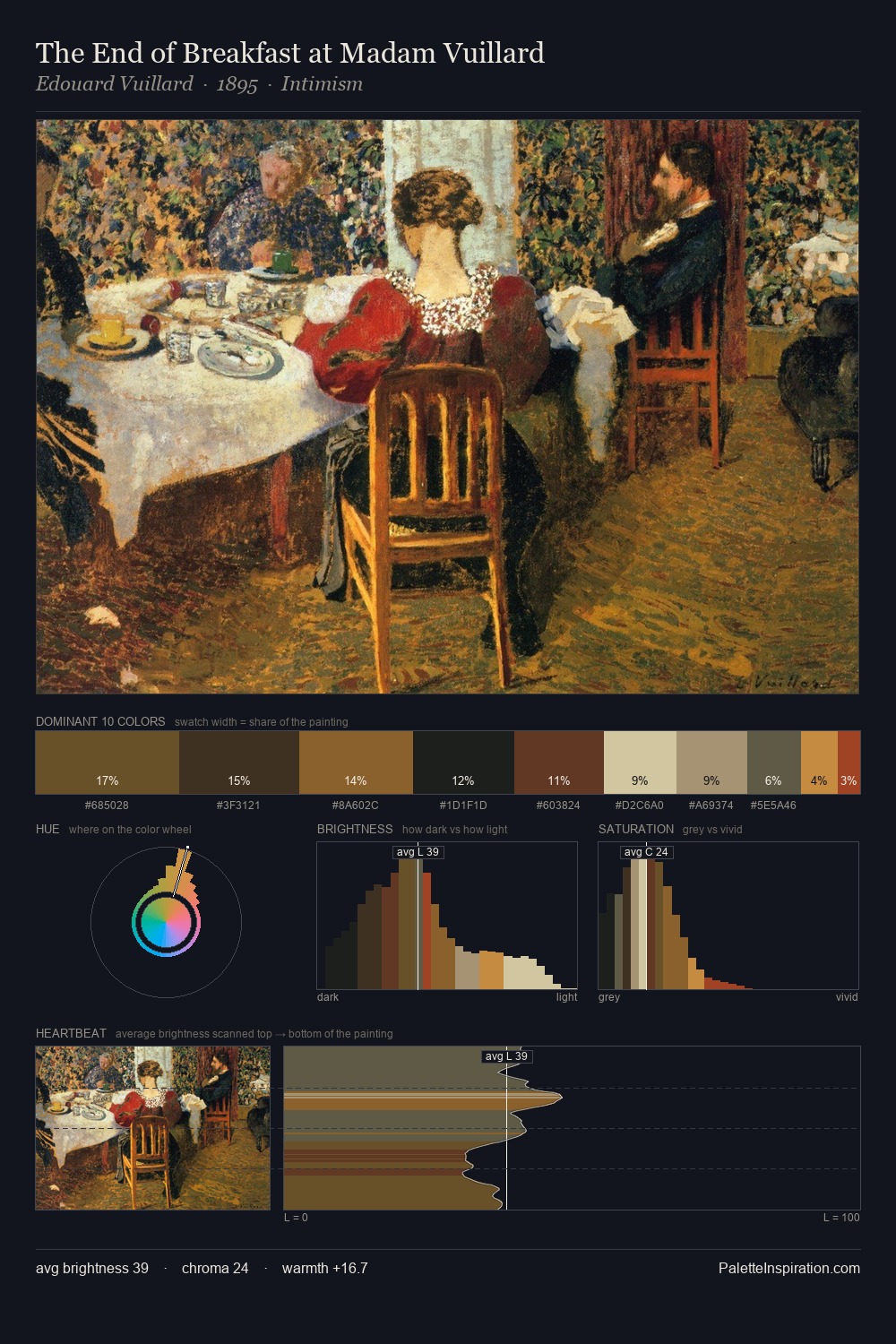
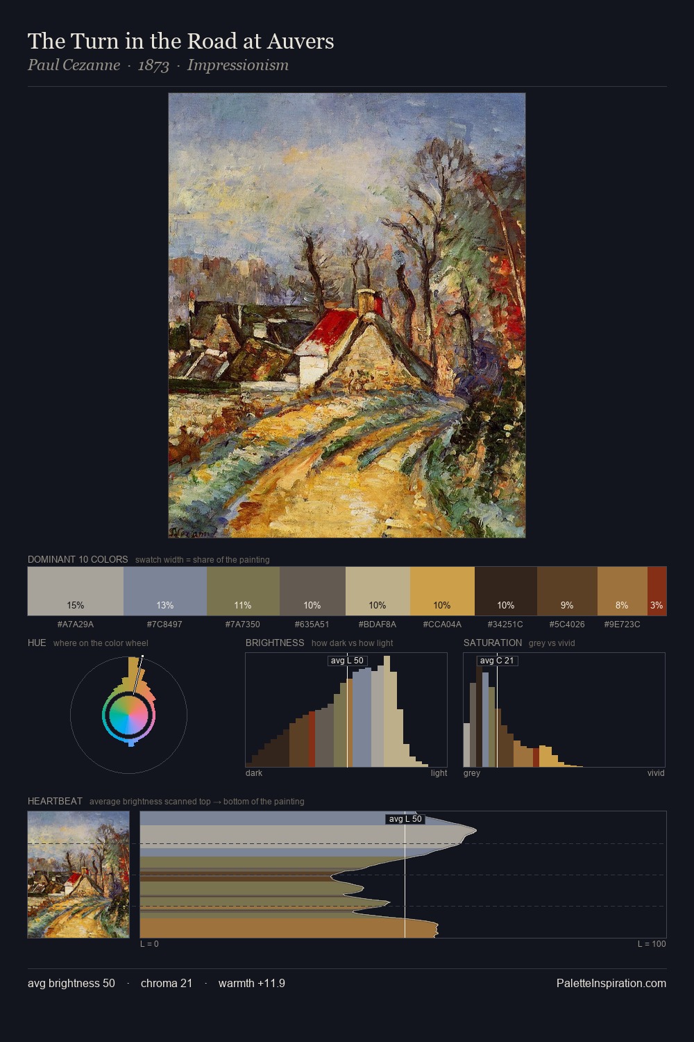
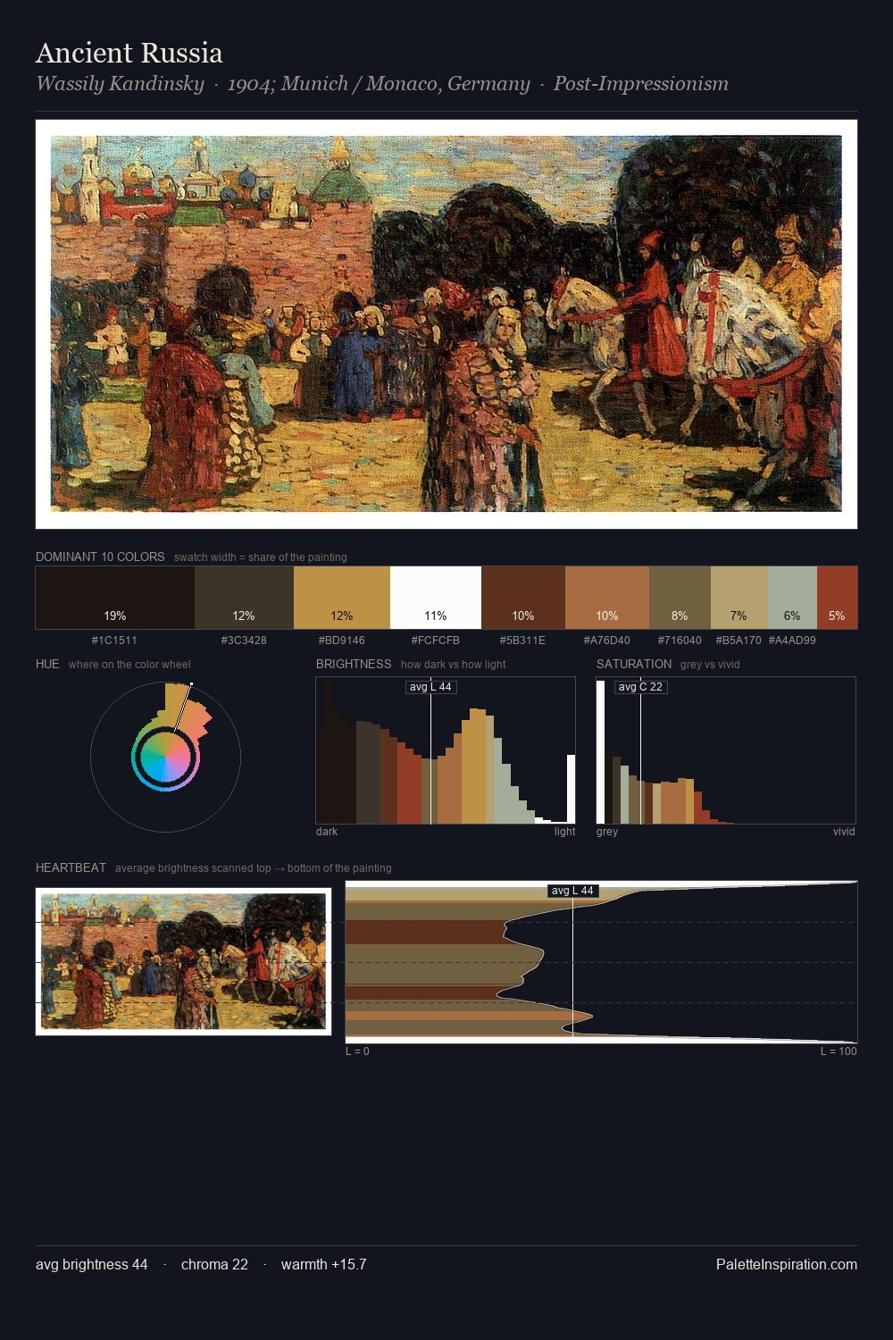
Robert William Buss Palette 4

Palette Analysis
The value structure of Robert William Buss is mid-key: quiet, controlled, and cohesive. Warmth dominates - the palette of Robert William Buss leans heavily on the yellow-orange-red arc of the colour wheel. Saturation is deliberately withheld - the beauty here lies in the near-monochromatic gradations rather than colour difference. The dominant colour, #42321F, takes 31.1% of the total area, establishing the overall mood before any other hue is introduced. At 3.4%, #8E5A26 carries the palette's sharpest chromatic charge: an accent that earns its place precisely because it is withheld. At 41 units across the value scale, the palette keeps contrast readable without letting it dominate. Palette 4 sits within the larger chromatic argument that Robert William Buss's complete body of work advances.
Example use cases
- music labels
- luxury hospitality
- editorial photography
- leather goods
- premium streaming
I Love This!
Copy, export, or download for your project