Robert William Buss Palette 1

Palette Analysis
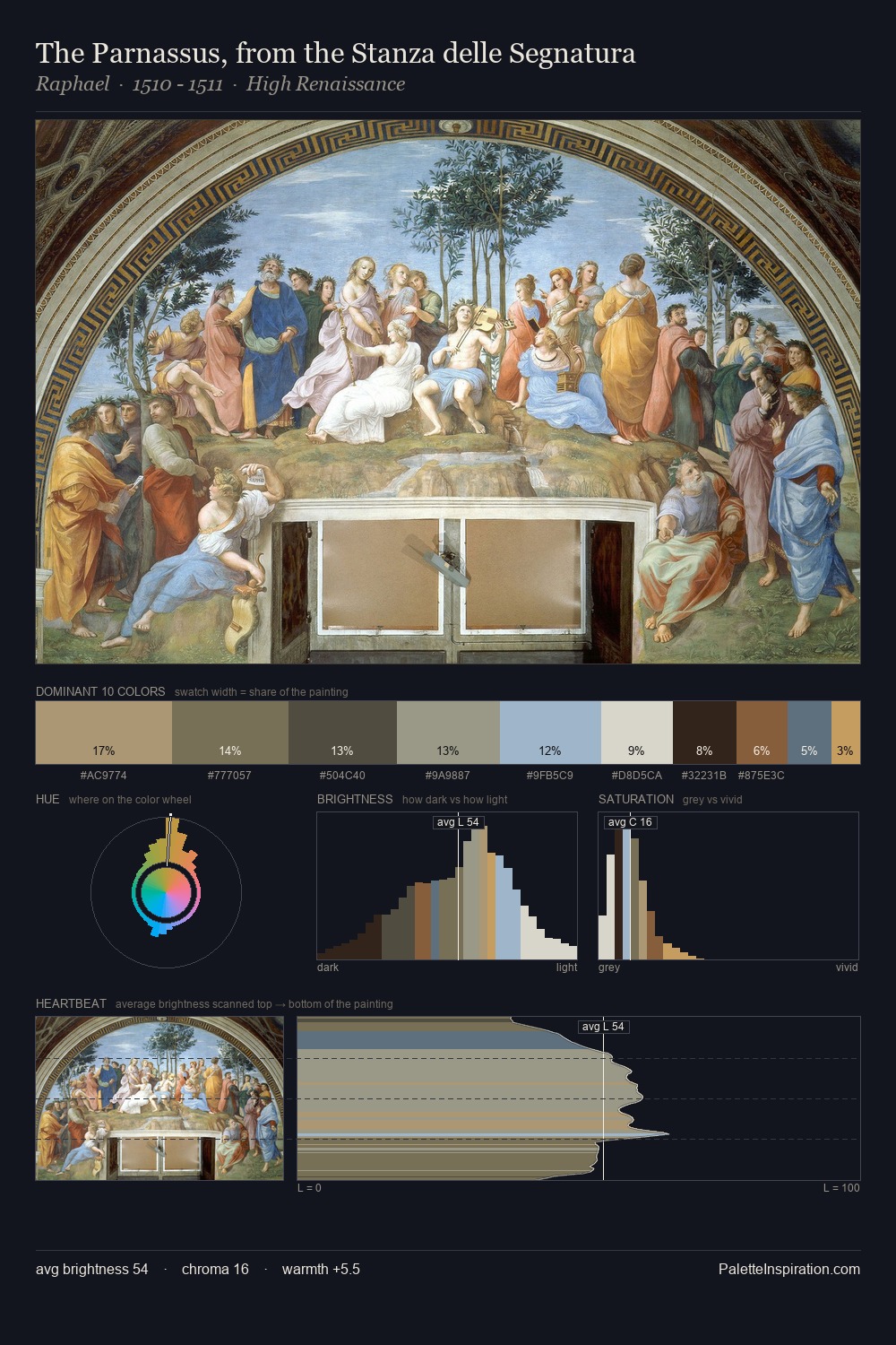
Robert William Buss works in the upper reaches of the value scale, creating an atmosphere of brightness and expansiveness. A distinctly cool atmosphere runs through this palette: sky, water, and mist given colour form. Every colour is desaturated; the palette proceeds through near-neutrals and gently-coloured greys. The highest-chroma note - #905C3D - appears at just 3.7%, deployed as a precision accent against the quieter ground. The value range spans 68 units across the palette, providing the full gamut from deep shadow to near-white and ensuring clear tonal hierarchy. The mid-to-high key, cool bias, and moderate chroma point to outdoor observation - sky and diffused daylight as the dominant light source. Robert William Buss's palette 1 carries its own internal logic while remaining in conversation with the artist's broader colour intelligence.
Example use cases
- museums & galleries
- academic publishing
- heritage brands
- auction houses
- exhibition design
I Love This!
Copy, export, or download for your project