Robert Spencer Palette 7
Shadowed Caramel
Shadowed Low-key - values weighted toward shadow, the palette of dim interiors and overcast skies.
Caramel Warm mid-brown - the color of cooked sugar, smooth and amber-toned.

Palette Analysis
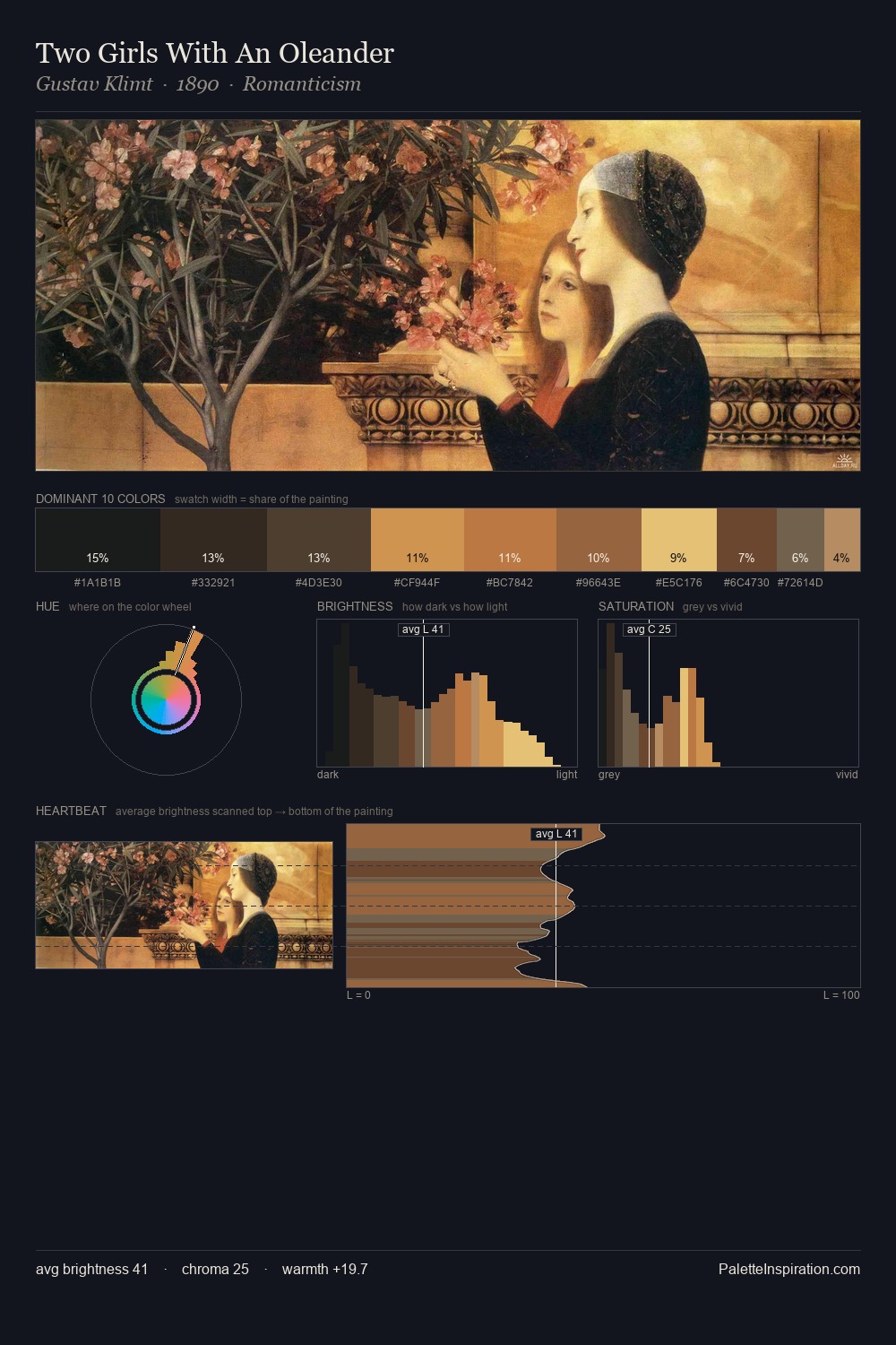
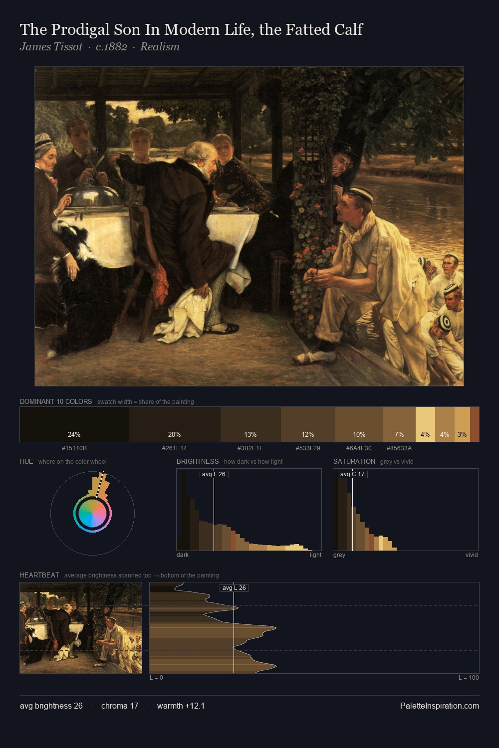
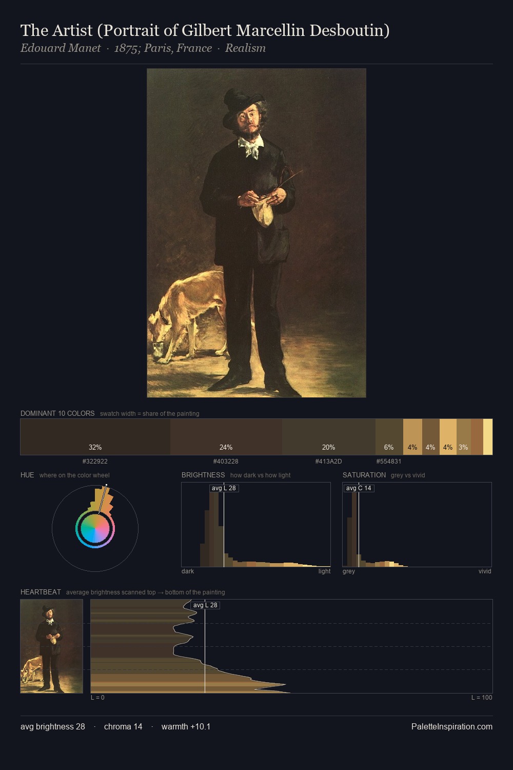
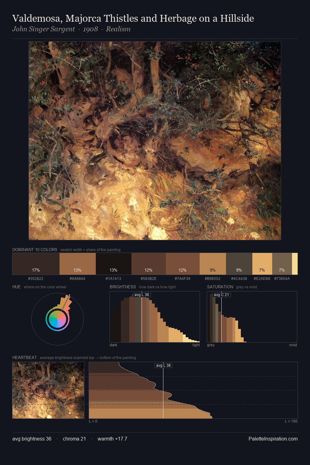
Robert Spencer distributes its values across the middle register, creating harmony without high contrast. Warm hues command this palette; Robert Spencer favours the reds, oranges, and yellows of firelight and earth. Chroma hovers near zero; colour declares itself through subtle shifts in hue rather than outright saturation. #B48445 delivers the chromatic peak at only 5.1% - a small shot of colour with outsized visual impact. The value range spans 62 units across the palette, providing the full gamut from deep shadow to near-white and ensuring clear tonal hierarchy. Robert Spencer's palette 7 carries its own internal logic while remaining in conversation with the artist's broader colour intelligence.
Example use cases
- theater design
- jewelry brands
- tobacco-adjacent retail
- event branding
- film & entertainment
I Love This!
Use This Palette
Copy, export, or download for your project
Copy, export, or download for your project
Copy:
Download:
Share: