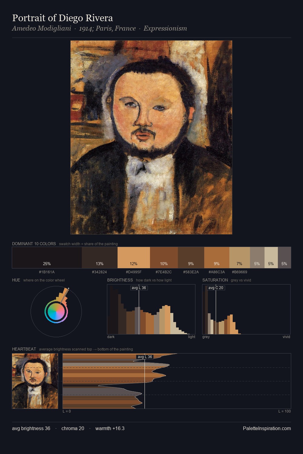
Robert Spencer Palette 11
Shadowed Tawny
Shadowed Low-key - values weighted toward shadow, the palette of dim interiors and overcast skies.
Tawny Warm orange-brown - a traditional term for the color of tanned leather or lion fur.

Palette Analysis
Robert Spencer distributes its values across the middle register, creating harmony without high contrast. Warm hues command this palette; Robert Spencer favours the reds, oranges, and yellows of firelight and earth. Every colour is desaturated; the palette proceeds through near-neutrals and gently-coloured greys. The most saturated colour, #D1B8A1, is reserved to 8.6% of the surface, where it acts as a focal punctuation. A value spread of 56 units gives the palette both depth and air - shadows are genuinely dark, lights genuinely light. Palette 11 sits within the larger chromatic argument that Robert Spencer's complete body of work advances.
Example use cases
- theater design
- jewelry brands
- tobacco-adjacent retail
- event branding
- film & entertainment
I Love This!
Use This Palette
Copy, export, or download for your project
Copy, export, or download for your project
Copy:
Download:
Share: