Robert Spencer Palette 1

Palette Analysis
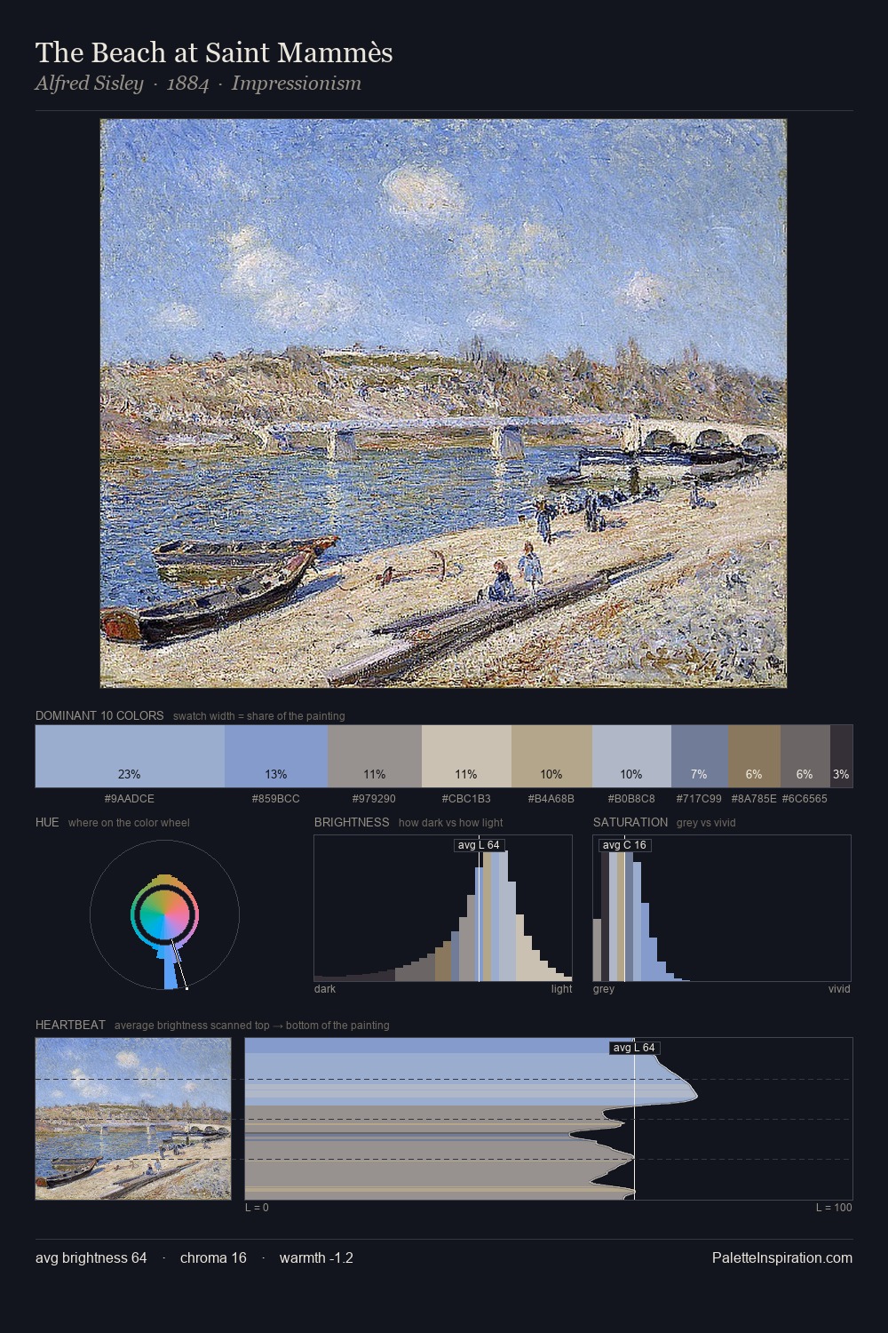
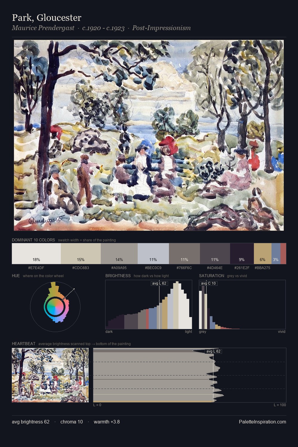
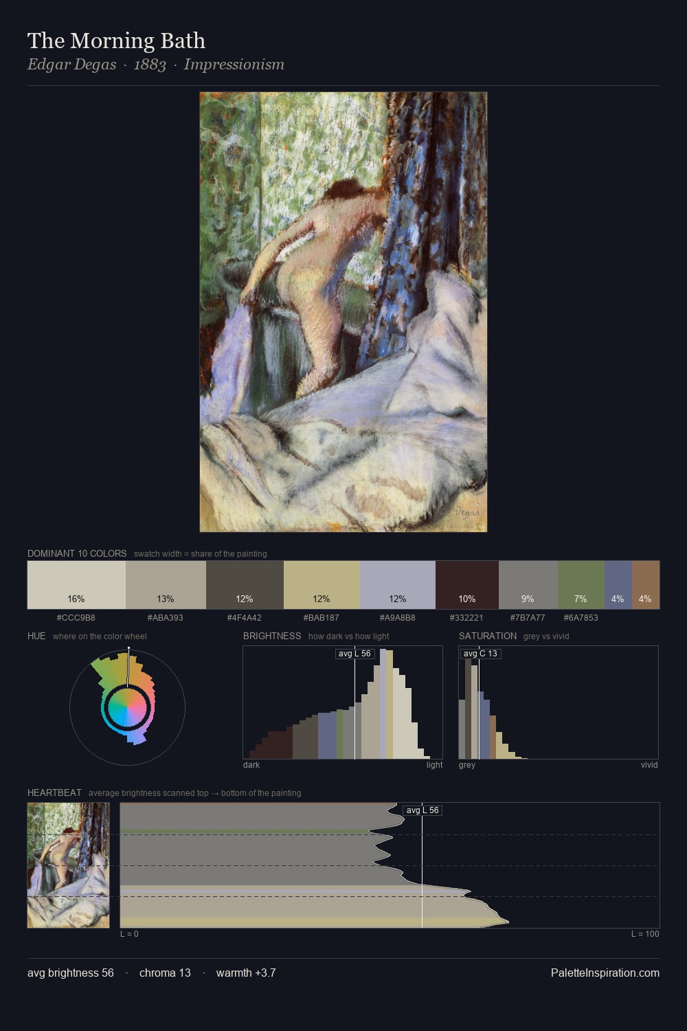
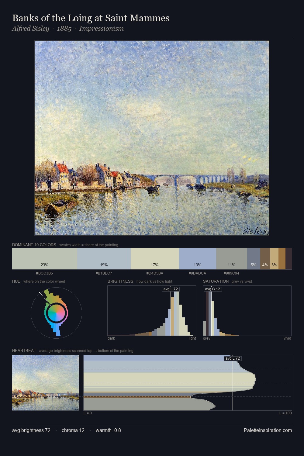
Values in Robert Spencer tilt decisively toward white, giving the palette its luminous character. Cool hues prevail: blues, greens, and greys anchor the palette's emotional temperature. Saturation is deliberately withheld - the beauty here lies in the near-monochromatic gradations rather than colour difference. The saturated accent, #5D7698, registers at 5.2% - sparse enough to feel like a deliberate surprise. From deepest dark to palest light, the palette traverses 61 units of the value scale - a span that creates natural depth. The mid-to-high key, cool bias, and moderate chroma point to outdoor observation - sky and diffused daylight as the dominant light source. Palette 1 sits within the larger chromatic argument that Robert Spencer's complete body of work advances.
Example use cases
- exhibition design
- foundation branding
- estate management
- art education
- museums & galleries
I Love This!
Copy, export, or download for your project