Robert Delaunay Palette 1
Soft Ivory
Soft Low-contrast, gentle chroma - mid-key values and low saturation, approachable and calm.
Ivory Warm creamy white - the color of natural ivory, warmer than pure white.

Palette Analysis
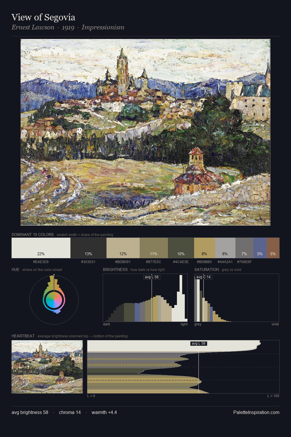
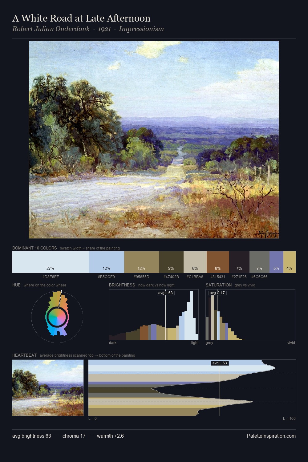
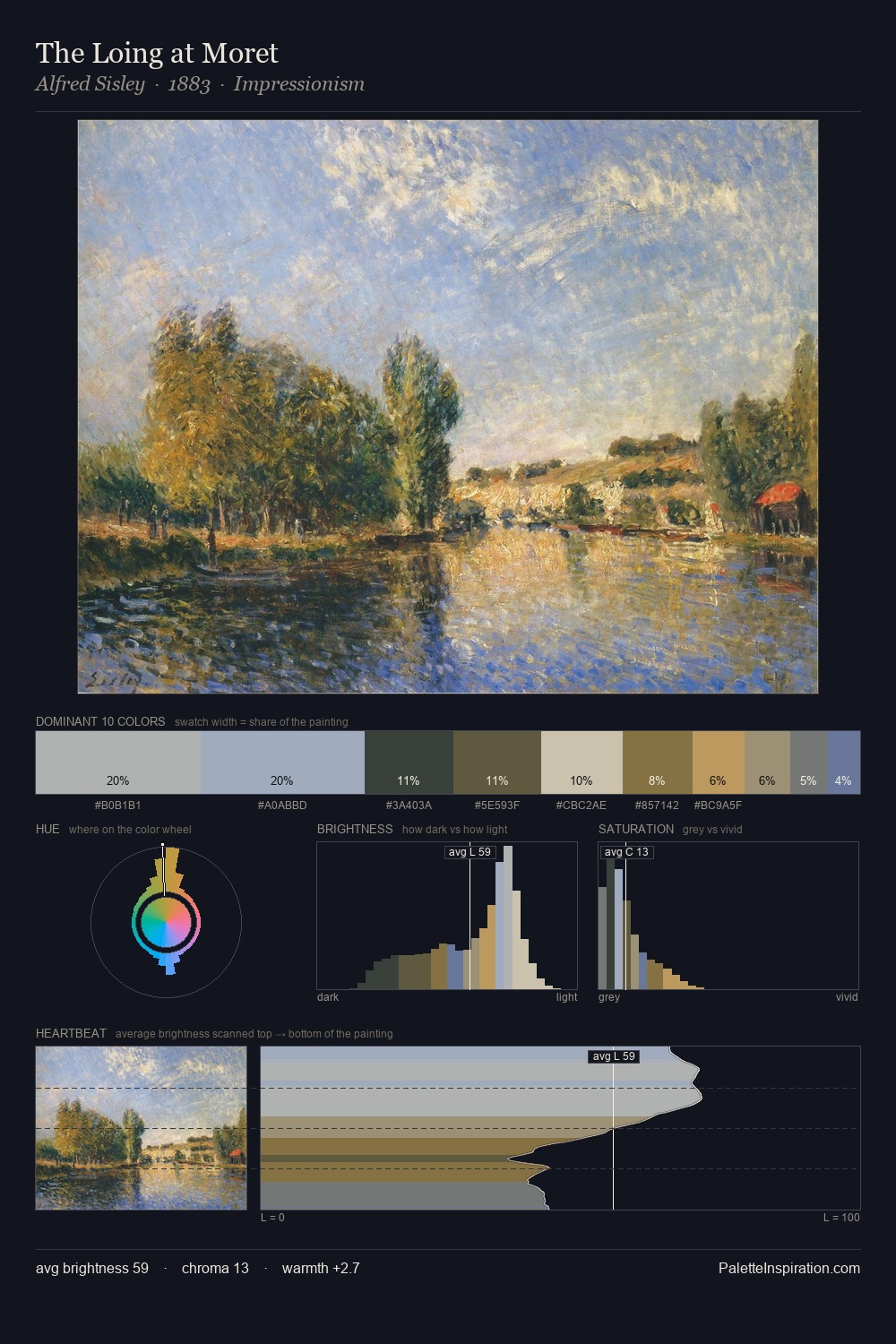
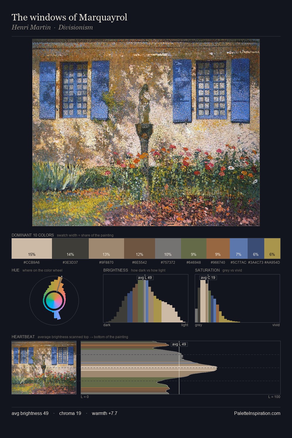
Robert Delaunay is strongly light-biased - shadow is suggested rather than declared. Temperature is cool-dominant, with blue and green families claiming the largest areas. Chroma hovers near zero; colour declares itself through subtle shifts in hue rather than outright saturation. Only 6.6% is devoted to #906340, yet that small allocation delivers the palette's entire chromatic tension. 57 units of value range underpin the palette's structural clarity: the eye always knows where light falls. High luminosity and cool temperature suggest the plein-air condition: unfiltered daylight and open sky. Palette 1 sits within the larger chromatic argument that Robert Delaunay's complete body of work advances.
Example use cases
- archival print
- university identity
- rare books
- cultural institutions
- nonprofit identity
I Love This!
Use This Palette
Copy, export, or download for your project
Copy, export, or download for your project
Copy:
Download:
Share:


 Palette 1 - Pale Ivory")


