Richard Parkes Bonington Palette 3

Palette Analysis
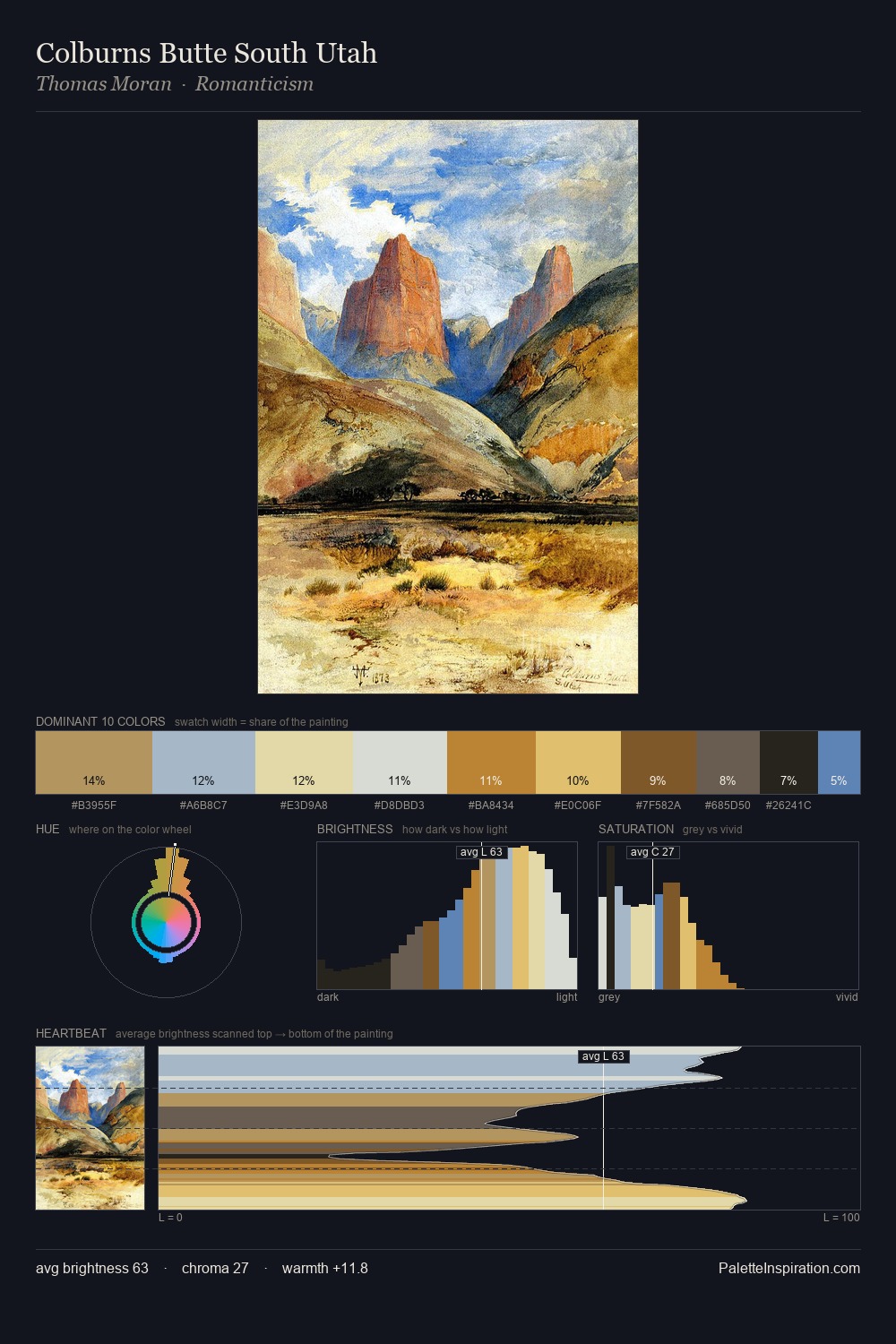
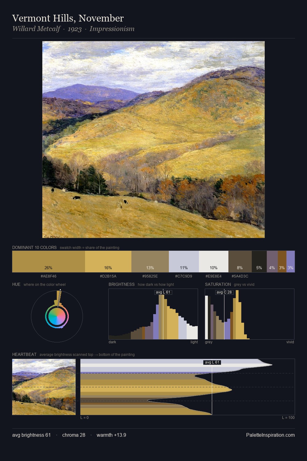
Values in Richard Parkes Bonington tilt decisively toward white, giving the palette its luminous character. Blues and teal-greys govern the palette, lending it an aquatic or atmospheric quality. Chroma hovers near zero; colour declares itself through subtle shifts in hue rather than outright saturation. The dominant colour, #F4F4DC, takes 33.2% of the total area, establishing the overall mood before any other hue is introduced. The highest-chroma note - #BD8620 - appears at just 3.7%, deployed as a precision accent against the quieter ground. At 71 units of value range, the palette has the tonal breadth to sustain complex spatial readings. The mid-to-high key, cool bias, and moderate chroma point to outdoor observation - sky and diffused daylight as the dominant light source. Richard Parkes Bonington's palette 3 carries its own internal logic while remaining in conversation with the artist's broader colour intelligence.
Example use cases
- publishing
- corporate identity
- consumer apps
- hospitality
- design agencies
I Love This!
Copy, export, or download for your project