Rembrandt Peale Master Palette
Shadowed Tawny
Shadowed Low-key - values weighted toward shadow, the palette of dim interiors and overcast skies.
Tawny Warm orange-brown - a traditional term for the color of tanned leather or lion fur.

Palette Analysis
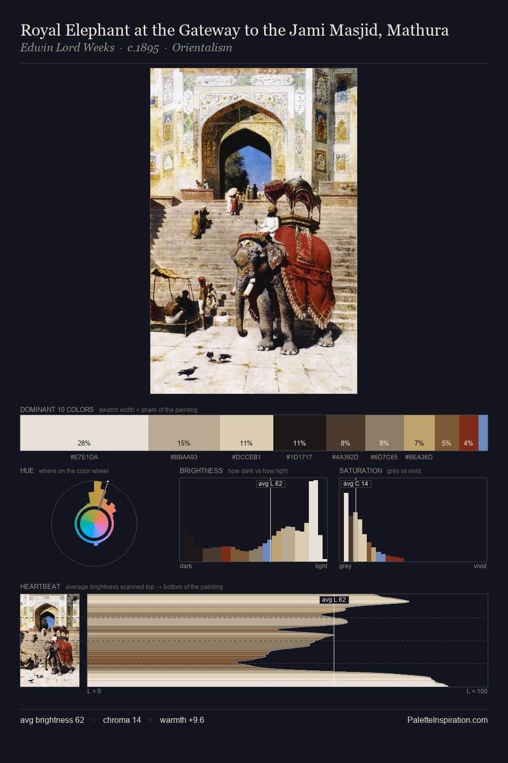
Mid-key values give Rembrandt Peale its characteristic quietness - nothing blazes, nothing disappears. Warm hues command this palette; Rembrandt Peale favours the reds, oranges, and yellows of firelight and earth. All colours lean toward grey, building depth through value rather than colour punch. The saturated accent, #7D5D35, registers at 11.0% - sparse enough to feel like a deliberate surprise. The value range spans 65 units across the palette, providing the full gamut from deep shadow to near-white and ensuring clear tonal hierarchy. This is the light Rembrandt Peale preferred, made measurable.
Example use cases
- theater design
- jewelry brands
- tobacco-adjacent retail
- event branding
- film & entertainment
I Love This!
Use This Palette
Copy, export, or download for your project
Copy, export, or download for your project
Copy:
Download:
Share: