Raden Saleh Palette 1

Palette Analysis
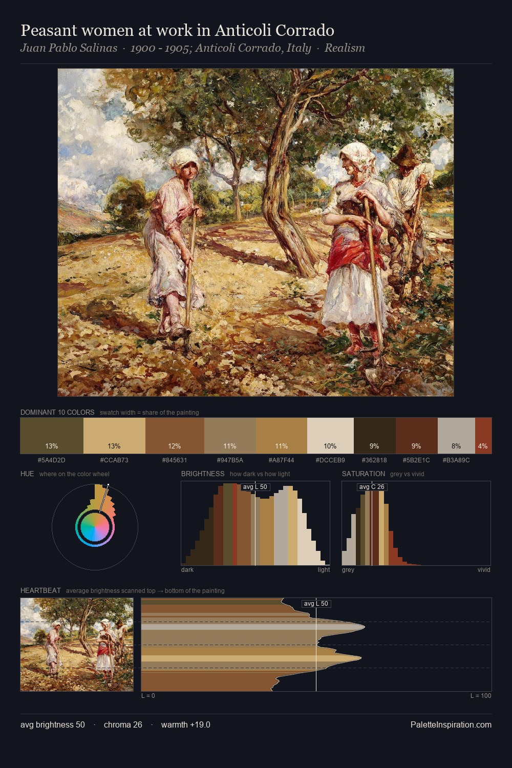
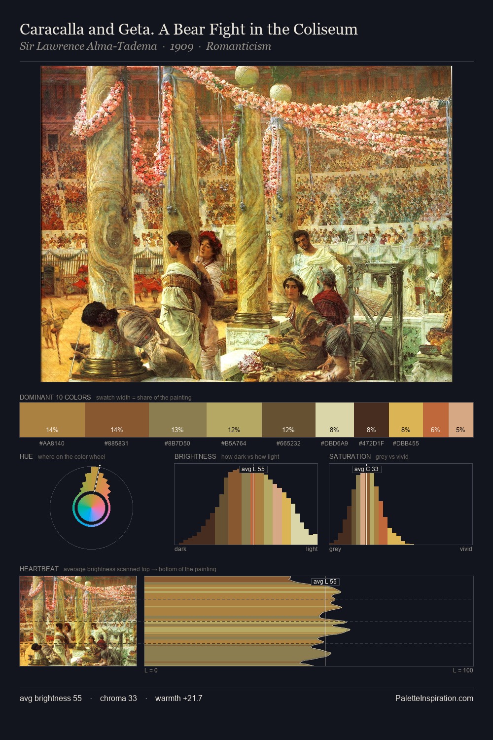
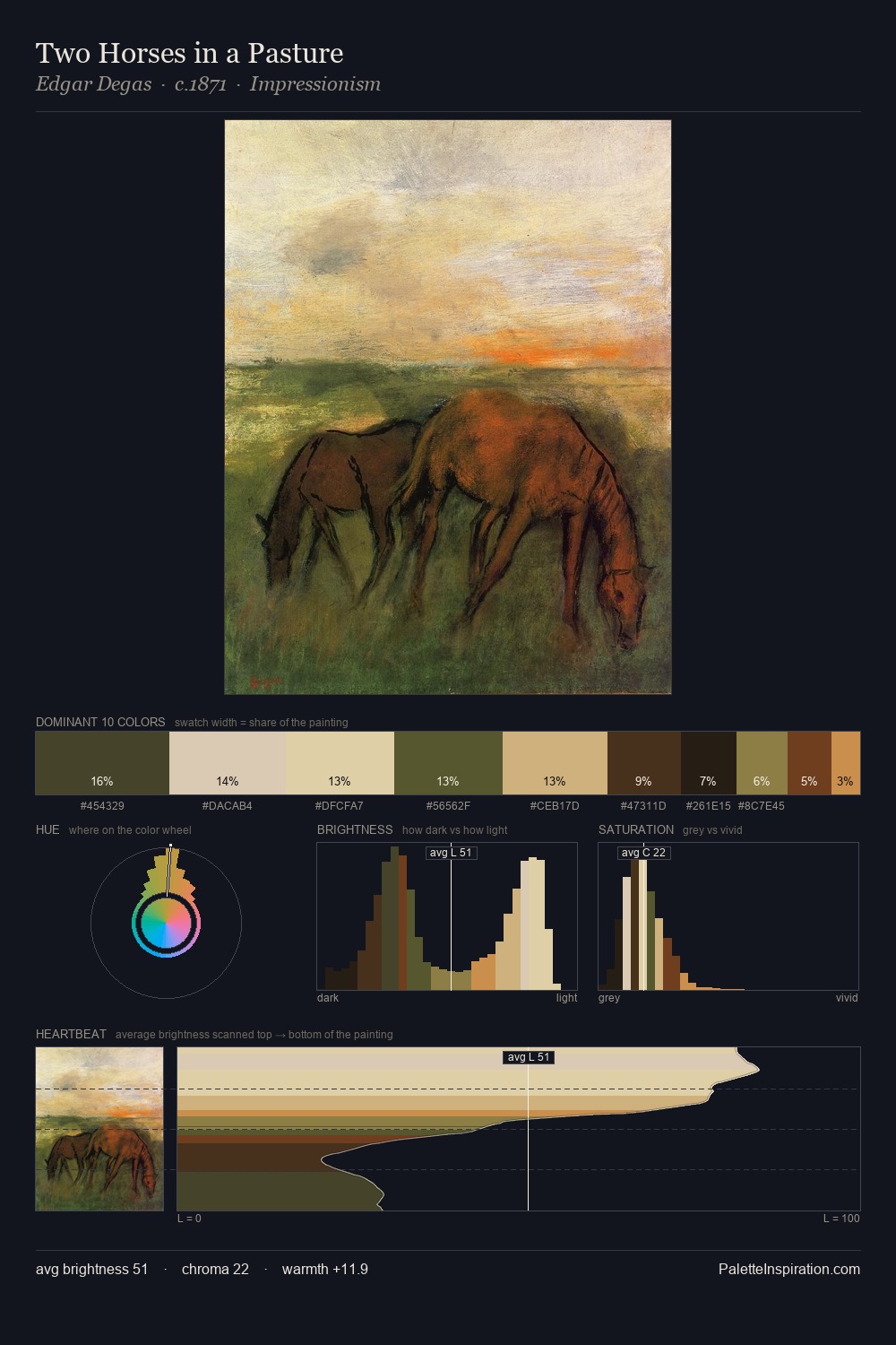
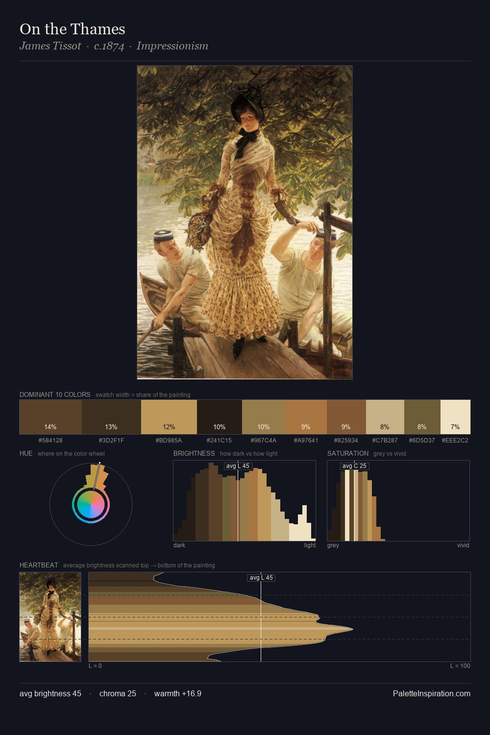
Raden Saleh occupies the comfortable middle of the value scale, avoiding both extremes to hold the eye in a sustained middle grey. Warm and cool tones are held in careful balance - neither family dominates, creating tension and resolution simultaneously. Chroma is moderate: colours carry enough saturation to be read as colour, but the palette stops well short of garish intensity. The highest-chroma note - #D6C38A - appears at just 9.3%, deployed as a precision accent against the quieter ground. 53 units of value spread create a palette that is varied but unified - contrast in the service of harmony. The palette reads as an Impressionist one - light-biased, chromatically direct, and built on temperature contrast rather than value opposition. In the context of Raden Saleh's full range of palettes, group 1 represents one movement in an ongoing chromatic dialogue.
Example use cases
- ceramics & pottery
- boutique hospitality
- menswear
- heritage food brands
- craft & artisan brands
I Love This!
Copy, export, or download for your project