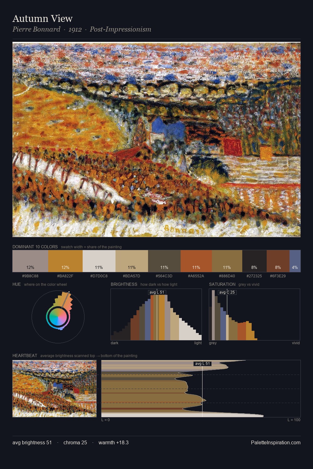
Pietro Perugino Palette 6
Muted Gamboge
Muted Deliberately desaturated - chroma pulled toward gray, the restraint of tonal painting.
Gamboge Deep golden yellow - a traditional warm pigment, rich amber-gold.

Palette Analysis
Values in Pietro Perugino rest in the mid-range - neither dramatically lit nor steeped in shadow. The palette achieves thermal balance - reds and blues, ochres and greens, each holding the other in check. The absence of saturated colour is itself an expressive choice: this is a palette of restraint and atmosphere. #C08540 delivers the chromatic peak at only 9.3% - a small shot of colour with outsized visual impact. The full value range is 74 units: broad enough to build convincing three-dimensional form. This is palette 6 of Pietro Perugino's sequence - a single chapter in a chromatic story told across many works.
Example use cases
- craft & artisan brands
- specialty coffee
- home goods
- lifestyle retail
- ceramics & pottery
I Love This!
Use This Palette
Copy, export, or download for your project
Copy, export, or download for your project
Copy:
Download:
Share: