Pietro Perugino Palette 14

Palette Analysis
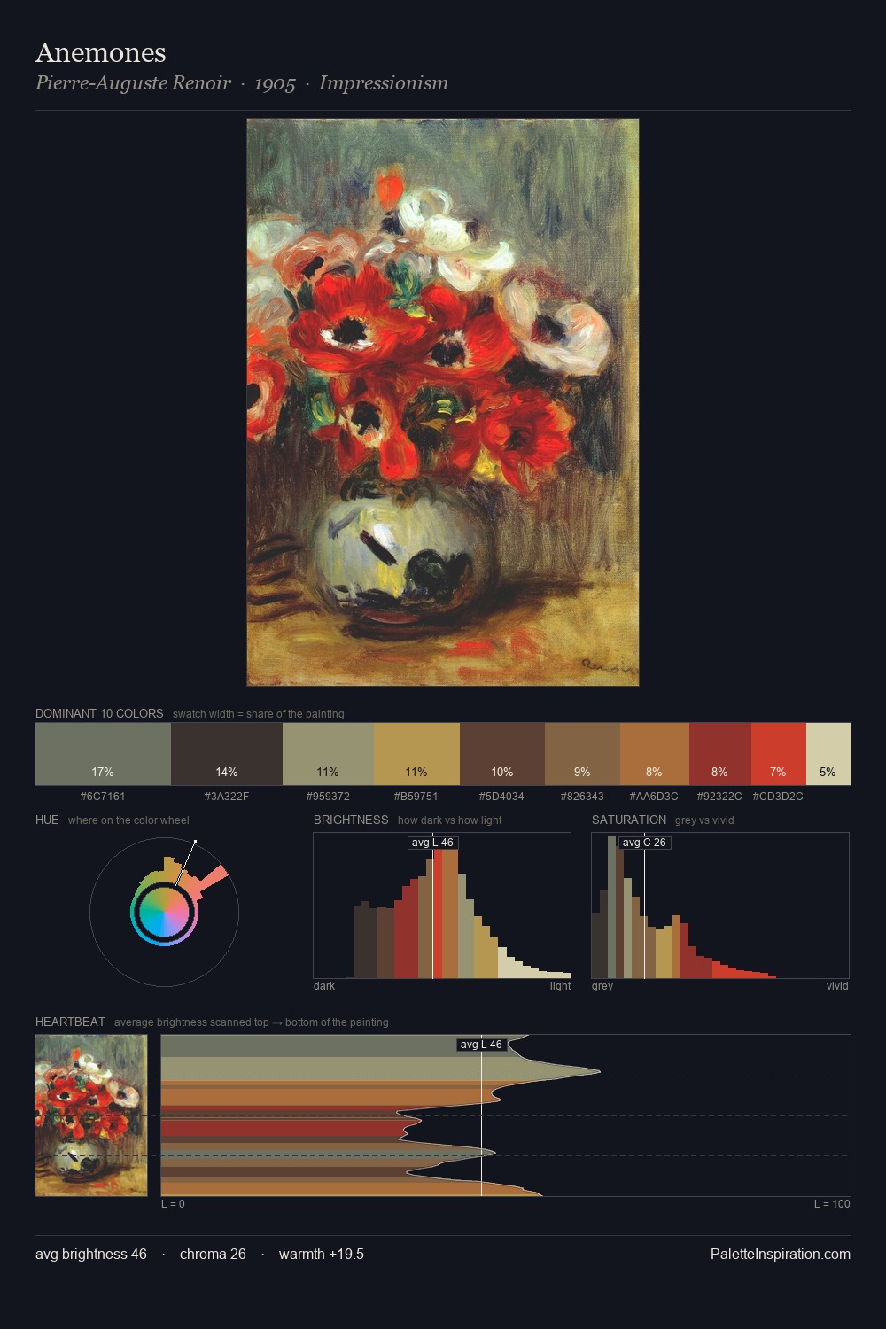
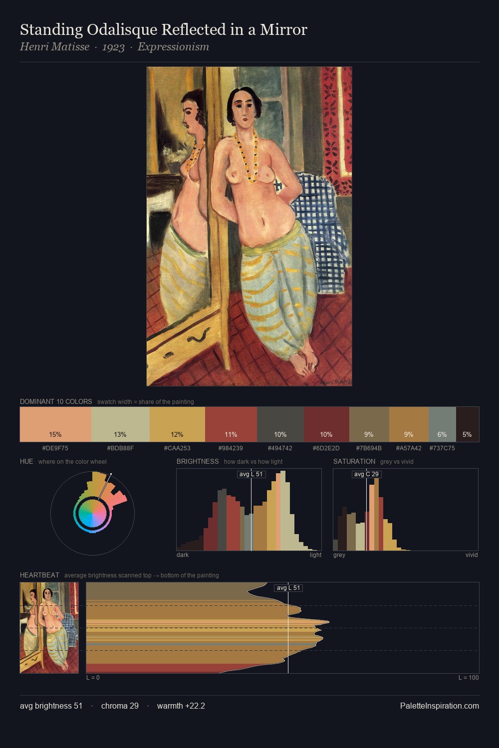
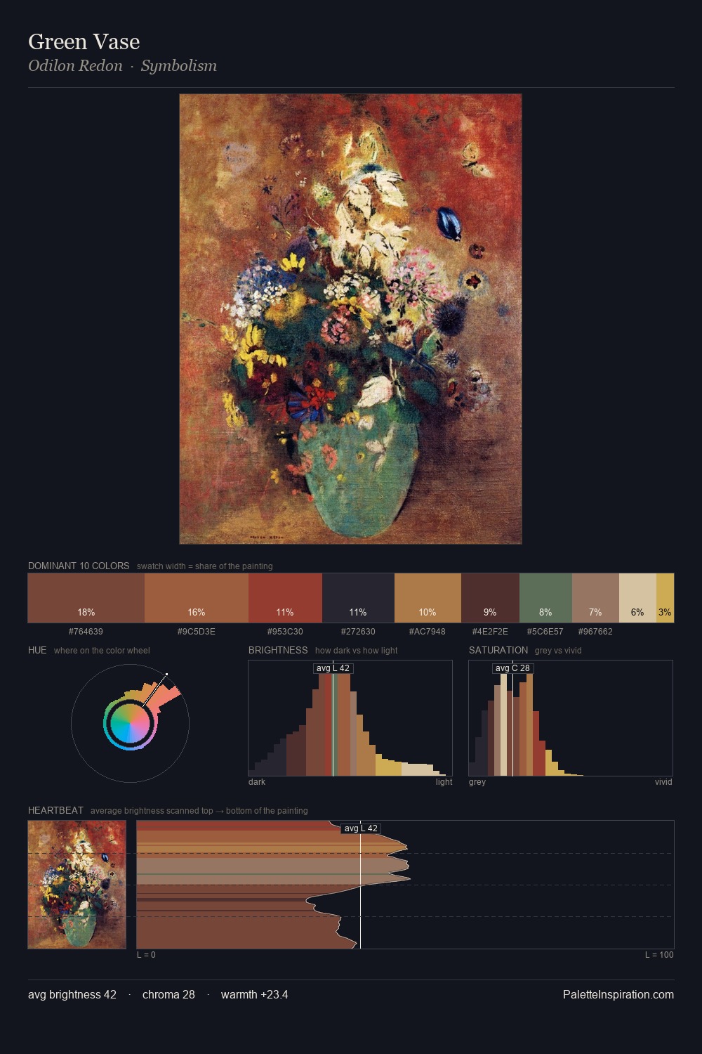
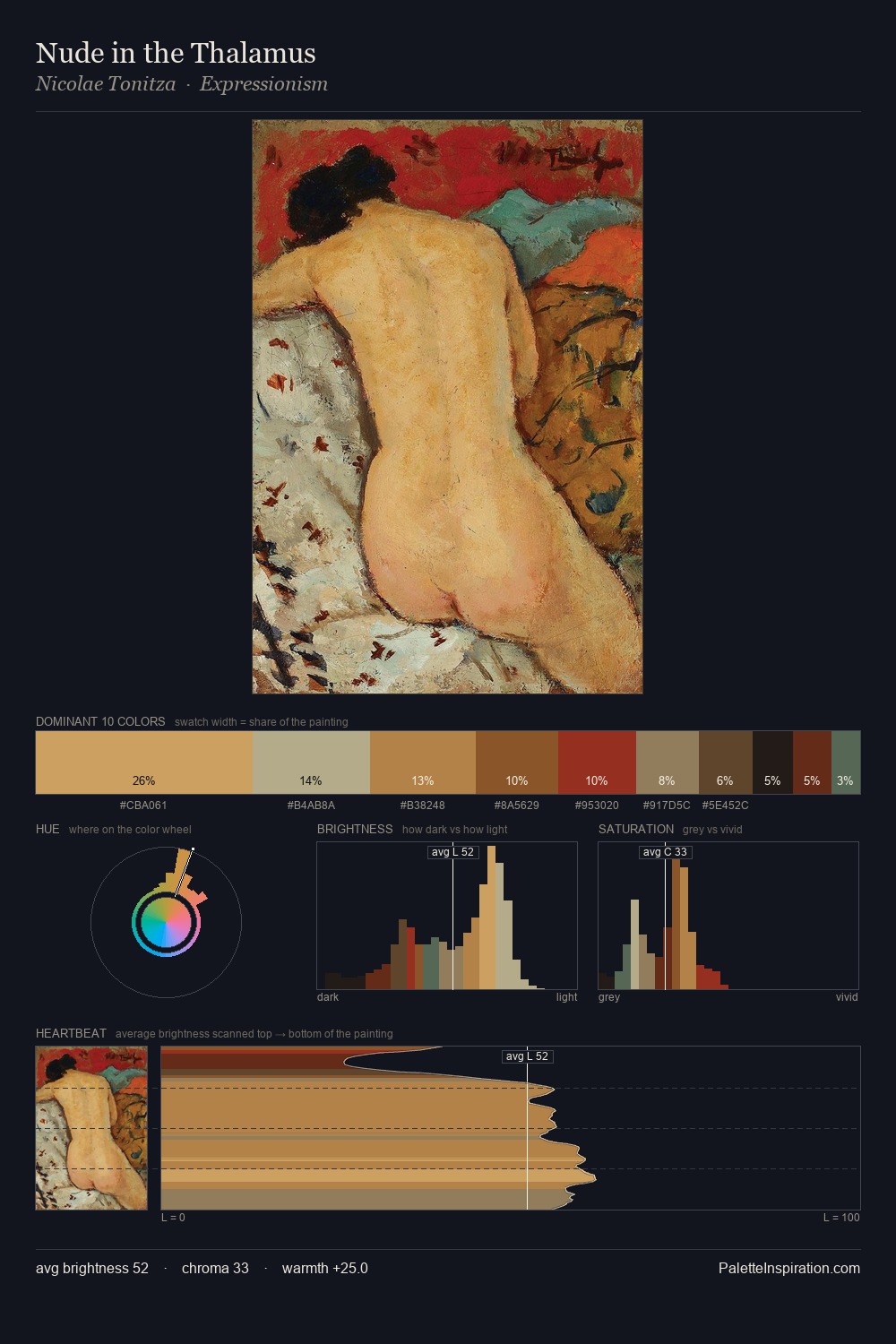
Pietro Perugino distributes its values across the middle register, creating harmony without high contrast. Temperature reads distinctly warm: the reds and earth tones from Pietro Perugino carry the compositional weight. The absence of saturated colour is itself an expressive choice: this is a palette of restraint and atmosphere. The dominant colour, #181918, takes 29.2% of the total area, establishing the overall mood before any other hue is introduced. #93352D functions as the palette's exclamation mark: highest chroma, lowest percentage (3.7%). The value range spans 60 units across the palette, providing the full gamut from deep shadow to near-white and ensuring clear tonal hierarchy. Pietro Perugino's palette 14 carries its own internal logic while remaining in conversation with the artist's broader colour intelligence.
Example use cases
- music labels
- luxury hospitality
- editorial photography
- leather goods
- premium streaming
I Love This!
Copy, export, or download for your project