Pierre-Marie Beyle Palette 5

Palette Analysis
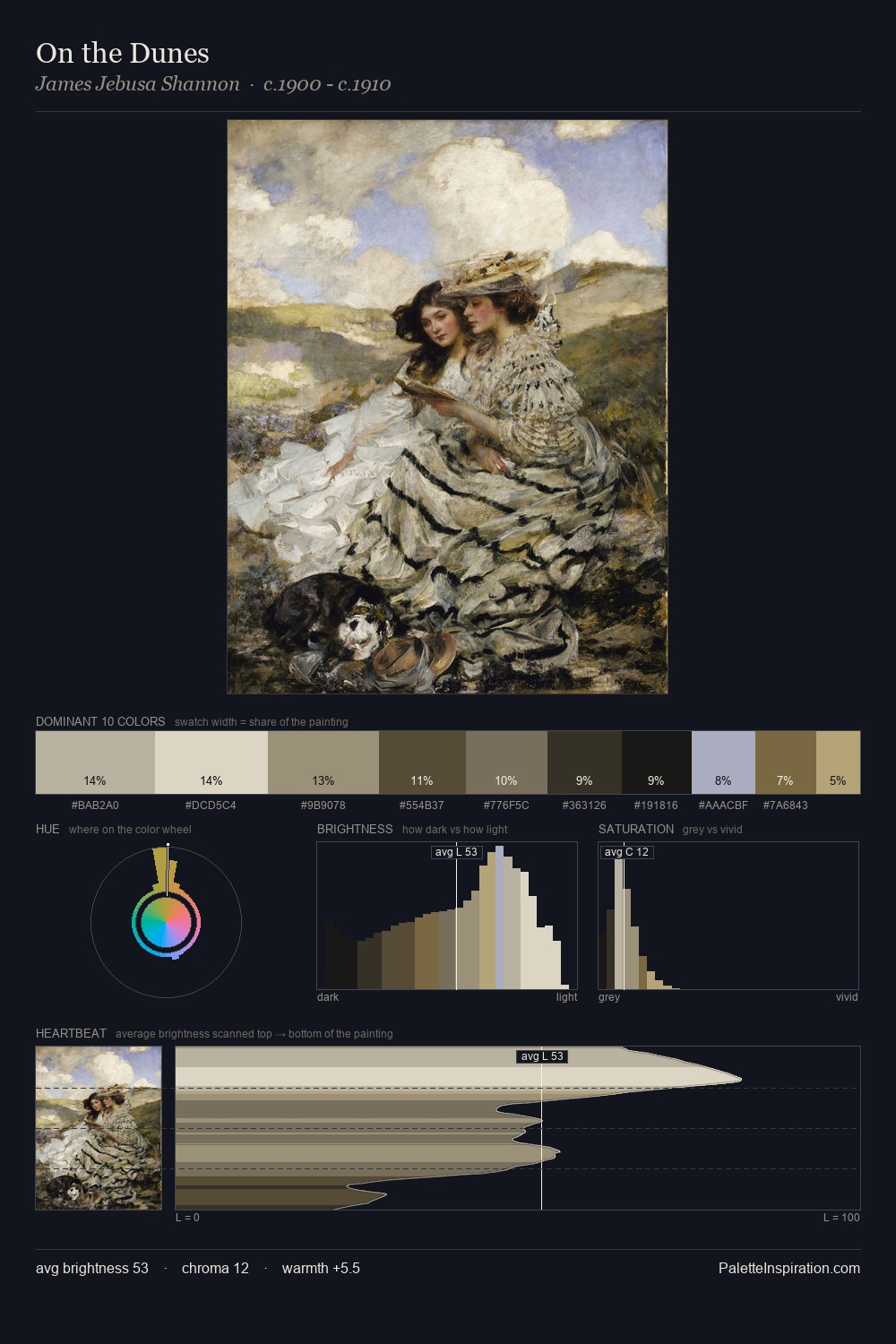
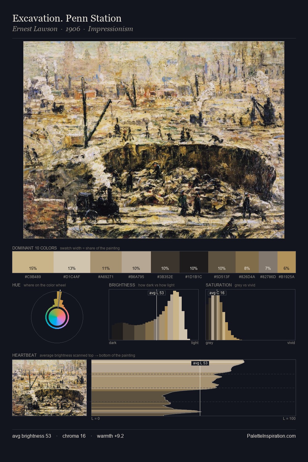
Pierre-Marie Beyle distributes its values across the middle register, creating harmony without high contrast. Temperature is cool-dominant, with blue and green families claiming the largest areas. Saturation is deliberately withheld - the beauty here lies in the near-monochromatic gradations rather than colour difference. 31.2% of the palette belongs to #332F25, a concentration that makes it the unmistakable visual centre. The highest-chroma note - #BBA367 - appears at just 1.0%, deployed as a precision accent against the quieter ground. Spanning 54 units on the value axis, the palette achieves the balance between tonal flatness and fragmentation. The mid-to-high key, cool bias, and moderate chroma point to outdoor observation - sky and diffused daylight as the dominant light source. Palette 5 sits within the larger chromatic argument that Pierre-Marie Beyle's complete body of work advances.
Example use cases
- theater design
- jewelry brands
- tobacco-adjacent retail
- event branding
- film & entertainment
I Love This!
Copy, export, or download for your project