Peter Nicolai Arbo Palette 5

Palette Analysis
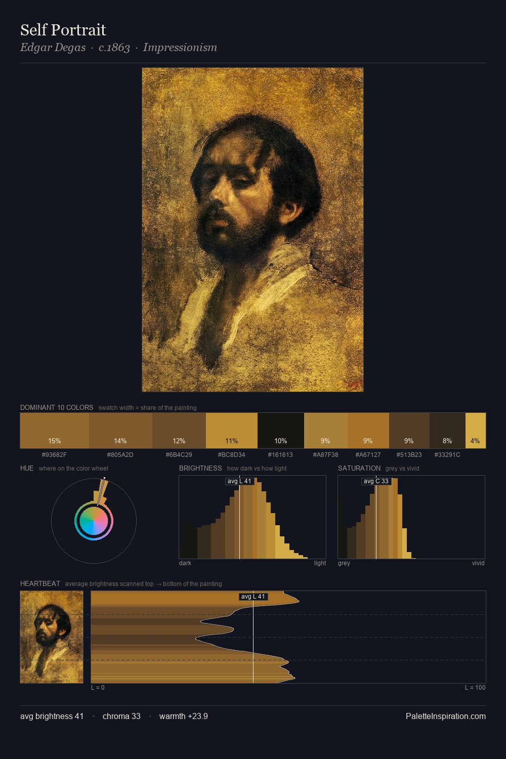
Peter Nicolai Arbo works almost entirely in the lower half of the value scale, privileging depth over brilliance. Peter Nicolai Arbo builds on cool foundations: the palette favours the blue-cyan-green arc. Saturation is deliberately withheld - the beauty here lies in the near-monochromatic gradations rather than colour difference. The dominant colour, #0C0E0A, takes 29.8% of the total area, establishing the overall mood before any other hue is introduced. The most saturated colour, #A97E35, is reserved to 5.4% of the surface, where it acts as a focal punctuation. At 64 units of value range, the palette has the tonal breadth to sustain complex spatial readings. Together these qualities place Peter Nicolai Arbo firmly in the tonal tradition - concerned with mood and atmosphere rather than chromatic display. This is palette 5 of Peter Nicolai Arbo's sequence - a single chapter in a chromatic story told across many works.
Example use cases
- theater design
- jewelry brands
- tobacco-adjacent retail
- event branding
- film & entertainment
I Love This!
Copy, export, or download for your project