Pavel Fedotov Palette 3

Palette Analysis
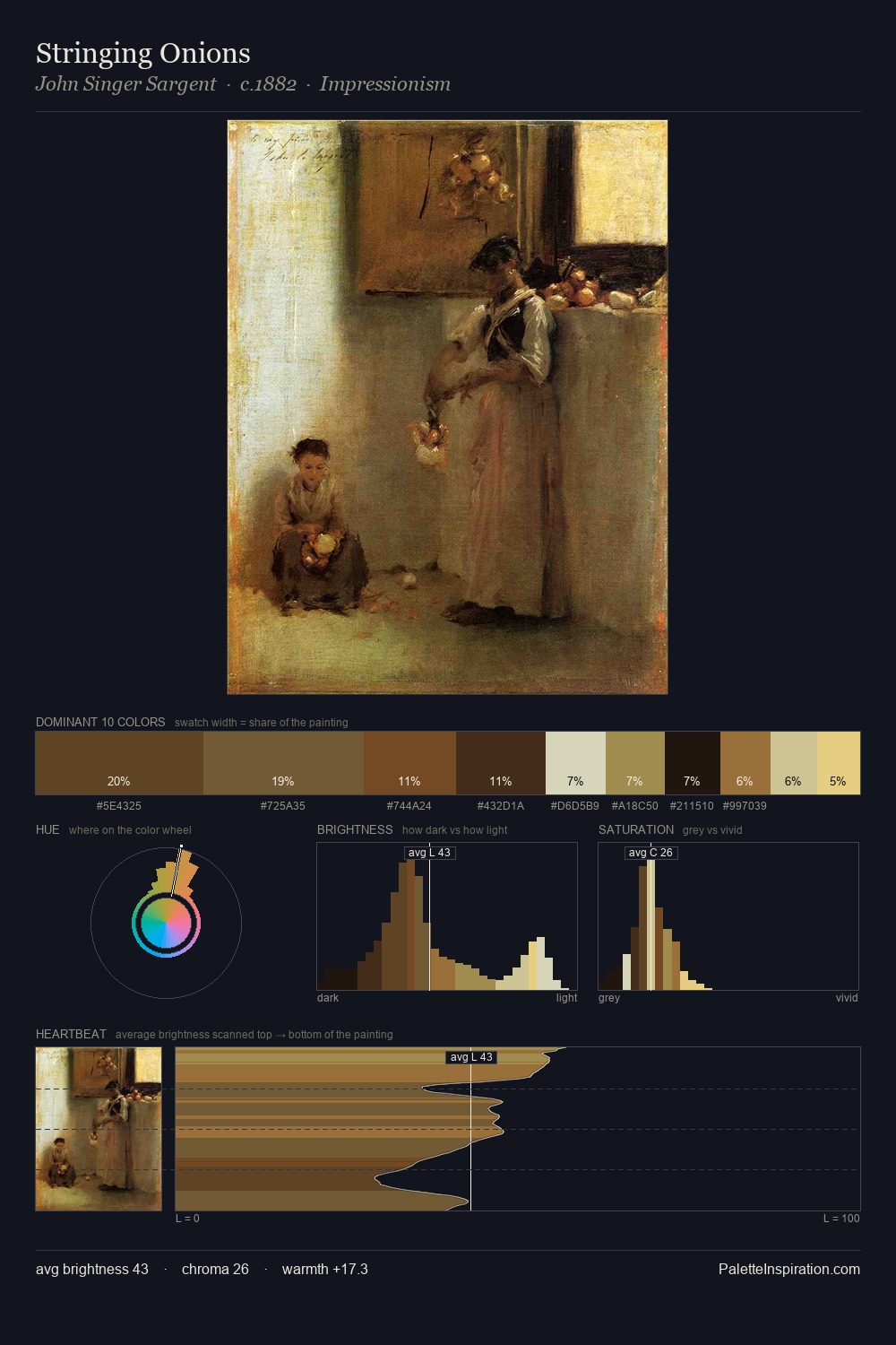
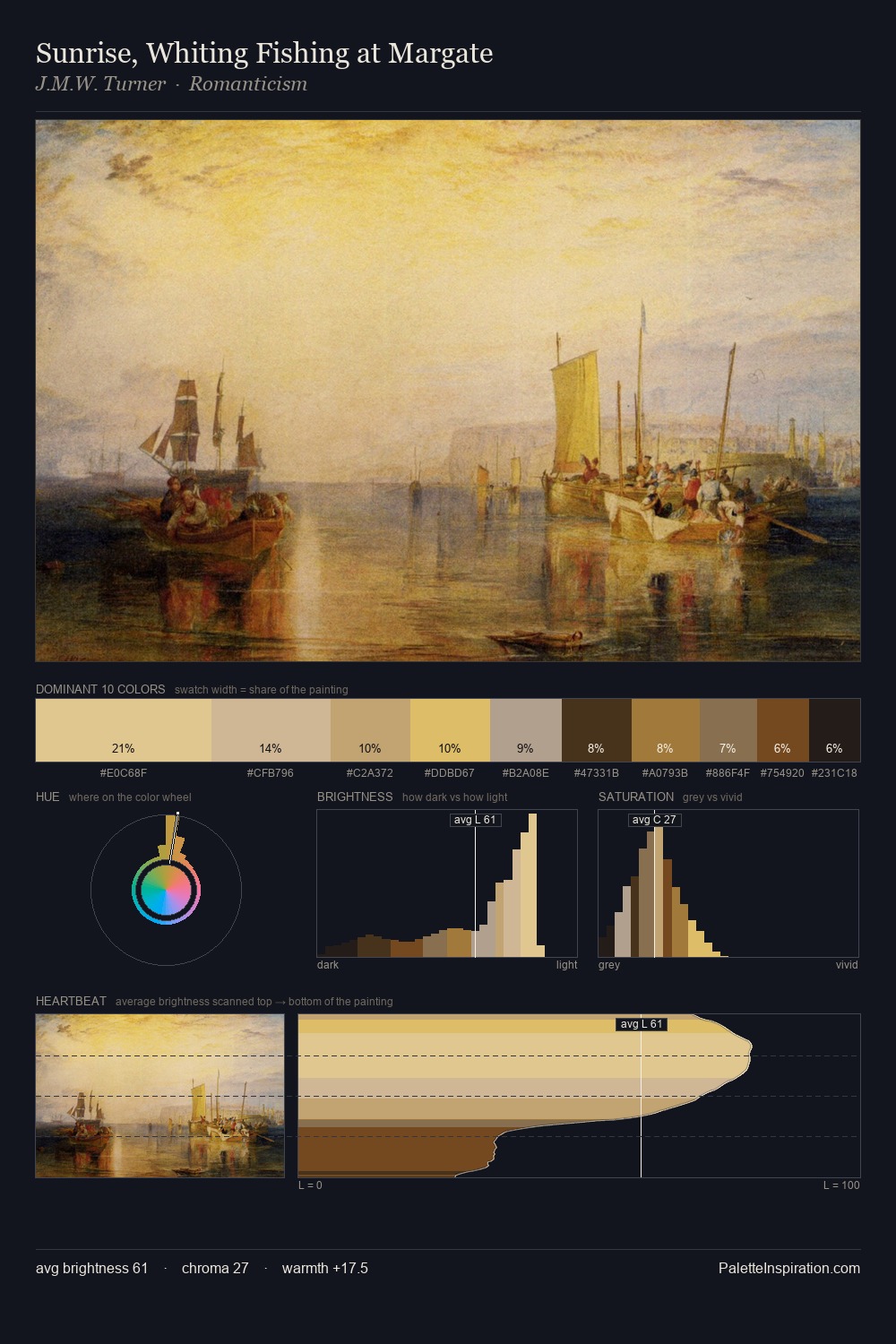
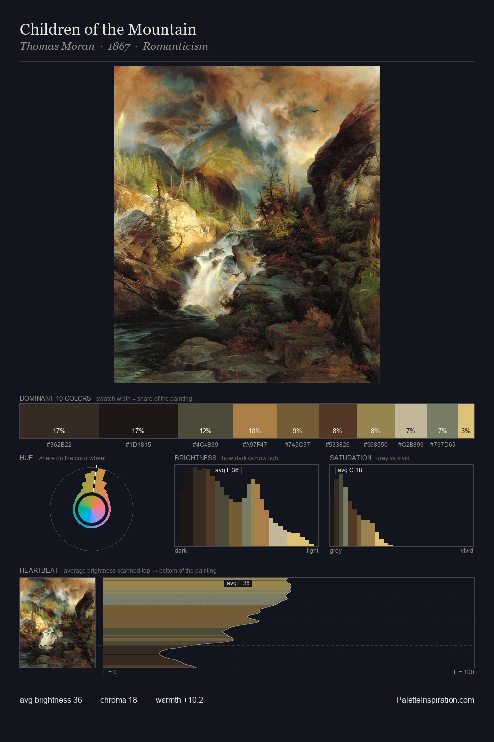
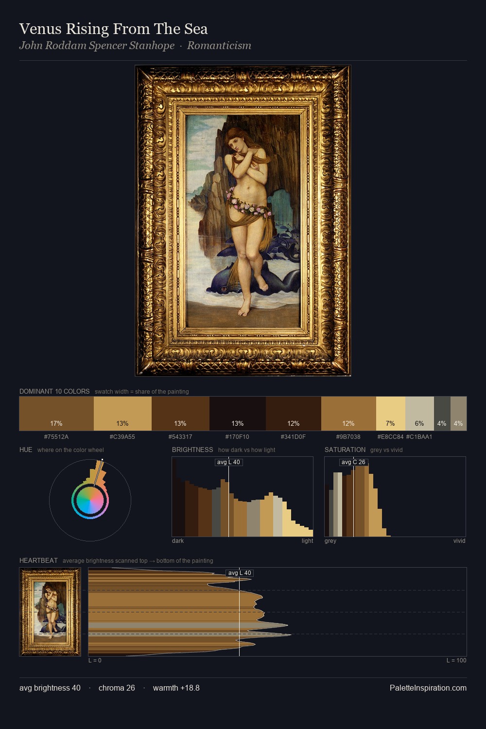
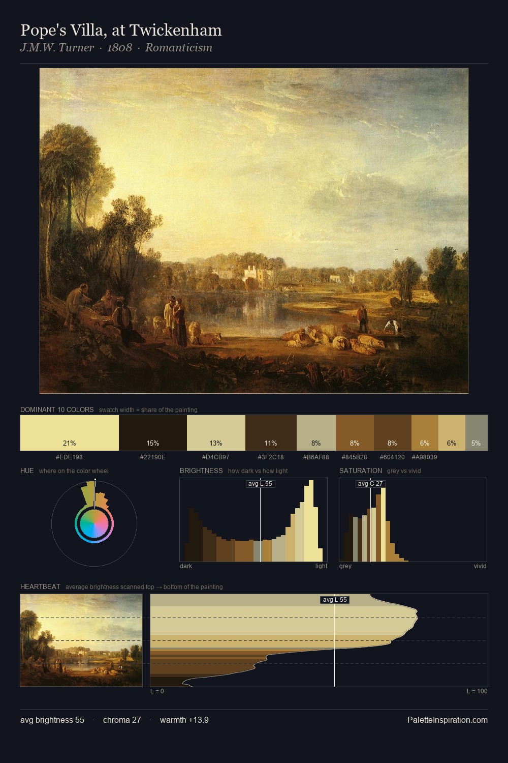
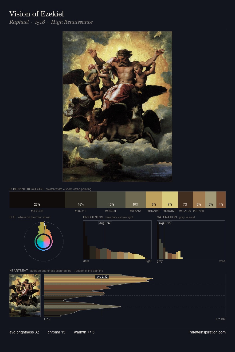
Pavel Fedotov occupies the comfortable middle of the value scale, avoiding both extremes to hold the eye in a sustained middle grey. Neither warm nor cool has the upper hand here; the equilibrium between the two generates the palette's visual energy. Chroma is held at a comfortable level - distinct colours, but no single hue is allowed to overwhelm. The most saturated colour, #452A15, covers 4.9% of the surface: too much to call an accent, too strong to ignore. 67 units of value range underpin the palette's structural clarity: the eye always knows where light falls. The palette reads as an Impressionist one - light-biased, chromatically direct, and built on temperature contrast rather than value opposition. In the context of Pavel Fedotov's full range of palettes, group 3 represents one movement in an ongoing chromatic dialogue.
Example use cases
- publishing
- corporate identity
- consumer apps
- hospitality
- design agencies
I Love This!
Copy, export, or download for your project