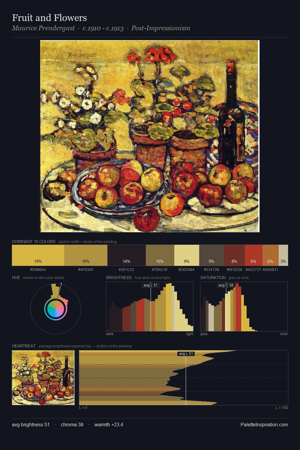
Paula Modersohn-Becker Palette 3

Palette Analysis
Mid-key values give Paula Modersohn-Becker its characteristic quietness - nothing blazes, nothing disappears. Paula Modersohn-Becker builds on cool foundations: the palette favours the blue-cyan-green arc. Saturation is measured and controlled, giving the palette presence without visual aggression. The highest-chroma note - #5A2B25 - appears at just 7.4%, deployed as a precision accent against the quieter ground. From deepest dark to palest light, the palette traverses 55 units of the value scale - a span that creates natural depth. The palette has the character of outdoor light: cool, mid-bright, with colour rendered faithfully rather than expressively. Paula Modersohn-Becker's palette 3 carries its own internal logic while remaining in conversation with the artist's broader colour intelligence.
Example use cases
- ceramics & pottery
- boutique hospitality
- menswear
- heritage food brands
- craft & artisan brands
I Love This!
Copy, export, or download for your project