Paul Peel Master Palette
Penumbral Tawny
Penumbral Partial shadow - the transitional zone between light and full dark, soft-edged.
Tawny Warm orange-brown - a traditional term for the color of tanned leather or lion fur.

Palette Analysis
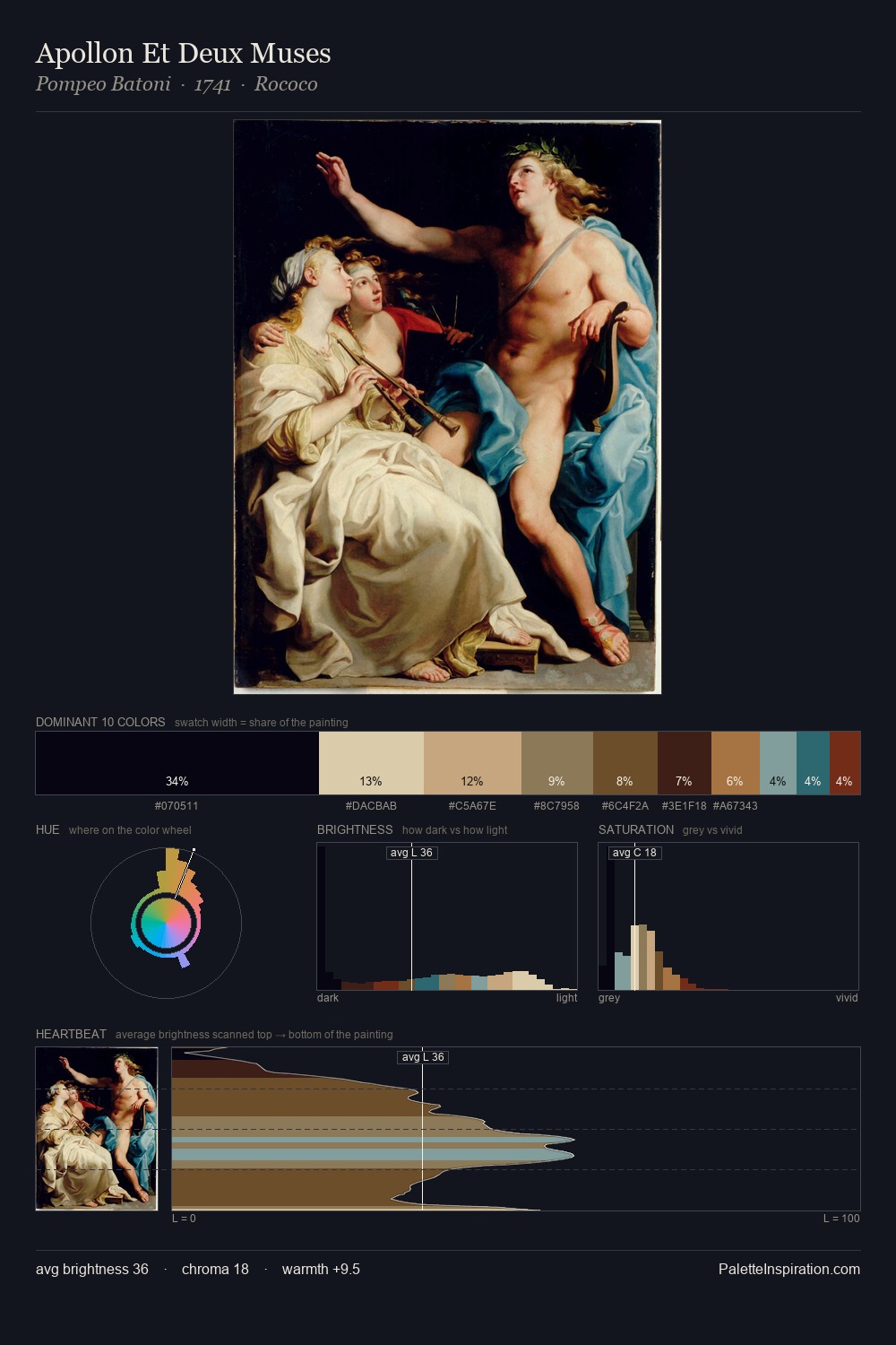
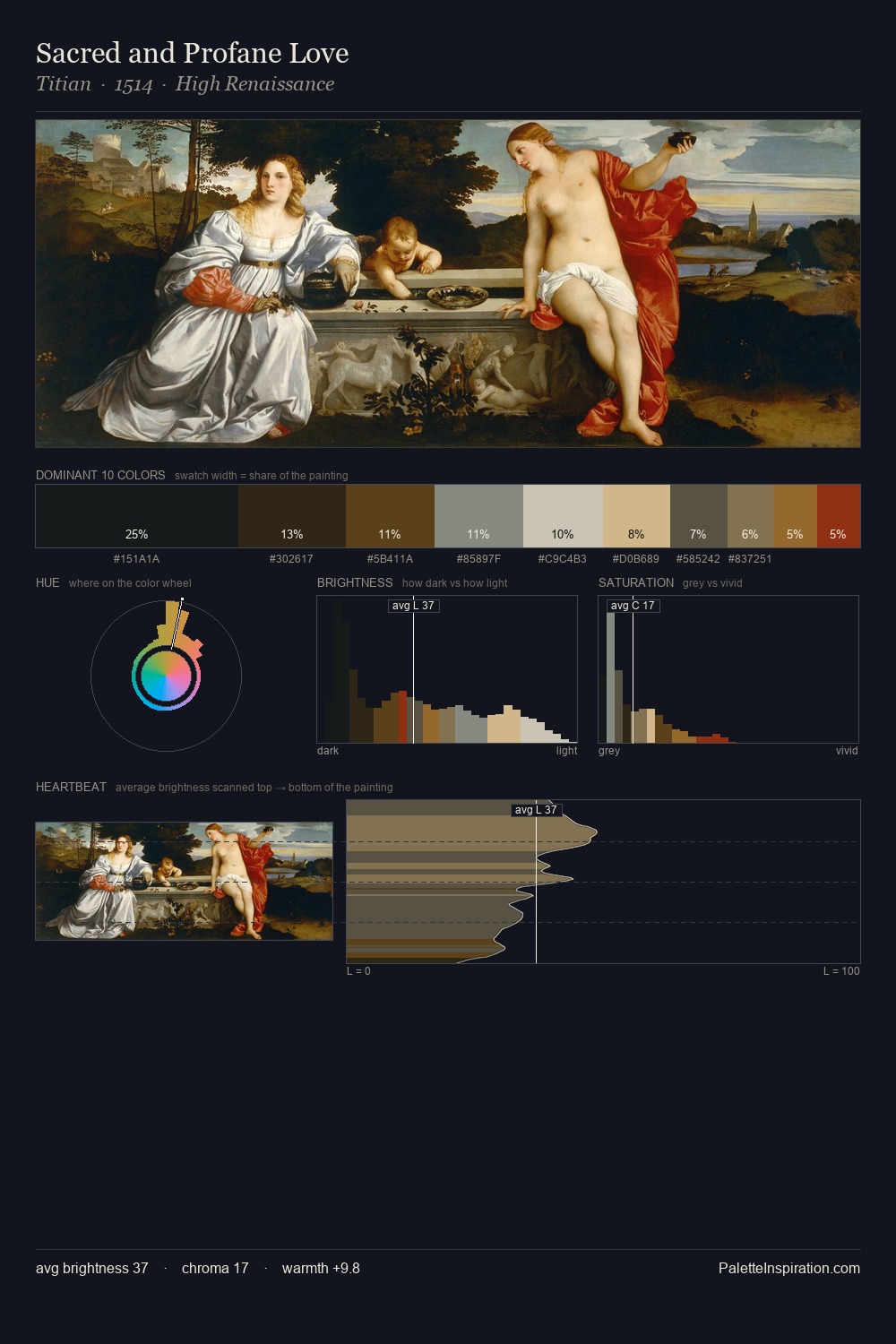
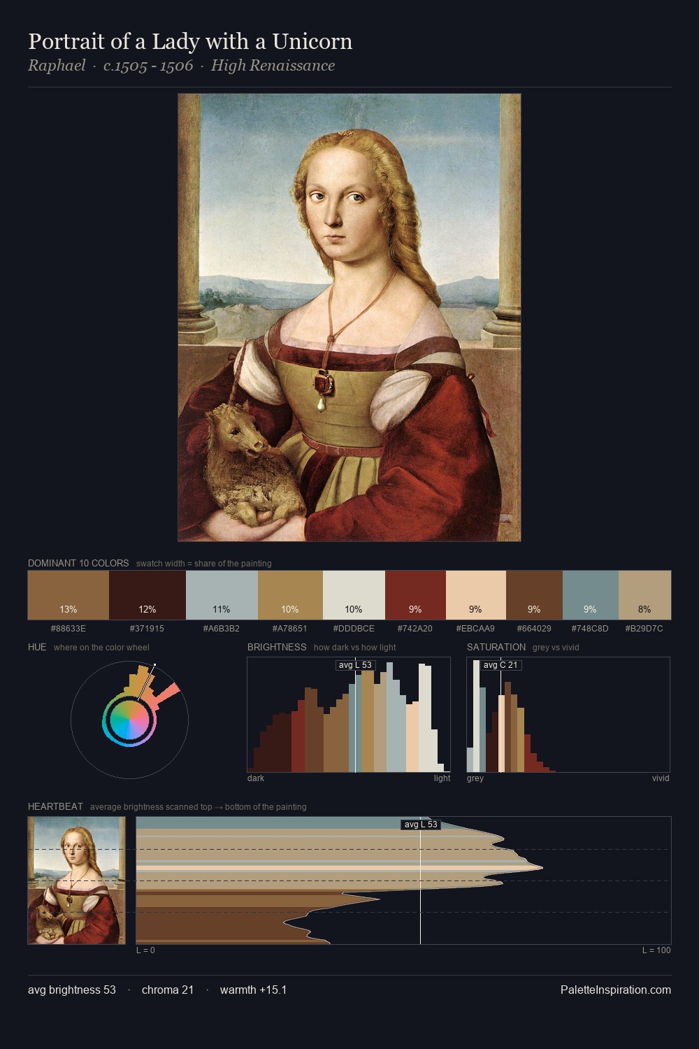
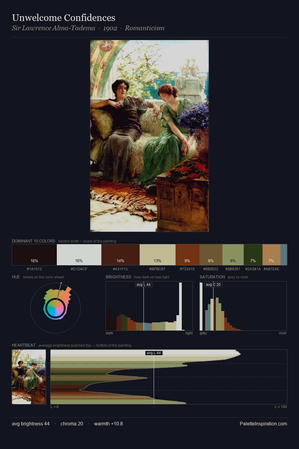
Paul Peel distributes its values across the middle register, creating harmony without high contrast. Temperature reads distinctly warm: the reds and earth tones from Paul Peel carry the compositional weight. Every colour is desaturated; the palette proceeds through near-neutrals and gently-coloured greys. The most saturated colour, #E4D2A6, is reserved to 4.7% of the surface, where it acts as a focal punctuation. A value spread of 65 units gives the palette both depth and air - shadows are genuinely dark, lights genuinely light. These proportions encode Paul Peel's instinctive sense of how much of each quality the eye can hold.
Example use cases
- theater design
- jewelry brands
- tobacco-adjacent retail
- event branding
- film & entertainment
I Love This!
Use This Palette
Copy, export, or download for your project
Copy, export, or download for your project
Copy:
Download:
Share: