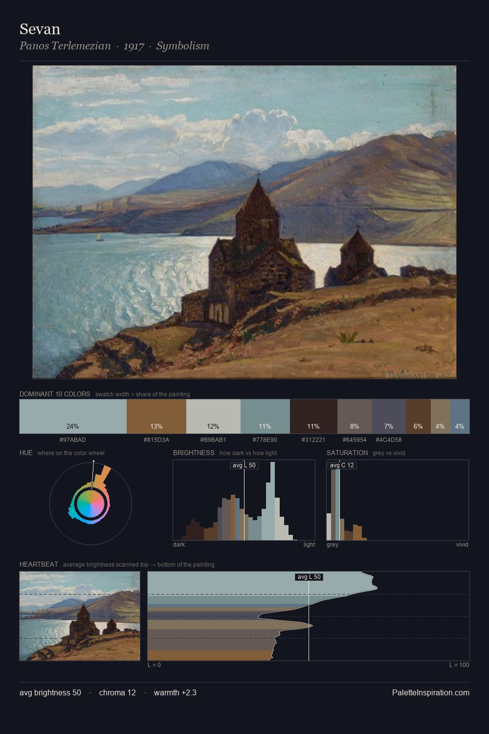
Panos Terlemezian Palette 1
Veiled Vellum
Veiled Partially obscured light - mid-dark with a hazy, scrim-filtered quality.
Vellum Smooth pale tan - the color of prepared calf-skin vellum, warmer than parchment.

Palette Analysis
Panos Terlemezian occupies the comfortable middle of the value scale, avoiding both extremes to hold the eye in a sustained middle grey. Warm and cool are kept in productive tension, creating the kind of chromatic harmony that sustains the eye. Saturation is deliberately withheld - the beauty here lies in the near-monochromatic gradations rather than colour difference. Only 6.0% is devoted to #4E3828, yet that small allocation delivers the palette's entire chromatic tension. The full value range is 55 units: broad enough to build convincing three-dimensional form. Palette 1 sits within the larger chromatic argument that Panos Terlemezian's complete body of work advances.
Example use cases
- exhibition design
- foundation branding
- estate management
- art education
- museums & galleries
I Love This!
Use This Palette
Copy, export, or download for your project
Copy, export, or download for your project
Copy:
Download:
Share: